Text Type: Small Letters – Big Decisions Manual
Until the early 19th century, virtually all type was of the text variety. Type was for books, pamphlets and newspapers. It wasn’t until the advent of the Industrial Revolution – and the accompanying need for advertising – that display type became popular. While display type is widely used, most of what we read is still text type.
Type between 6 and 14-points is generally considered to be text type. At these sizes, it is best to use typefaces that are easy to read, set with an even texture and are light to medium weight.
Easy on the Eyes
Generally, the most legible typefaces offer big features and have restrained design characteristics. Although these attributes may seem conflicting, they are not. “Big features” are qualities such as open counters, large apertures, ample lowercase x-heights and character shapes that are obvious and easy to recognize. The most legible typefaces are also restrained. They are not excessively light or bold; character stroke weight changes are subtle; and serifs, if the typeface has them, are not particularly long or heavy

Big Features in Little Letters
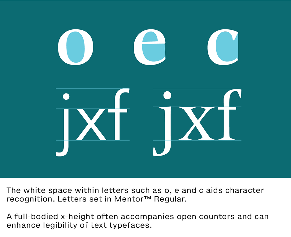
Open counters help to define a character. The white space within letters such as o, e and c aids character recognition. A full-bodied x-height often accompanies open counters and can also enhance the legibility of text typefaces. Because more than 95% of the letters we read are lowercase, the larger their proportions, generally the more legible they will be. Large, however, does not mean enormous. Very large x-heights, such as those in Antique Olive® and Americana®, force ascenders and descenders to be truncated, which detracts from typographic legibility at small sizes.
The “Just Right” Serif
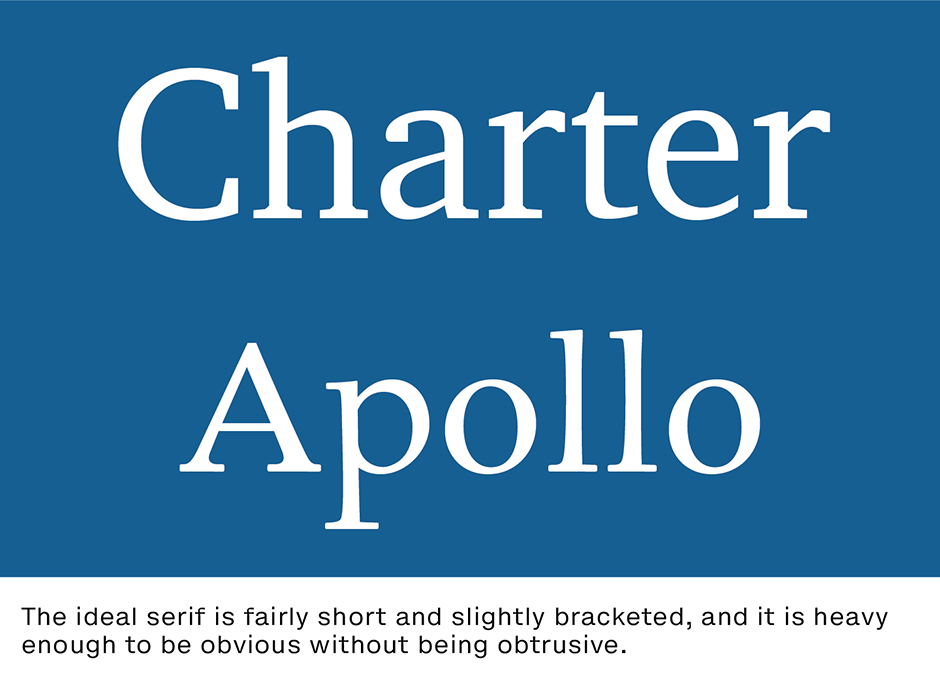
The ideal serif is fairly short and slightly bracketed, and is heavy enough to be obvious without being obtrusive. Apollo® and Charter®, for example, have great serifs. Individual letter legibility begins to suffer as serifs take on exaggerated shapes. Very long, exceptionally heavy or unusually-shaped serifs are the bane of character legibility.
Lightweight Power
Lighter typefaces are usually more legible than heavier weights. They enable full, open counters and unmodified character shapes. Studies have shown that the optimal character stroke thickness for text typefaces is about 18% of the x-height. The medium weights of Albertina®, Mentor™ and Linotype Ergo™ are good examples.

Even Texture
If you squint at a block of text copy, you should see an even, grey texture on the page. Typefaces that do not space evenly or that have strong contrasting stroke weights create an uneven – and uninviting – texture.
Invisible Type
Beatrice Warde, Monotype’s famous marketing manager of the 1930s and ‘40s, created the metaphor that typography should be like a crystal goblet. She believed that the best text typefaces do not get in the way of the communication process. That they should be virtually invisible, and, like a crystal goblet holding wine, allow words to be read without the type being seen. Although this is a good goal, it is also a very conservative view. This does not mean that text typefaces cannot be distinctive in design. Some very distinctive typefaces, such as Cartier™ Book or Menhart™, make fine text fonts. The metaphor is, after all, a crystal goblet – not an empty jam jar.
Download a pdf version of the Text Type: Small Letters – Big Decisions Manual


