Manual: The Story of Typographic Numbers
Handwriting Fonts: Unique Designs for Special Projects
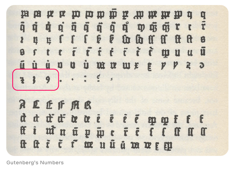
Numbers have, pretty much, always been included with fonts of type. When Gutenberg invented the art of typography, he included a set of numerals in his fonts. For almost 100 years, however, numerals were treated as “pi” characters and not created to be part of any specific typeface design.
Claude Garamond, the great 16th century type designer, is generally given credit for creating the first font of type with numerals designed to complement letterforms of a particular typeface. Except for stylistic variations, Garamond’s numerals set the standard for over 200 years.
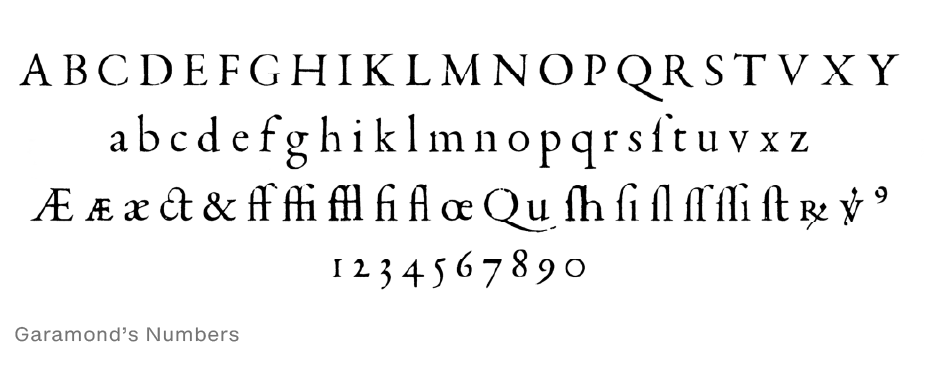
Garamond intended his numerals to be set as part of text copy and designed them to have the same proportions as the lowercase letters. Like lowercase letters, Garamond’s numerals are based on three forms: ascending, medial, and descending. To avoid confusion with the lowercase “o,” the zero has a different weight stress than the lowercase character.
New Numbers
This “lowercase” style of numerals became a model for type designers until the late 18th century. It was then that a new kind of number (called “lining” and sometimes “ranging”) was introduced. The idea behind this new set of numerals was that they would be larger – and a more legible alternative to Garamond’s design.
Lining figures emerged from the new middle-class phenomenon of shopkeepers’ hand-lettered signage. They were first introduced to European typography in 1788, when Richard Austin designed a new font for typefounder and publisher John Bell, featuring three-quarter height lining figures. These figures were further refined by 19th century type designers and significantly replaced text figures in various contexts, particularly in newspaper and advertising typography.
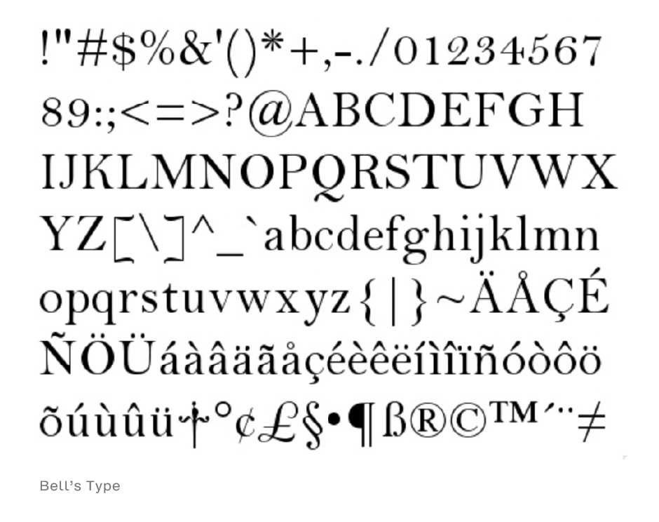
These figures were further refined by 19th century type designers and significantly replaced text figures in various contexts, particularly in newspaper and advertising typography.
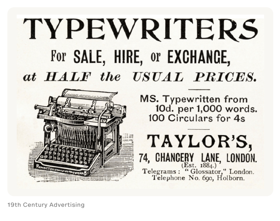
Sometimes lowercase numerals are referred to as “old style” designs. This is because when numerals became popular, many typographers referred to them as “modern” numerals – which left the previous style to be relegated with the moniker of “old style”. To this day, traditionalists tend to refer to the style of numerals found in Garamond’s font as “old style.”
Machine Typesetting V. Typography
For many years, printers and typographers benefited from both sets of numerals, but as machines began to be used for setting type, typographic variety was sacrificed for mechanical efficiency. Machine-set type had limited character sets, which allowed for only one set of numerals. Some fonts (generally those text designs confined to what printers called “book work”) had the lowercase design, while others (more general-purpose fonts used for “jobbing work”) had the lining design. When phototype replaced machine set metal type, most foundries chose just the lining style for inclusion in their fonts.
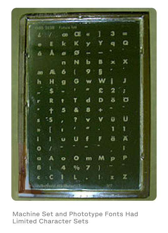
It is only with the advent of digital fonts and OpenType® technology, which enabled fonts with huge character sets, that designers and typographers have the ability use easily choose between old style and lining numbers.
It’s About Legibility
At first glance, lining numerals may appear to be more legible than their more senior brethren, but a variety of legibility studies have proven that this is not the case: lowercase numerals are moderately more legible than lining numerals when isolated, and considerably more legible when set in groups. In addition to being more legible, many designers and typographers also believe that lowercase numerals are more attractive than the lining variety.
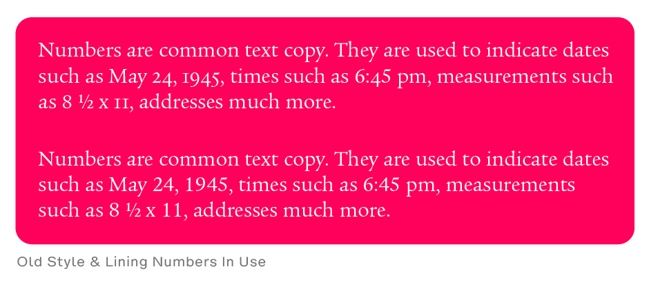
Lining numerals are great for situations where you want figures to stand out, or when setting all-cap copy. When these figures are used in text composition, however, they are often too conspicuous. The result is that the reader’s eye tends to fixate on the numerals rather than read the text composition. Oldstyle numerals, which are specifically designed to blend with text composition, provide information without calling special attention to themselves. They are also ideal for page folios, dates, and in other places where you want the numerals to be discreet.
The evolution of numbers in fonts reflects the advancements in typography and serves as a testament to the cultural and technological changes that have shaped typographic communication.


