Type Trends: 2022 Q3 Trends by Ryan Arruda and Jason Ramirez
Chalk & Cheese – Not
We reached out to two designers for this issue of Type Trends – and soon discovered: even though they had seemingly very different gigs, the two worked to surprisingly similar design goals. We asked lot of questions and came away with some valuable typographic guidance.
Two Terrific Trendsetters
Ryan Arruda creates drop-to-your-knees packaging and promotional design for Tree House Brewing Company, in Central Massachusetts. He’s also a freelance designer that uses type and typography as the primary tools in his multi-faceted design repertoire. A previous gig wrangling, design, content and fonts at MyFonts and Monotype, helped hone his craft.
Jason Ramirez is an award-winning art director and designer for Viking/Penguin Books, in New York. He’s earned recognition from AIGA Eye on Design, the AIGA 50 Books | 50 Covers competition, the Type Directors Club, the New York Book Show, and Communication Arts and Print magazines. In addition, his projects have been published in several books related to graphic design and publishing. He has also been a guest lecturer at Parsons School of Design and NYU Center for Publishing.
Shared Views
What do these seemingly divergent designers have in common? Both create point-of-purchase design that is generally limited to just one or two typeface choices. This requires thoughtful font choice and astute pairing. They also share the common goal of creating unpretentious, yet eye catching, typographic design. In addition, neither Arruda or Ramirez are satisfied with typographic status quo.
They both see the value in using typographically inspired nostalgia to get a message across. Both are comfortable in taking typographic chances – but temper this, with thoughtful choices. They believe that typefaces can have a personality – or, at least, be remarkably expressive. Both also delve deeply into the roots and nuance of each project, before they do any design.
The Power of Nostalgia
“Everything old is new again,” says Arruda, “with an updated voice, additional refinement, and new craftspeople at the helm. I think the process of circling around to bygone aesthetics has accelerated, as design tools have continued to be democratized. Well-crafted type is no longer the exclusive realm of tenured type designers.
“If the last five years saw revival of 1970s stylings coming in hot, the 1980s and1990s are, themselves, now in full swing,” He continues. “Sure, there’s a heavy dose of nostalgia and irony thrown in the mix, but I think we’re also seeing an appreciation for beautifully crafted letterforms that may have fallen into disuse purely because the aesthetic zeitgeist changed – not because the designs were subpar.”
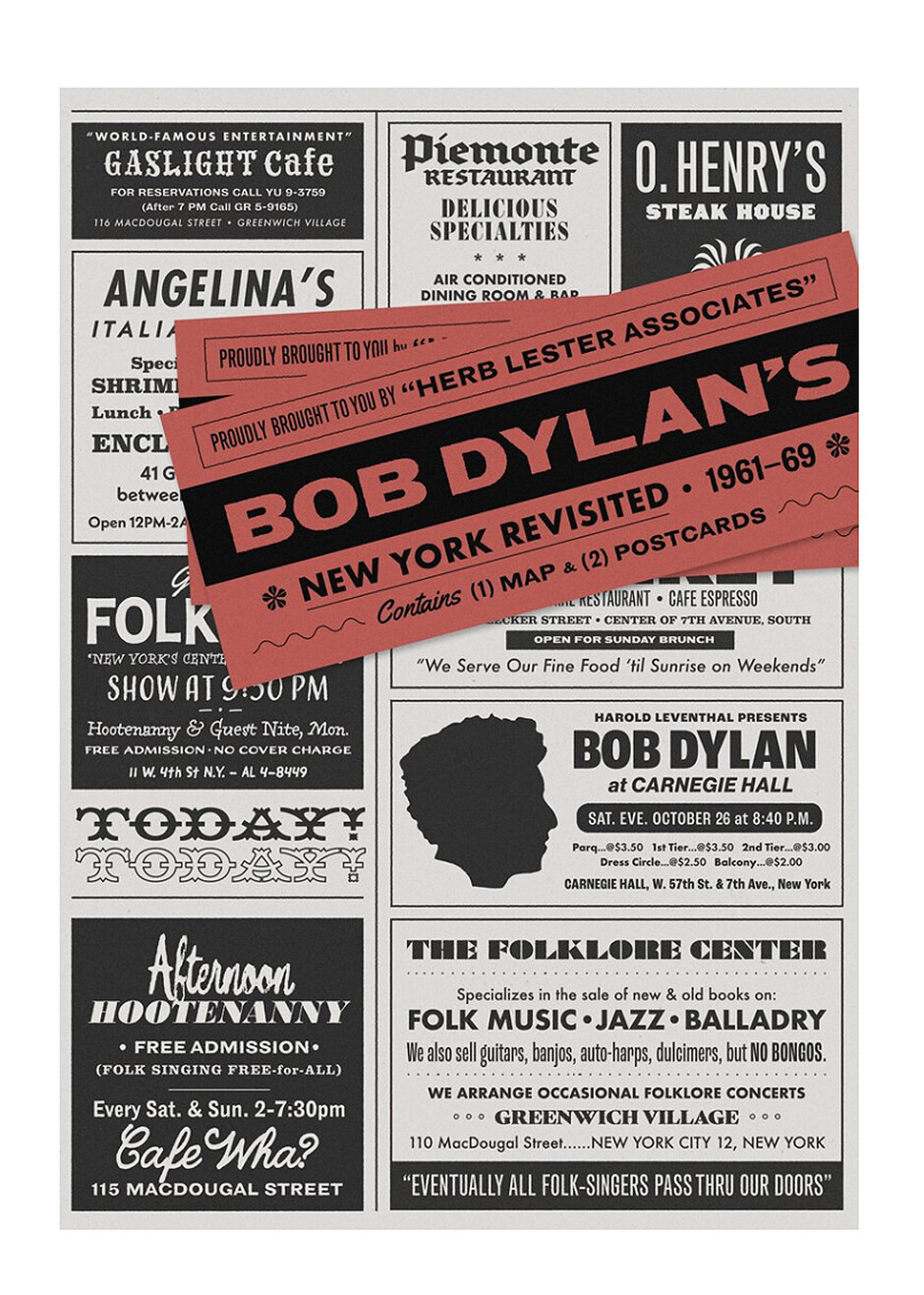
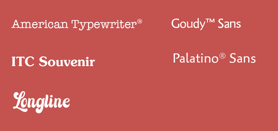
Ramirez, echoes this appraisal. “A more nostalgic style of typography – an embracing of a typographic classics, made popular during the 1960s and 1970s, is clearly being welcomed. These vintage letterforms are friendly, familiar, and perhaps even playful. They abound with soft serifs, gentle curves and widely splayed angular strokes.”
“The adoration for this vintage aesthetic can be seen in the application of classic typefaces of the era, or their reimagined cousins (sometimes as bespoke designs), for numerous rebranding projects. While nostalgic typefaces may appear to some, as novel to modern typography, these letterforms offer a promise of authenticity. This vintage aesthetic – classic or reimagined – can also infuse brands with a sense of heritage, creating greater legitimacy, in an increasingly competitive marketplace.”
Bland vs Brave
“I’m not sure I buy ‘The Crystal Goblet’ approach,” says Arruda. “Of course, there are times when designers are obliged to utilize certain typefaces, but typographic choices absolutely add flavor to the composition a designer creates – and there’s nothing wrong with doing so. Being beholden to the pursuit of the exceptionally bland, out of fear of distractibility, isn’t the answer.
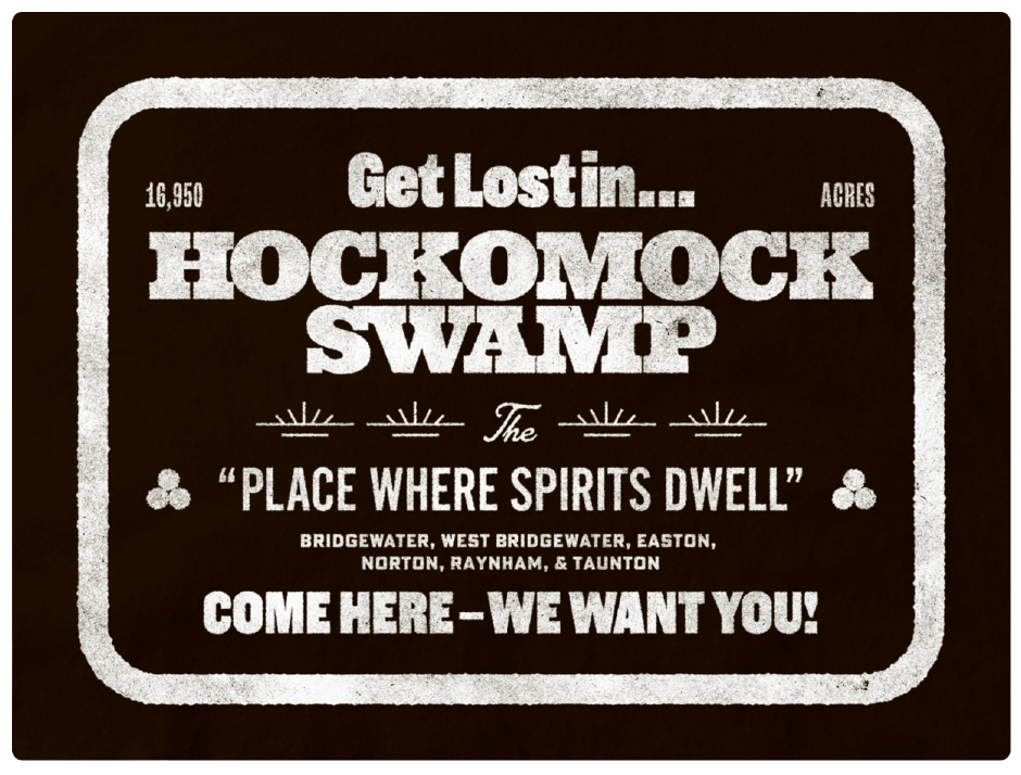
“I have a soft spot for ephemeral broadsides from the mid-1800s,” Arruda continues. “Think: big, type-driven posters featuring large letterforms and dense assortments of information. There’s something about the collision of type sizes, styles, and widths that give these design artifacts a unique charm.”
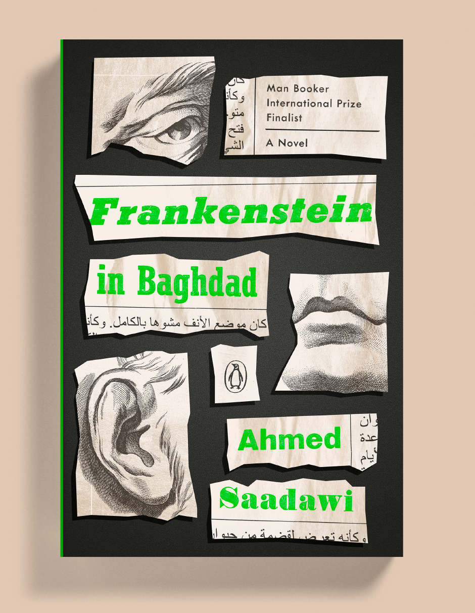
“While more than two or three typefaces on a book cover might make for a busy, confusing, and not-so-good-looking composition,” says Ramirez, “each book is unique, with its own set of circumstances, and deserves an equally distinct cover treatment. The various typefaces used on the cover for Frankenstein in Baghdad, were integral to the design concept.
“The book is a contemporary retelling of the Frankenstein myth set in U.S.-occupied Baghdad, where a local scavenger collects disparate human body parts from the war-torn streets and stitches them together to create an unlikely monster that leaves a trail of death in its wake. A photographer/reporter for a weekly news magazine ultimately encounters and interviews the monster, only to discover its surprising humanity.
“I created mock newspaper clippings as the primary vehicle to reinterpret and reimagine the monster as a sum of both his human parts, and his spoken words from the reporter’s interview.”
Typographic Personality
Every typeface has a personality,” says Ramirez. “Every typeface has something to say. And in book cover design, a typeface can make an implicit promise to the reader. This, guiding principle, informs how I work with type.”
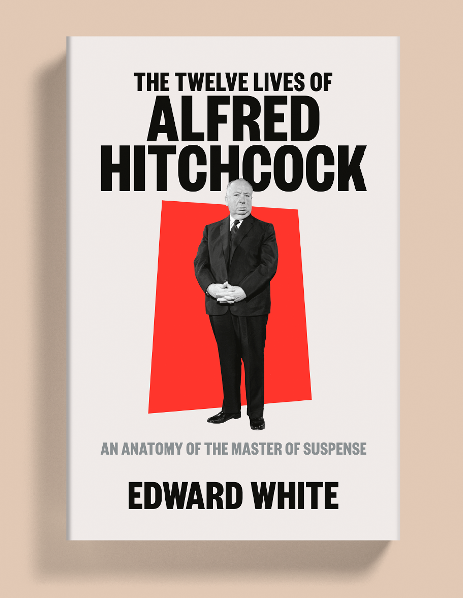
“The Twelve Lives of Alfred Hitchcock book jacket, is a perfect example. The book was positioned by the publisher as a ‘fresh, innovative interpretation of the life, work, and lasting influence of the twentieth century’s most iconic filmmaker.
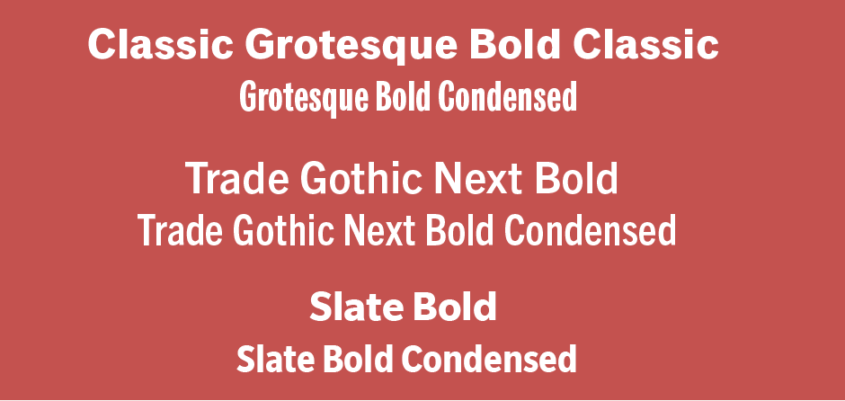
“The heft and weight of the compressed sans serif type conveys a gravitas that speaks to the breadth of this nuanced and expansive portrait of Hitchcock, as well as the phenomenal influence and legacy of this cultural icon. The exaggerated and quirky features of these semibold letterforms lend an authoritative yet warm tone to this biography. And by varying hierarchy, scale, and placement, the punchy typography frames the subject in a way that allows focus to remain on a defiant portrait of Hitchcock.”
“Tree House, has been a wonderful place to take chances,” says Arruda, “and this is top-down driven by Nate Lanier, Tree House’s CEO. While we have some standardized typographic treatments employed regularly, they’re never an absolute; if there’s a good reason to break from a convention, it’s wholly encouraged.
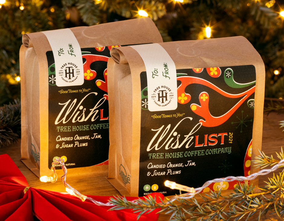
“An example of this was a project the team tackled for Tree House’s yearly Wish List release: a wintertime trio of companion beer, cold brew, and roast coffee releases.
“We wanted to channel the rich warmth of vintage holiday packaging, but also assure that the three releases, while completely different products, still felt cohesive as a group. In addition to festive shades of red, green, and cream, the typographic palette utilized an expressive calligraphic script, a friendly handprinted sans serif, a ‘Copperplate-esque’ glyphic design and a festive blackletter. What otherwise may have been a motley, cacophony of typefaces was tempered by using each in moderation, and knowing they brought contrast to the design – without overpowering it.”
Arruda and Ramirez provided us with savvy guidelines, rather than ephemeral trends. They point the way to powerful, expressive and ultimately successful typographic design. They may not be trends, but they’re smart guidelines to follow.
Ryan Arruda can be reached at: [email protected]
Jason Ramirez can be reached at: [email protected]
Tree House Illustrations courtesy of Jackie Saucier
Download a pdf version of the Type Trends: 2022 Q3 Trends by Ryan Arruda and Jason Ramirez.