Type Trends: 2023 Q1 Ryan Crouchman

From Simple Sans to Psychedelic Futurism
Variable fonts have graduated from a trend, to a full-on typographic staple. Scripts with a twist, American retro and a new wave of fonts that reject traditionalism are also part of what’s happening in type.
Meet Ryan Crouchman
To get a handle on the pulse of typographic trends, we reached out to Ryan Crouchman, Partner, Vice-President, and Executive Creative Director at LG2 – Canada’s largest independent creative agency.
Ryan was also a judge at Communication Arts magazine’s 13th annual Typography Competition. This is someone who knows type.
Consistent Trends & Something New
The first question we asked Ryan was: as a judge in the Communication Arts Typography Competition, did he see any typographic design trends that MyFonts customers should be aware of – or emerging typographic clichés they should avoid?
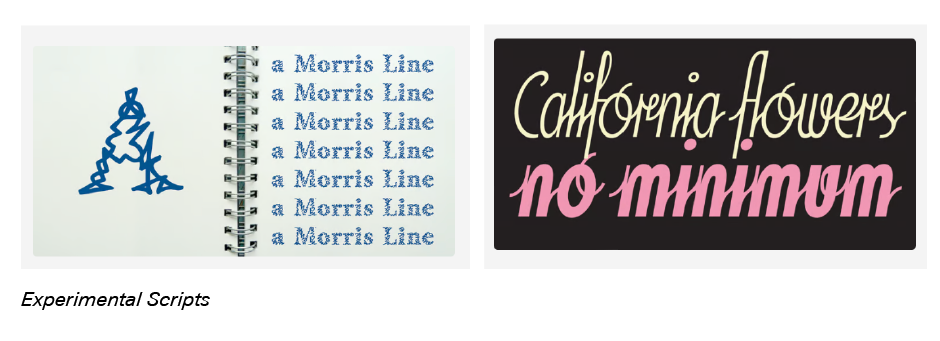
He replied that there were some definite trends that consistently showed up throughout the competition. “The usual suspects such as Swiss revivals, experimental scripts and nods to old-timey Americana,” Ryan explained, “all of which can be absolutely lovely when well crafted.” He also singled out something new. “One direction I’ve seen a lot of recently is ‘psychedelic futurism.’ It’s a style that embraces the organic spirit of art nouveau, mixed with the fluid experimentation of 1970s hippie culture. Lots of undulating, wavy letterforms, often manipulated or drawn by hand, used in very expressive ways.”

Avenir® Next, Helvetica® Now, Neue Haas Unica™, and Univers® Next all qualify as Swiss revivals.
If you’re looking for experimental scripts, MyFonts typefaces like A Morris Line, Soda Script™, and Bechamel™ might fit the bill. Although most successful experimental scripts are examples of hand lettering.

Brughler, Birthmont, and Dustland are distinct nods to old-timey Americana. While, Blowing Vesicle, Visualism, and HWT Arabesque™ are new designs that clearly pay homage to the 1970s hippie culture.


Simple, But Powerful Rebrand
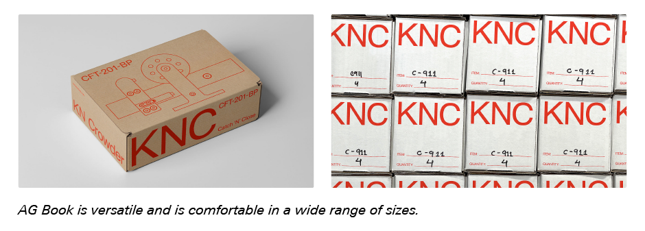
Ryan was quick to add that, sometimes, a very simple, traditional typeface is the correct choice. “We recently rebranded KN Crowder,” he explained. “It’s an established family-run business that has been designing and manufacturing high-end door hardware for over 70 years. The updated brand needed to appeal directly to interior designers and architects – and reflect the clean, timeless and well-crafted nature of their products.
“To capture this, we selected AG Book® (a Berthold design available from MyFonts) as the primary typeface. The streamlined geometry of this particular typeface works well at small sizes, to brand their products. It also offers, incredible impact when printed large on their packaging, making KN Crowder’s products highly visible on factory floors and at construction sites.”

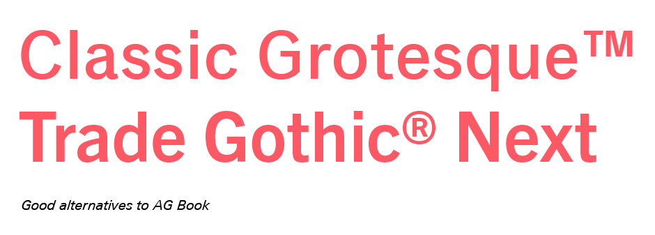
If you’re considering clean, timeless typeface family large enough to support the needs of virtually any branding project, you might also want to consider typeface designs like Classic Grotesque™, an early 20th century design, reimagined for current digital imaging, or Trade Gothic® Next, a mid-century sans redrawn for today’s branding needs.

We also asked Ryan what drives his personal choices for fonts and typographic design. While he told us that he sees each project as an opportunity to explore a new typographic approach, Ryan also has three, important factors that drive his methodology. “The choice of type depends on,” he said, “brand personality, communication needs and audience. As with all design disciplines, it’s about matching form with function in a well-crafted and interesting way. Sometimes a project requires a simple, hard-working typeface and not much more. Other times, something more expressive is needed to convey a unique point of view. It all comes down to what feels right and looks great.”
Variable Fonts Can Be The Perfect Choice
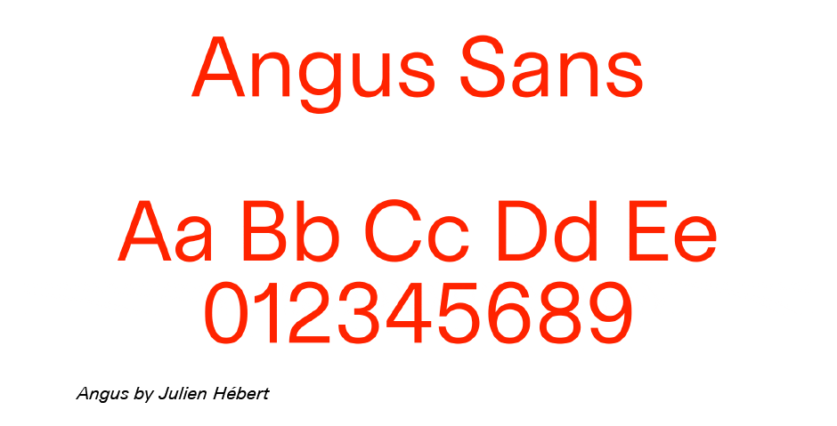
Ryan told us that he and his team recently launched an update to LG2’s visual identity – and that this included the development of a unique variable typeface. “Variable fonts give us the ability to easily apply motion as part of our identity,” he explained. “Designed by Canadian typographer and designer, Julien Hébert, the typeface is called ‘Angus,’ in honor of the neighborhood where our new Montreal headquarters are located.” Angus is an understated, yet sophisticated, design that references Canada’s strong modernist design legacy – and does this from a single font file.

When asked what he thought was driving current type trends, Ryan’s answer was, “There are too many cultural forces at play to provide a comprehensive answer. However, it’s safe to say that technological advances have always influenced trends in a very direct way. One example is the steady increase of data-driven, generative and dynamic typographic expressions, especially within the arts and culture space. Variable fonts are here to stay