TypeNotes magazine issue 3 on sale!
TypeNotes magazine issue 3 on sale!
Emily Gosling Inspiration
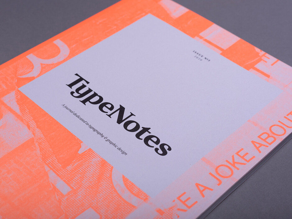
With the last issue of TypeNotes, we (in hindsight, rather hubristically) spoke of bucking the rule of the difficult second album. It turned out the third album—or in our case of course, issue—would be the one that would get sticky; but finally, here it is. TypeNotes #3 has been two years in the making—so expect something special. Three, after all, is the magic number.
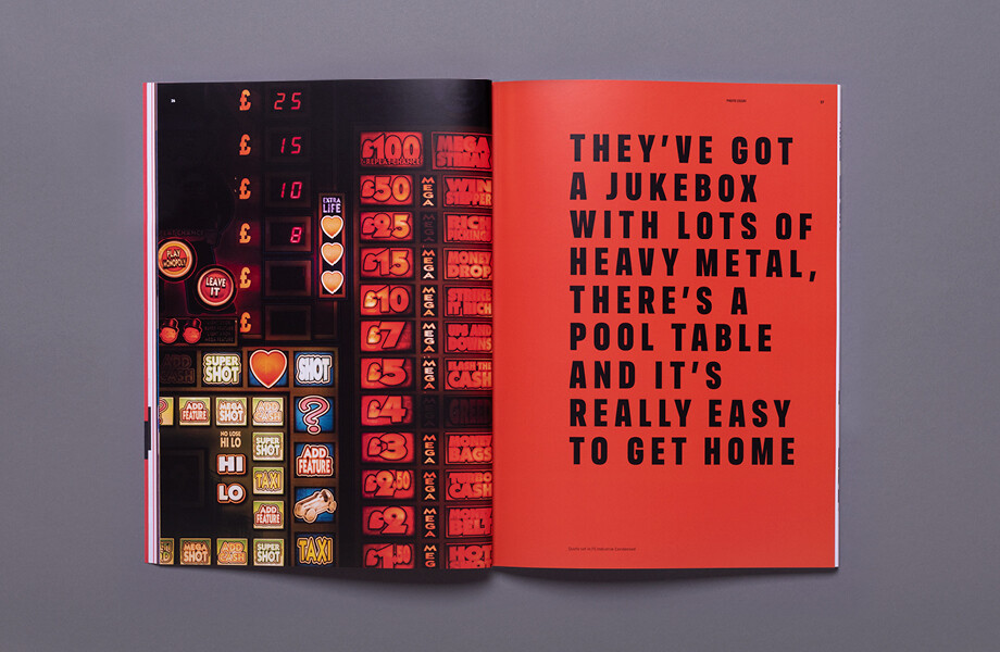
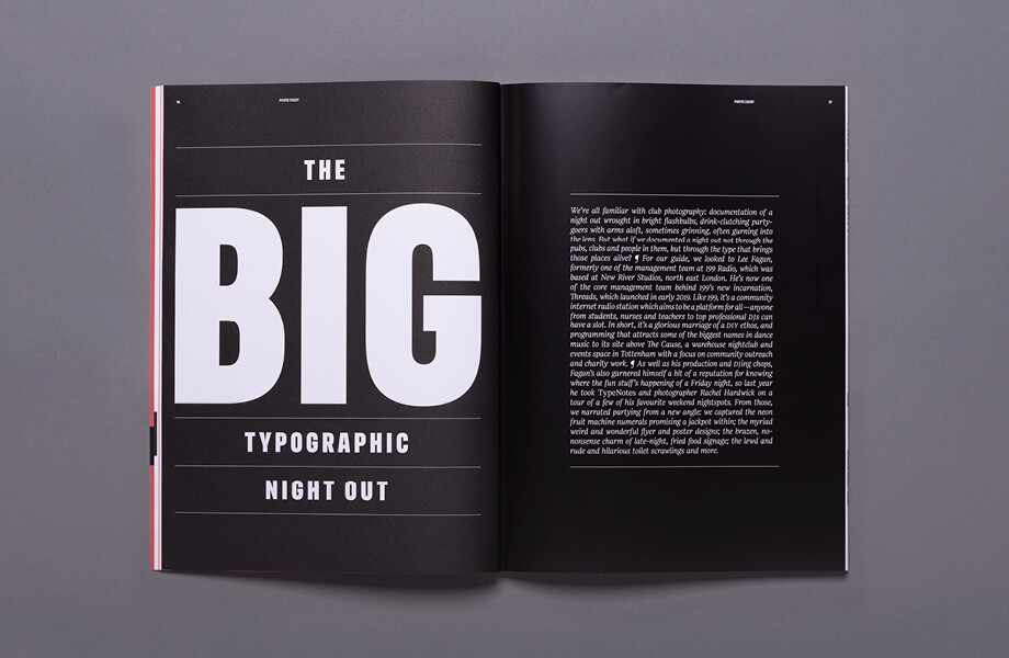
With this issue, as per its its two predecessors, we cater for everyone from the resolulelty typographically technical to the graphic design geek to the bystander with a passing interest in visual culture. In our 2019 outing, we even have something for those people who just like to have a really good time in the shape of a very different form of party photography: we devote an entire section to documenting a Friday night out in east London through the lens of its typographic touchpoints rather than gurning photo-bombers or sweaty dance floors.
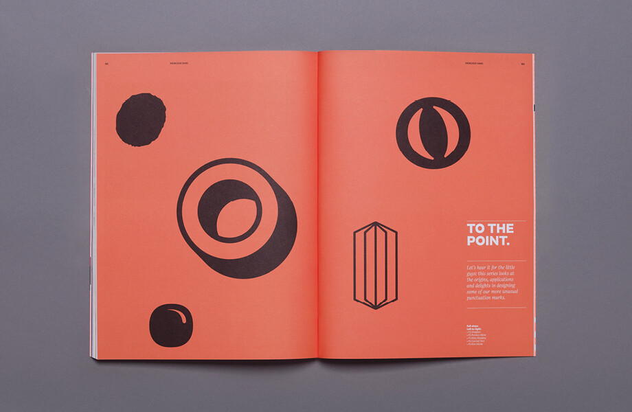
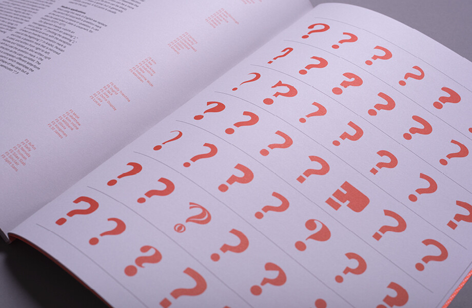
For the typophiles, expect our usual deep dive into the intricacies of designing punctuation marks; We also look at the crucial but oft-overlooked role of typography in contemporary and conceptual art, and discuss the importance and relevance of St Bride Foundation in preserving typographic ephemera and bringing together like-minded typographers, designers, illustrators and general letter-nuts.
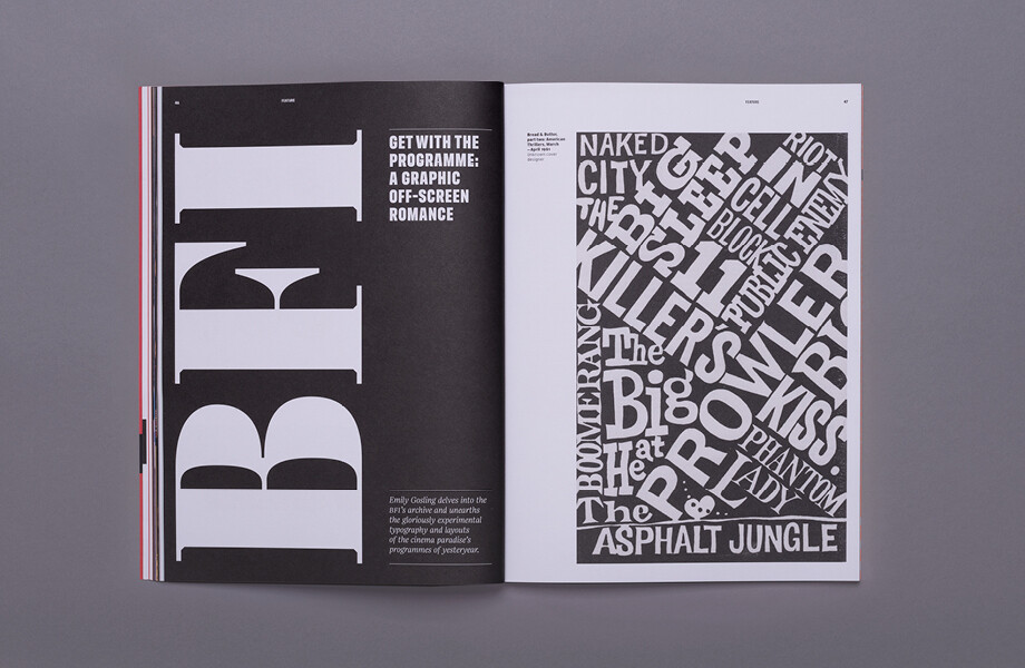
This mixture of the serious and the playful is summarised neatly in a couple of pieces—one which looks at the “after hours” preoccupations of a few creative professionals (expect everything from swimming to chilli sauce) and a never-before-seen delve into the British Film Institute’s stunning archive of programmes that date from the 1950s to the present day. These offer a fascinating exploration of not only what people wanted to see on the silver screen but how they found out about them, with the type used on such pieces of printed matter offering beautiful clues into the moods and graphic trends of the past seven decades.
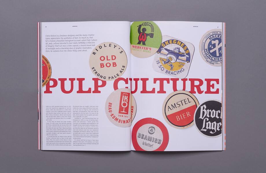
As ever, it’s been a joyful process to delve into the possibilities of TypeNotes as a printed publication to explore what typography means to us all; whether you work in the industry or just happen to find yourself in a particularly typographically interesting samosa shop, somewhere in Dalston at some unspecified point of a weekend. Hopefully you, our readers, will enjoy celebrating lettering and all its multifarious manifestations as much as we did, as well as joining us in celebrating type-heroes both sung and unsung who’ve been kind enough to let us and our photographers into their studios, sketchbooks, beer mat collections and practices.
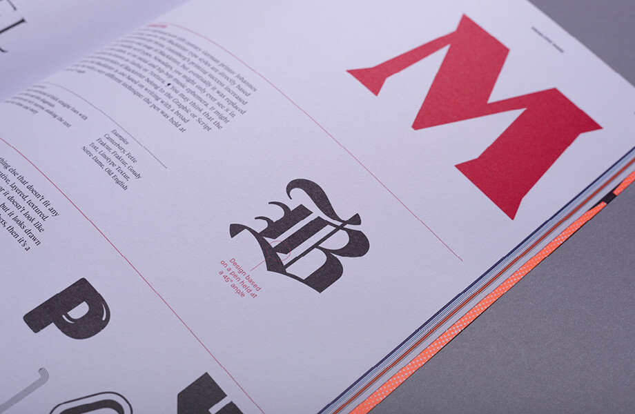
We’re proud to be the only magazine to discuss one man in Minnesota’s garage-based gallery-turned-global-typographic-sensation alongside intricate guidance on the correct typesetting of symbols; why Futura is the feminist font of the art world thanks to the likes of Barbara Kruger and Gorilla Girls; the beauty of audio interface fonts and a hell of a lot more besides.
