Futura Now & Albertus Nova Font Pairing

Majestic Capitals
Another retro-chic trend, but this time to the low-resolution, pixelated blockiness of the 80s and 90s digital revolution. Retrofuturism, if you will. This can easily reflect a high-tech or industrial look. Typefaces like FS Pele are lighthearted while maintaining maximum boldness. Pair it with a legible square sans like Kairos Sans to fulfil body copy and subhead responsibilities.
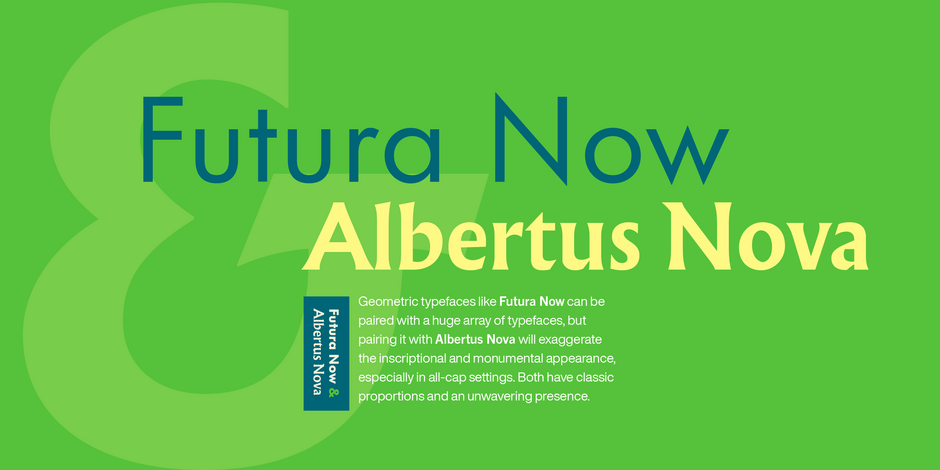
Futura Now’s contemporary alignment of names and weights makes the family easier to understand and use, and its comfortable Text and judicious Headline subfamilies provide instantly refined spacing.
The Albertus Nova typeface takes the best of the original Albertus design - sharp, flaring serifs modeled on letters chiseled in bronze - and expands the original character set.