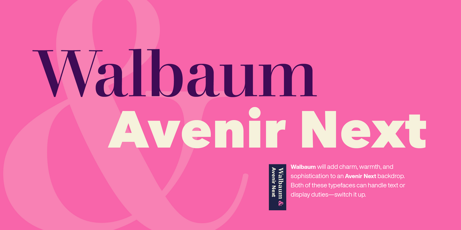
Walbaum & Avenir Next Font Pairing

Friendly Business
Avenir Next is a new take on a classic face—it’s the result of a project whose goal was to take a beautifully designed sans and update it so that its technical standards surpass the status quo, leaving us with a truly superior sans family. Overall, the family’s design is clean, straightforward and works brilliantly for blocks of copy and headlines alike.
Walbaum’s text weights work well for the demands of digital environments, while decorative and display weights offer more dramatic, sculptural forms. Unusually, the family also includes a generous range of ornaments. From massive billboards, to micro-type on e-readers, Walbaum has it covered.