Resistenza

Resistenza is the first italo-spanish type foundry based in Valencia, Spain and Torino, Italy, founded in 2008 with over 100 font families. Specialised in calligraphic, display and handwritten fonts.
Popular Resistenza fonts.
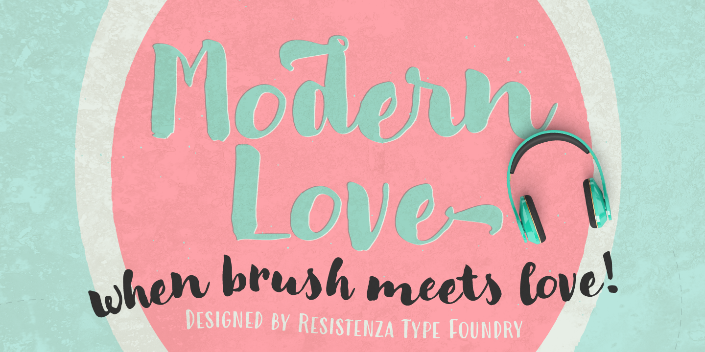
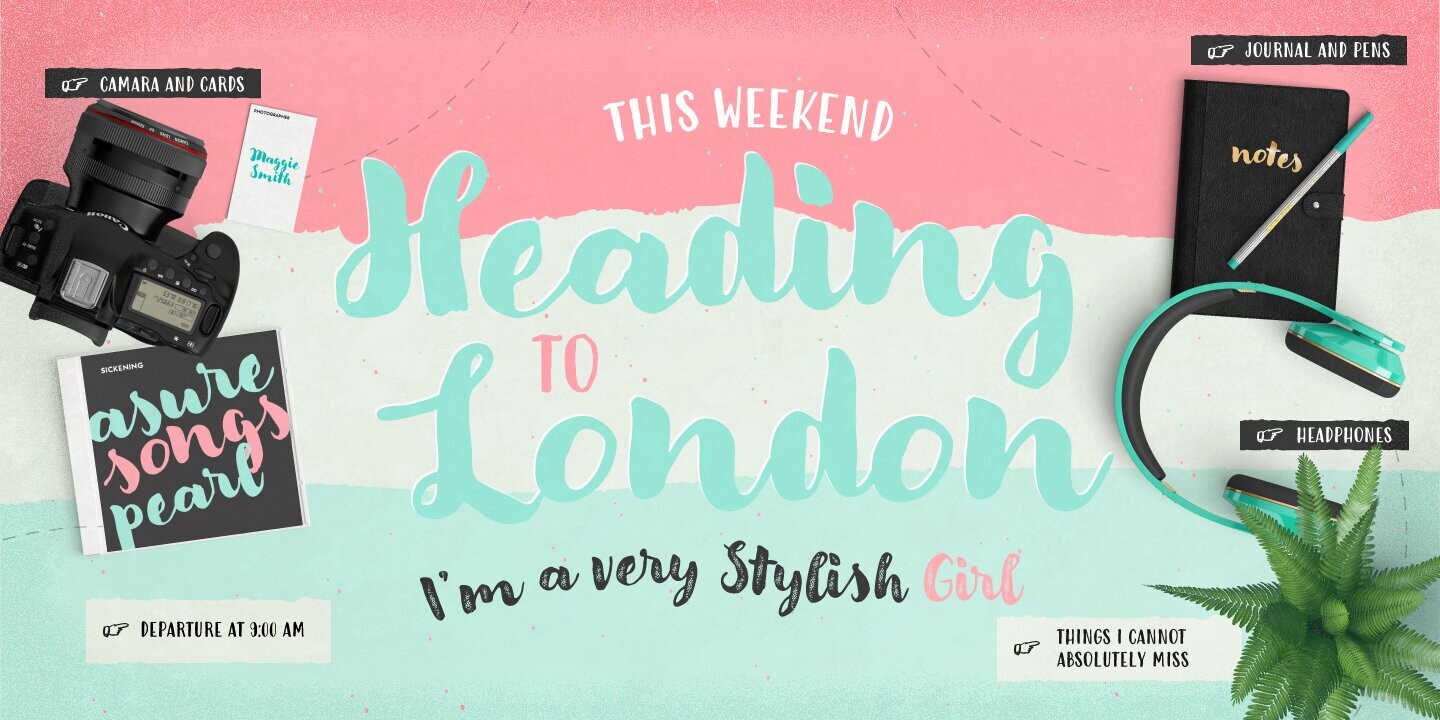
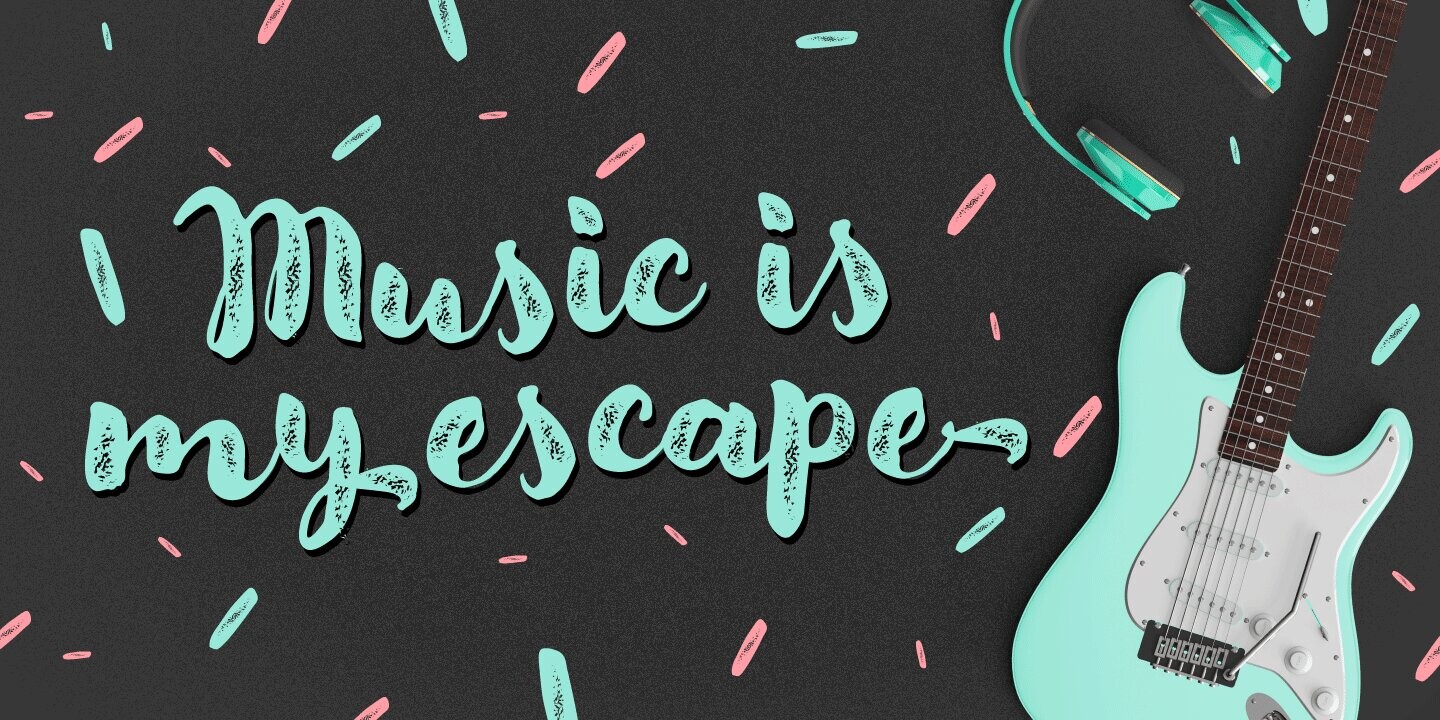
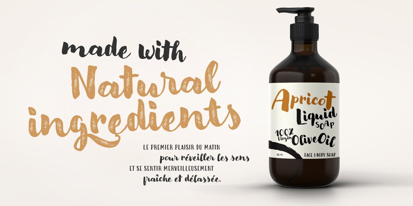
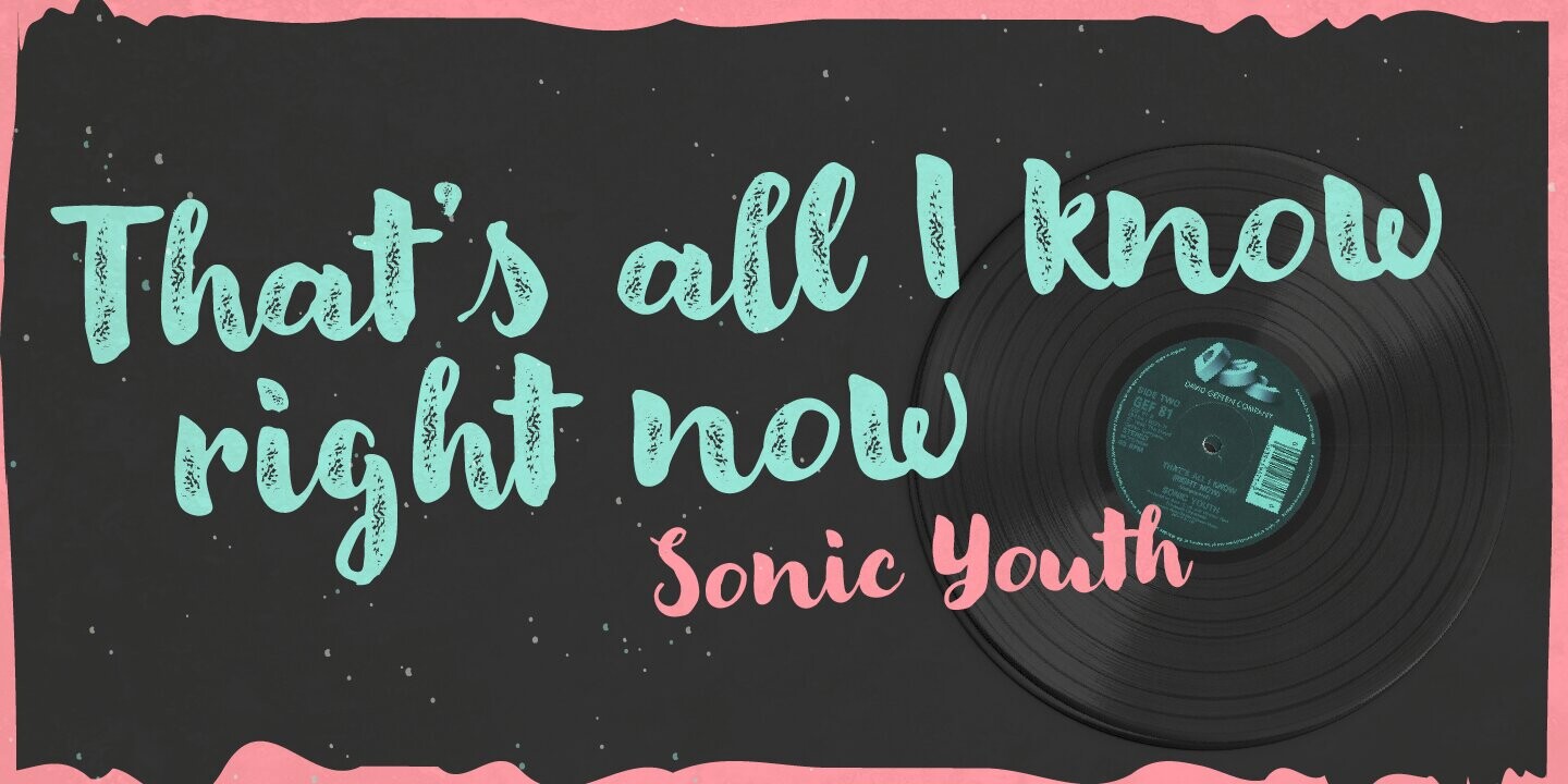
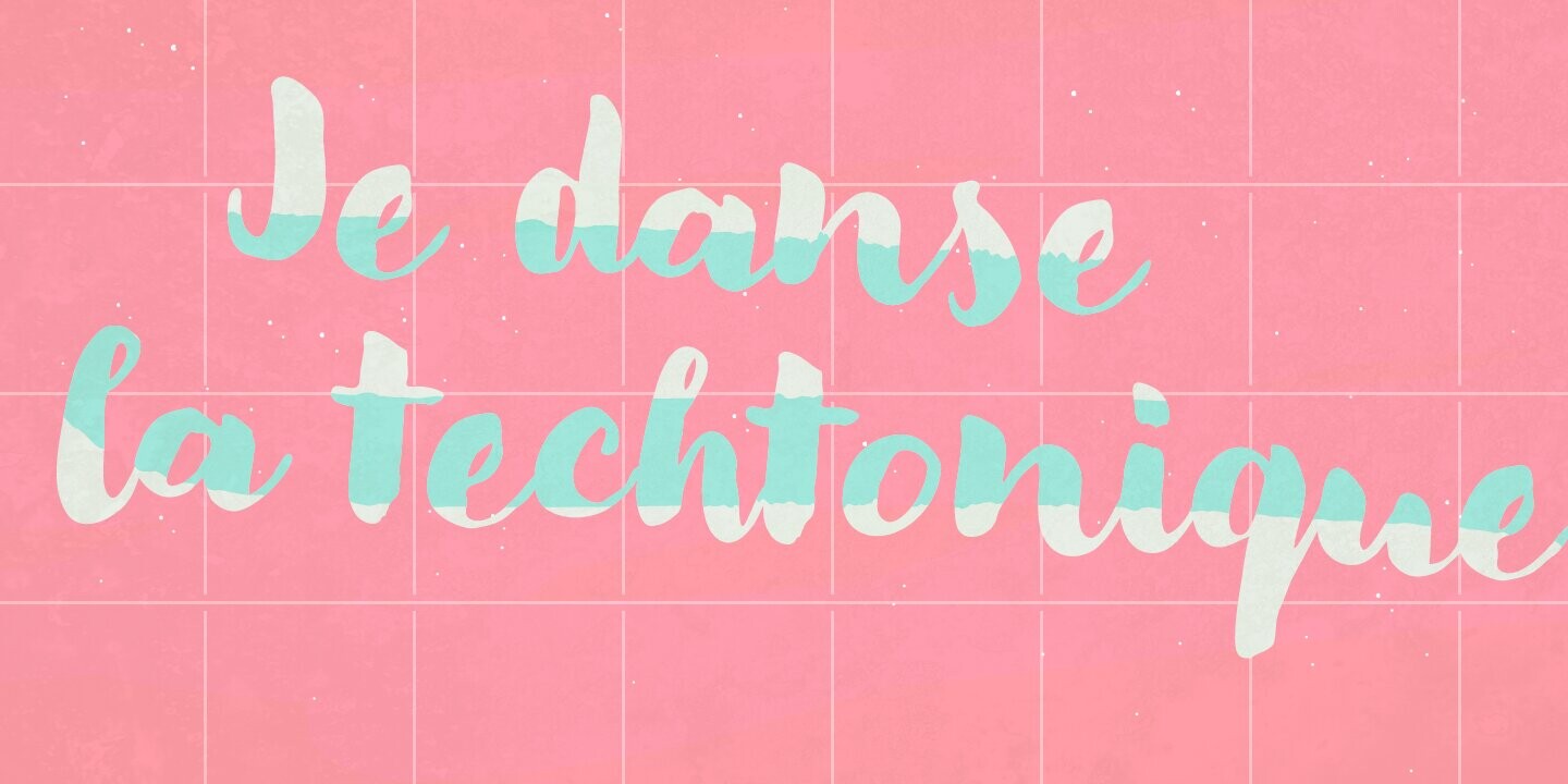
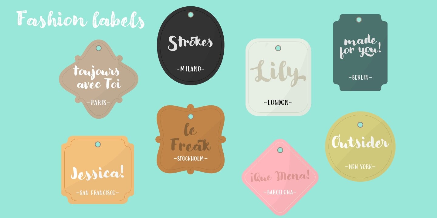
Breaking from our catalog of typefaces to create a new handwritten font family, Modern Love was born out of our desire to see what would happen if we took a step back from the norm. We weren’t looking for the perfection of the many calligraphy techniques, but more of a natural way of writing with the same tools. Our escapist experiment into casual lettering culminated into 4 fonts: Modern Love Regular, Grunge, Rough and Caps.
Modern Love Regular is a hand-painted script, each glyph individually designed with a pointed brush and walnut ink. The aim was to create an effortless hand-drawn feel while keeping the contrast high density.
We recommend to combine ModernLove with: Auster, Annuario, Pesto Fresco
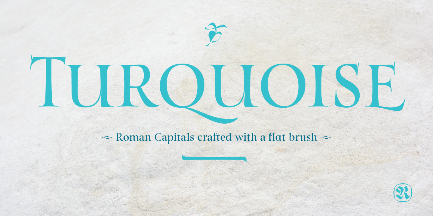
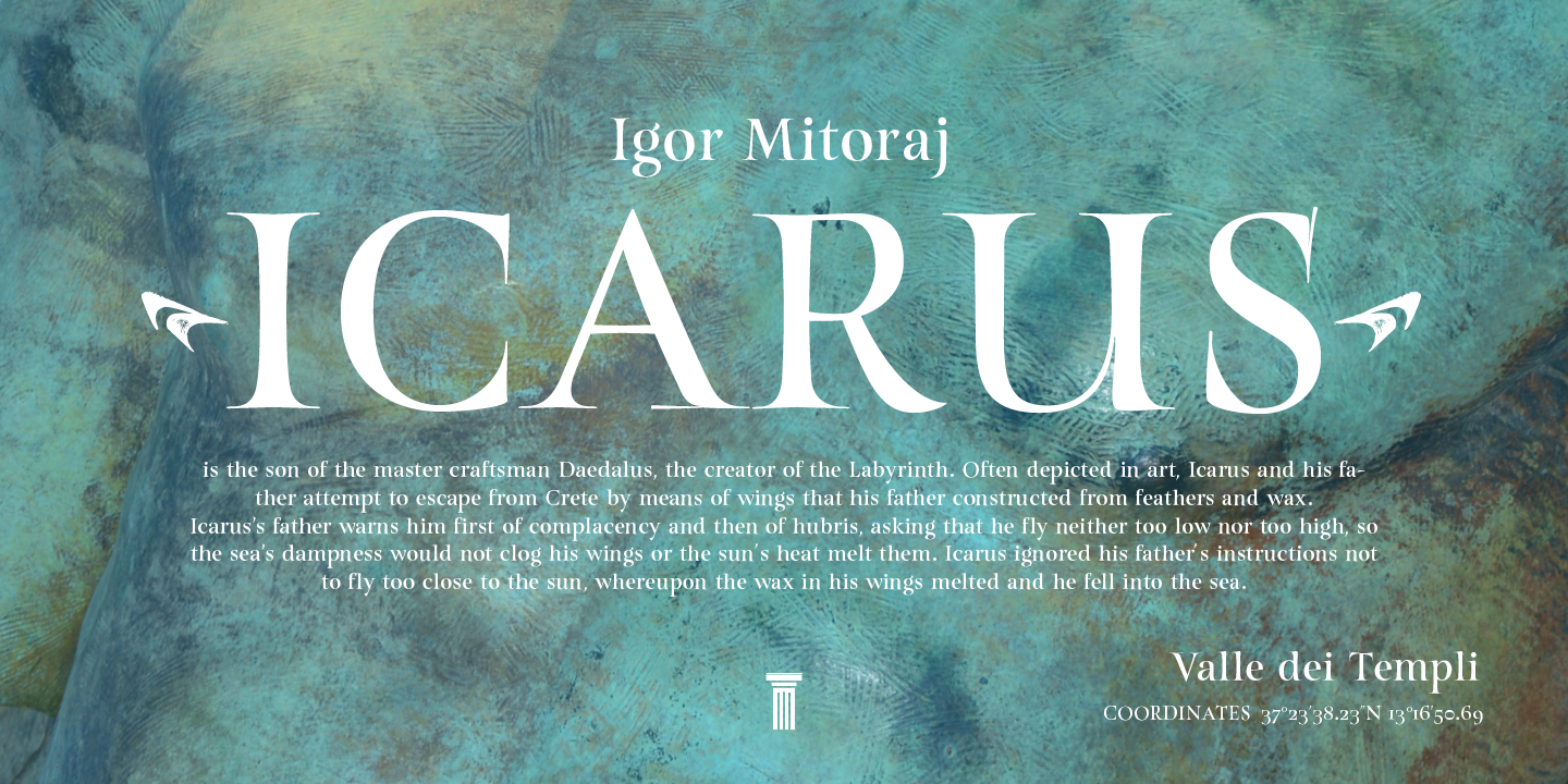
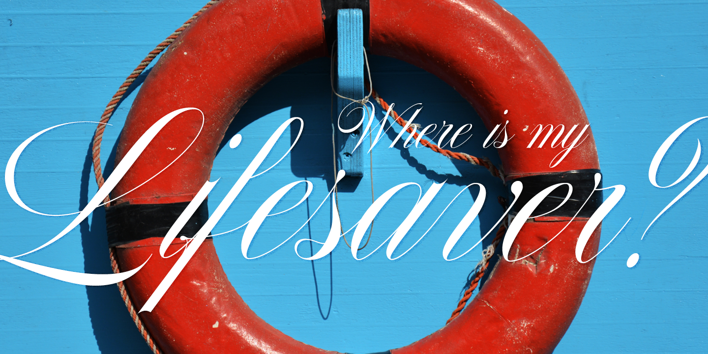
Turquoise typeface based on my Capitalis Romana practice with a flexible broad edged brush and gouache. During the lowercase process I was still following Foundational calligraphy with a flat brush. My Turquoise Capitals were then adjusted and redesigned at the Tipobrda calligraphy workshop in Slovenia.
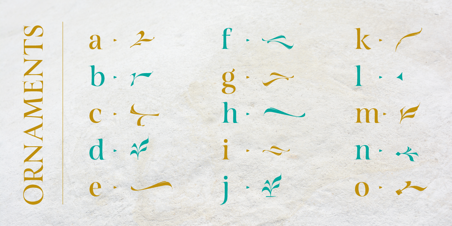
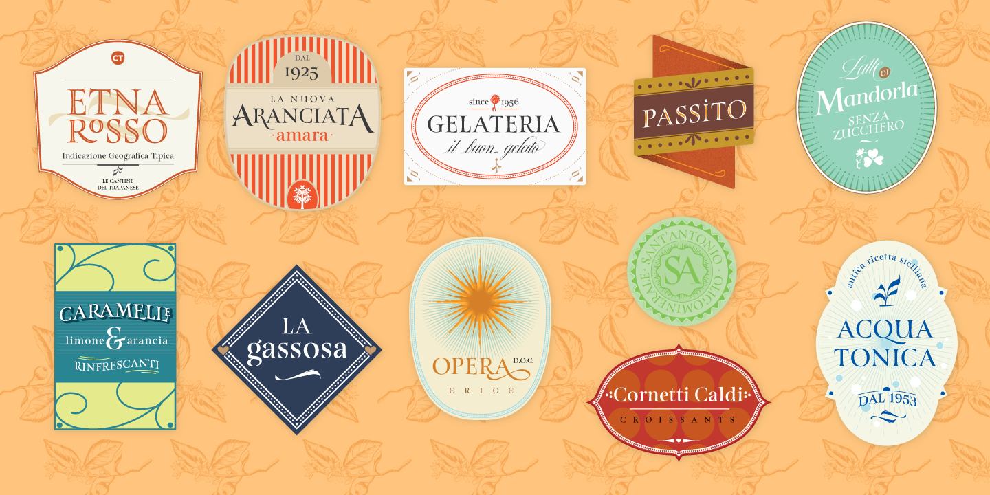
Turquoise contains small caps, many discretionary ligatures, ornaments, swashes as well as several brushy nature-inspired ornaments, accessible via OpenType. Ideally suited for headlines or body text in advertising, packaging and visual identities, its delicate shapes, curves and endings give projects a harmonious elegance and stylistic feel in unique Turquoise style.
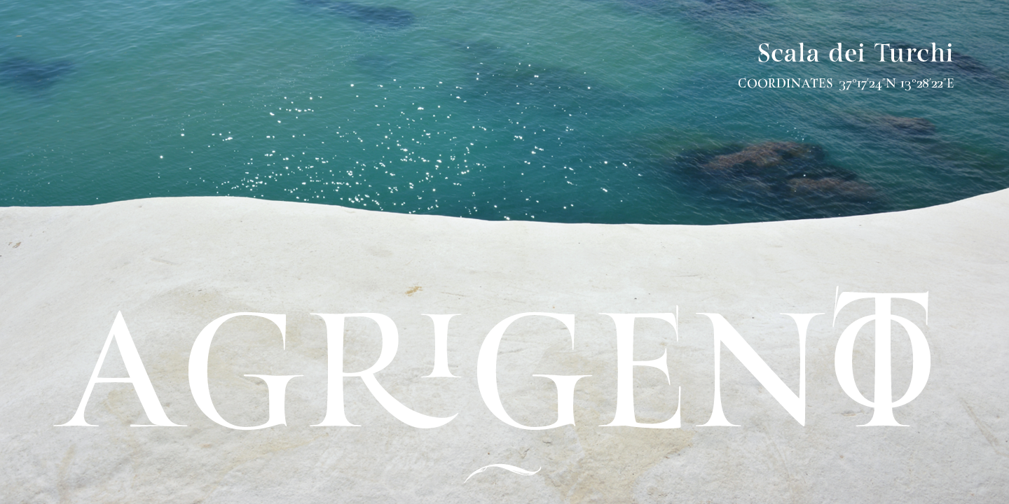
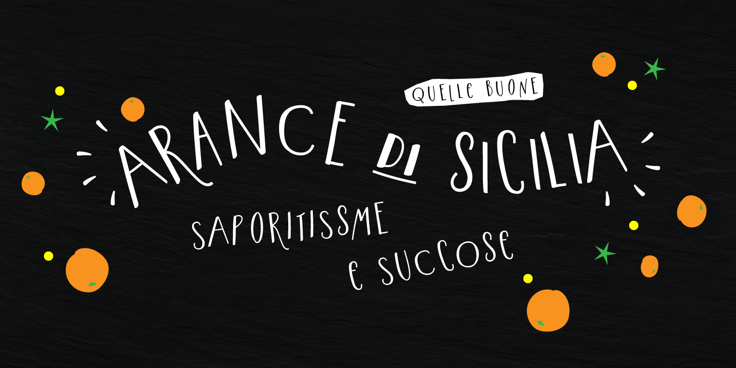
My inspiration for this font showcase is one of the richest islands in the Mediterranean, the place where my parents are from, Sicily. This southern Italian region has so many unique spots: Stromboli, part of the Aeolian Islands, and the Pelagie Islands is one of my favorite places in Sicily. The pictures I used were taken there this year.
We recommend to combine Turquoise with: Nautica, Nautica Lines, Nautica Sottile
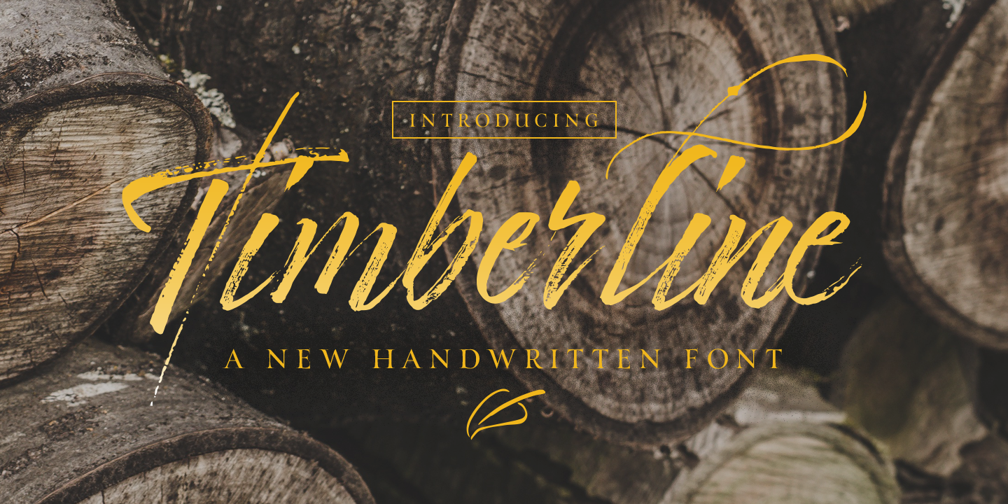
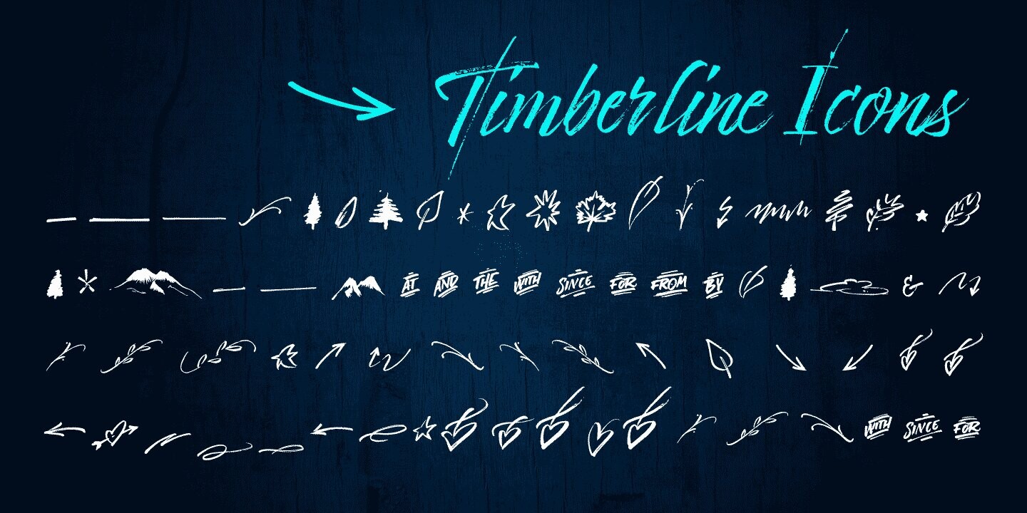
A new handwritten font full of character with textured lines and graceful strokes. A casual handwritten script to get the perfect look you need for your design. Timberline Icons is the perfect match to this font. A collection of catchwords, ornaments, swashes and doodles to customise your layout.
It includes opentype features - stylistic alternates and an extended set of Ligatures to add to the realistic nature of calligraphy.
We recommend to combine Timberline with: PestoFresco, Turquoise, Norman
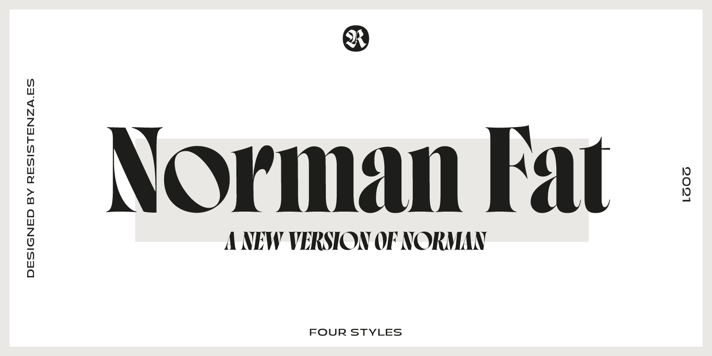
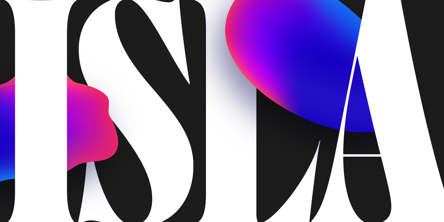
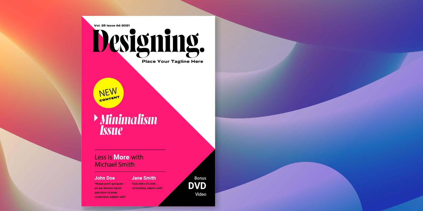
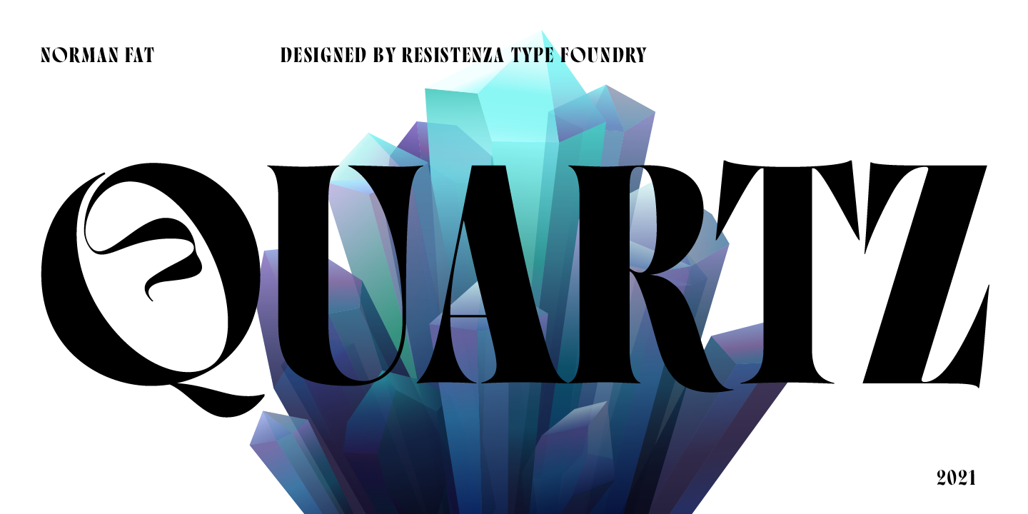
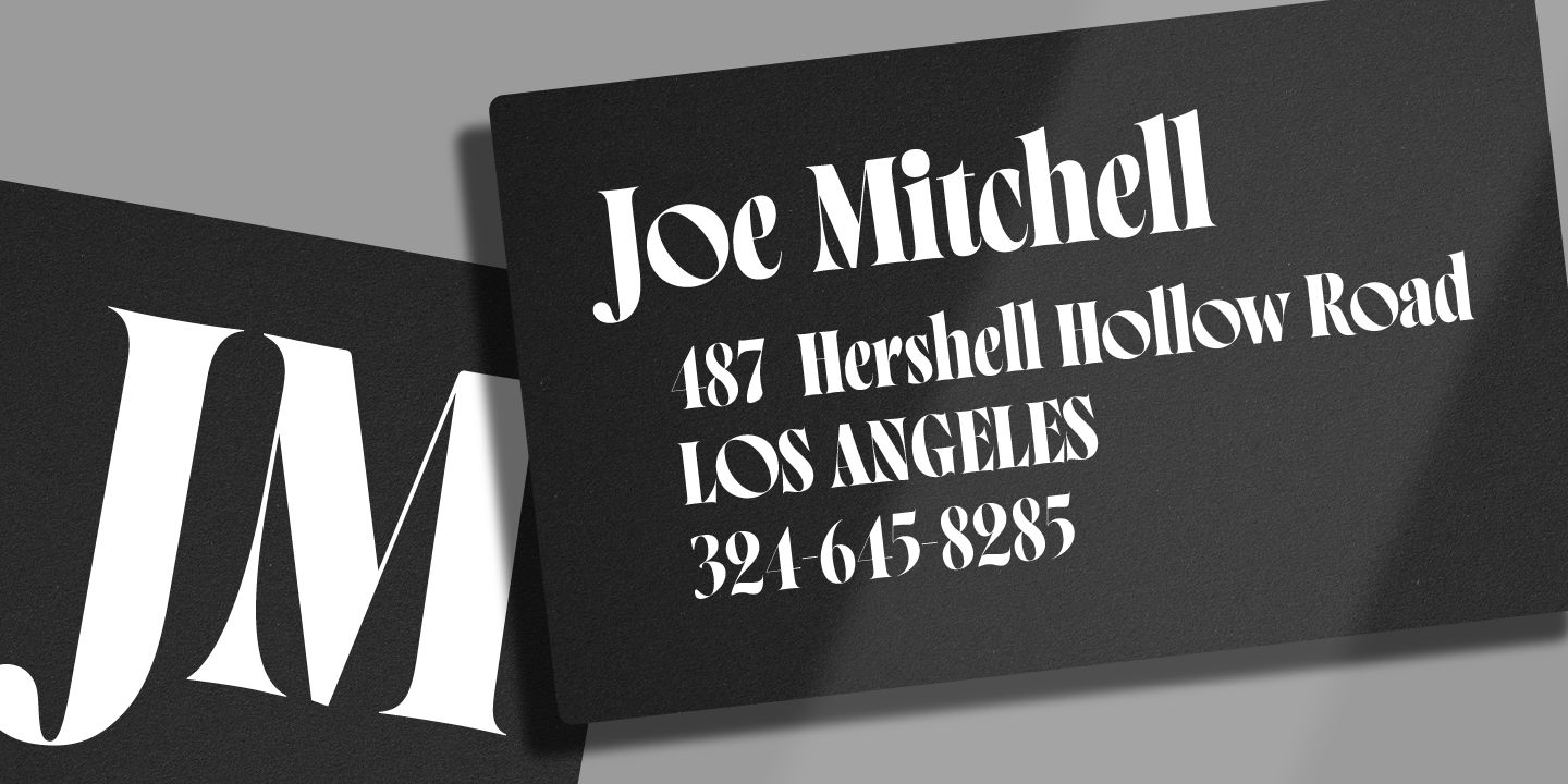
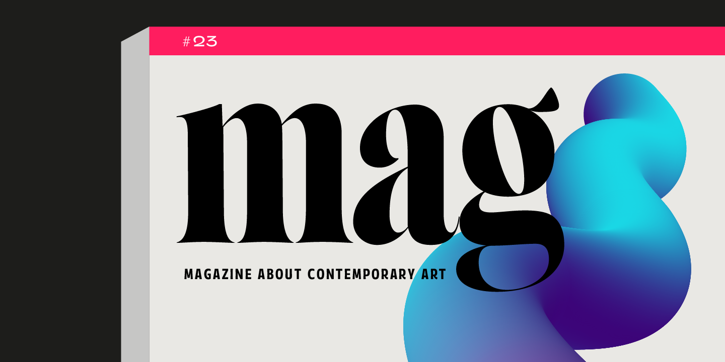
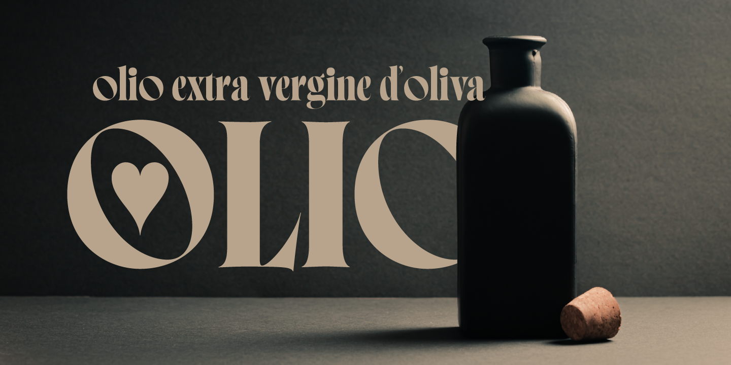
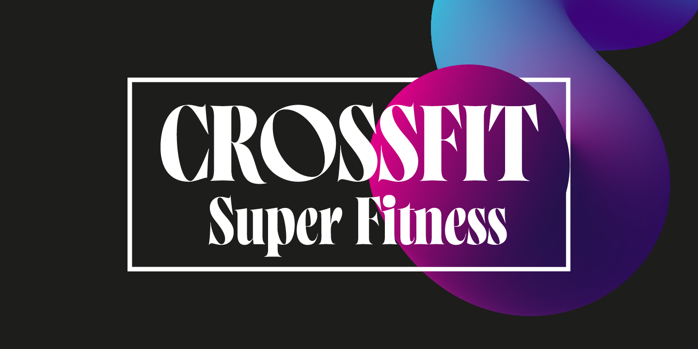
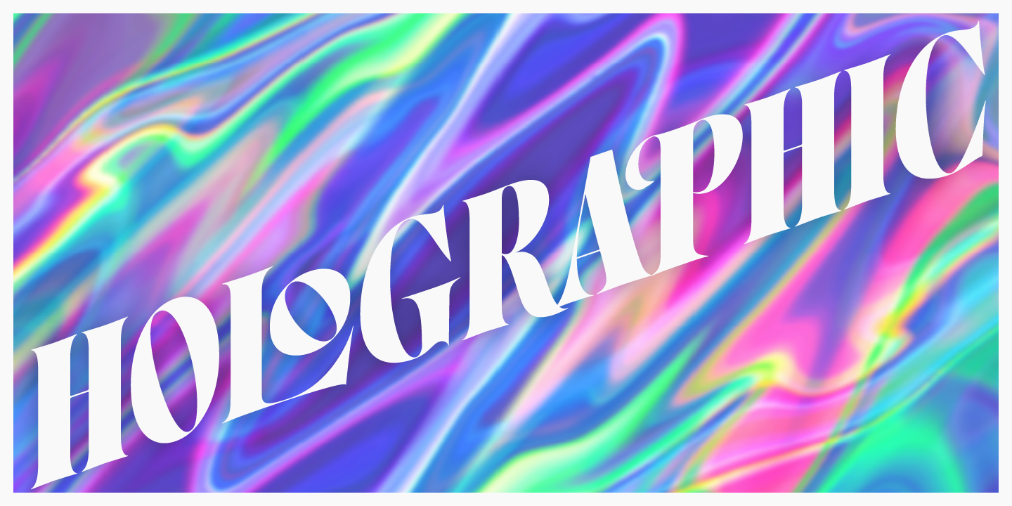
Get to know Norman Fat a new version of our best seller Norman, elegant and fashion forward. This new condensed high contrast and heavy weight serif font is based on expansion giving a sense of self confidence. The oblique ax was specially added to get a contemporary and innovative sense.
Norman Fat is young and idealist, he has a distinctive sense of style. A complete set of ligatures and stylistic alternates is included, this will help the designer to customize and give a special look to any layout.
We recommend to use it for big title, magazine, editorial purposes and display.
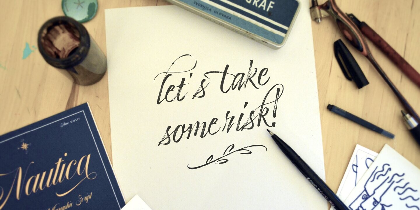
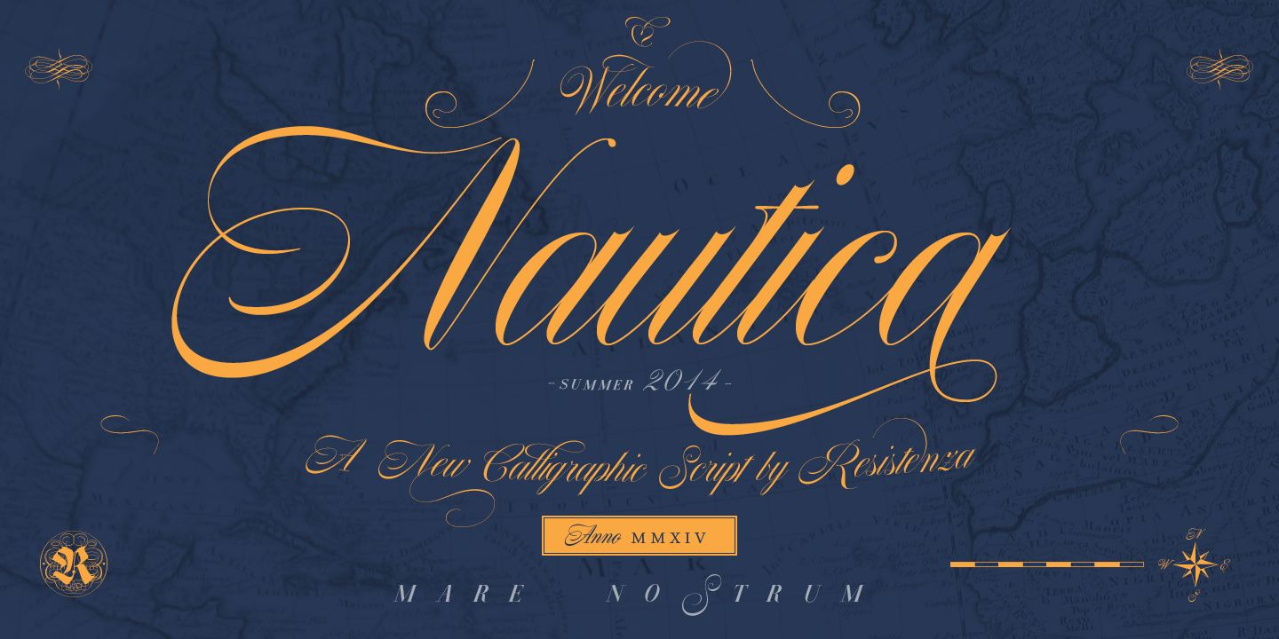
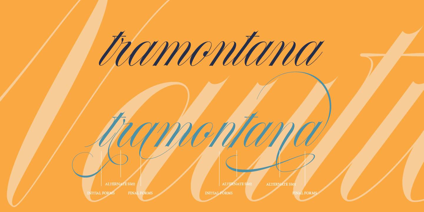
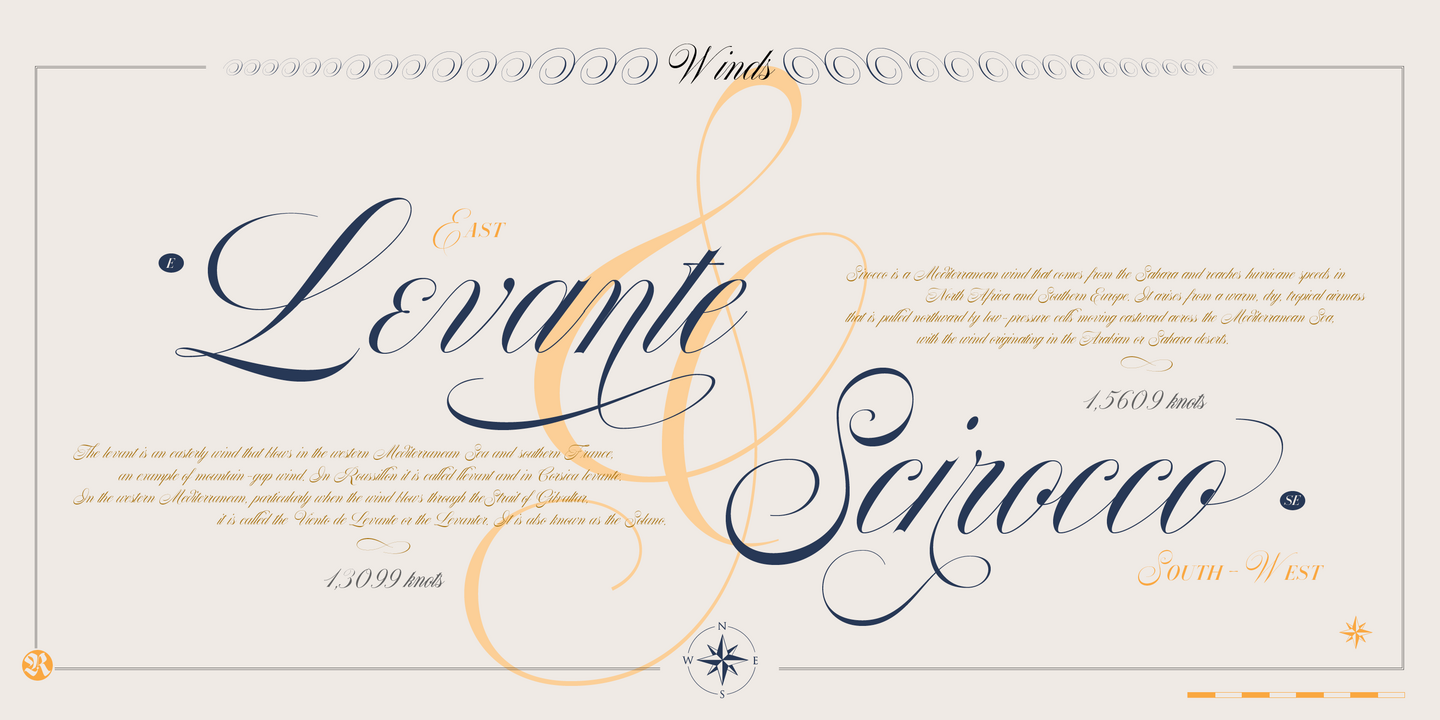
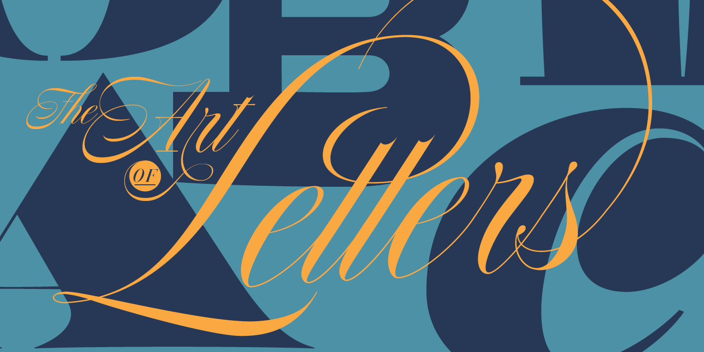
Nautica is a new script typeface based on Copperplate’s ductus. High in contrast, it is a very original type with a strong character.
With over 1000 glyphs and extensive language support, Nautica offers full professional typographic features.
Ligatures and swashes are more inspired by brush pen strokes. Nautica provides three weights and one set of useful icons and knots to improve your graphics.
We recommend to combine Norman with:Nautica, Auster, Norman, Nautica Lines
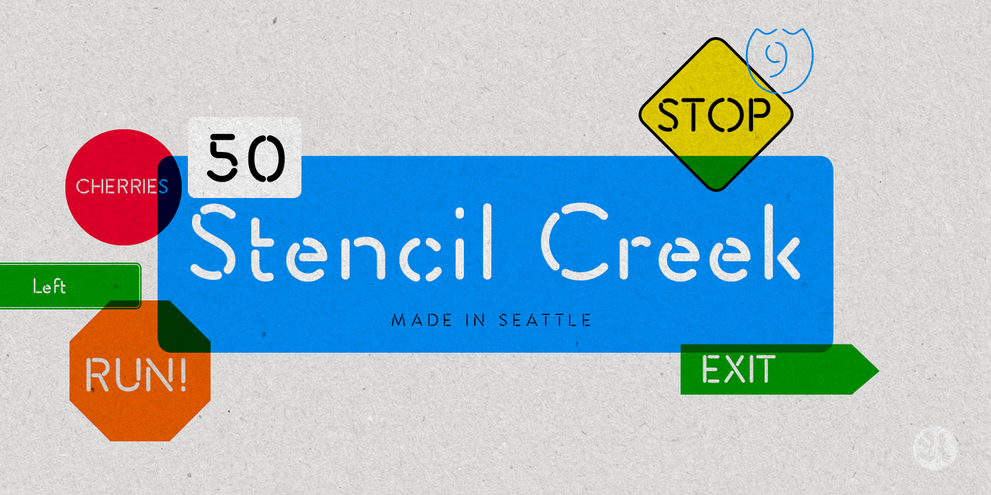
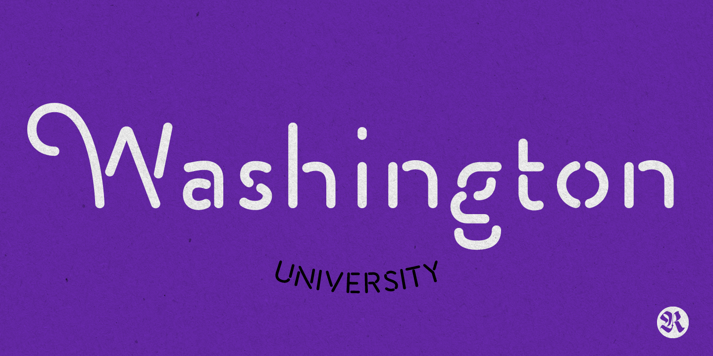
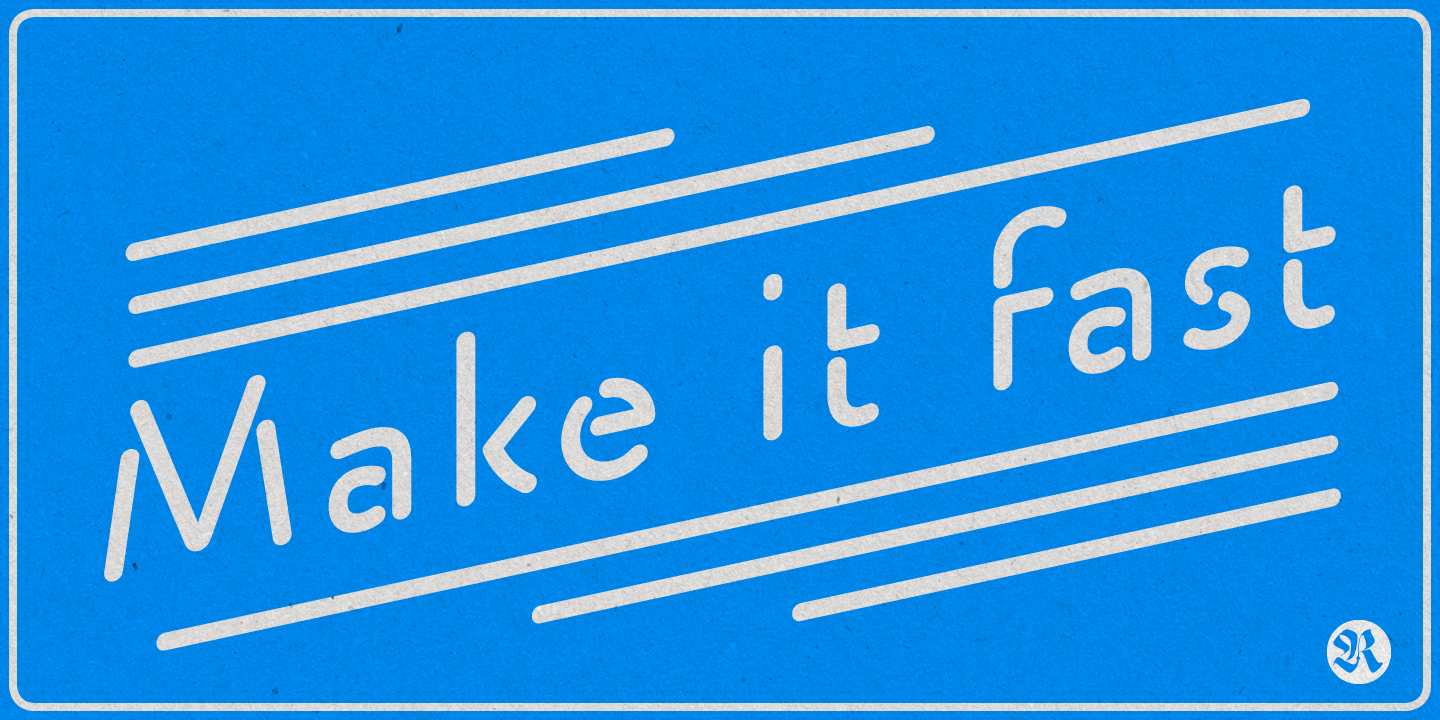
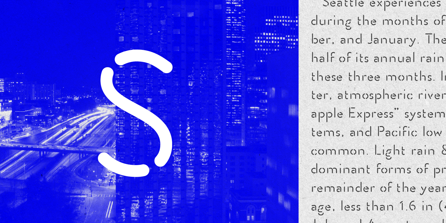
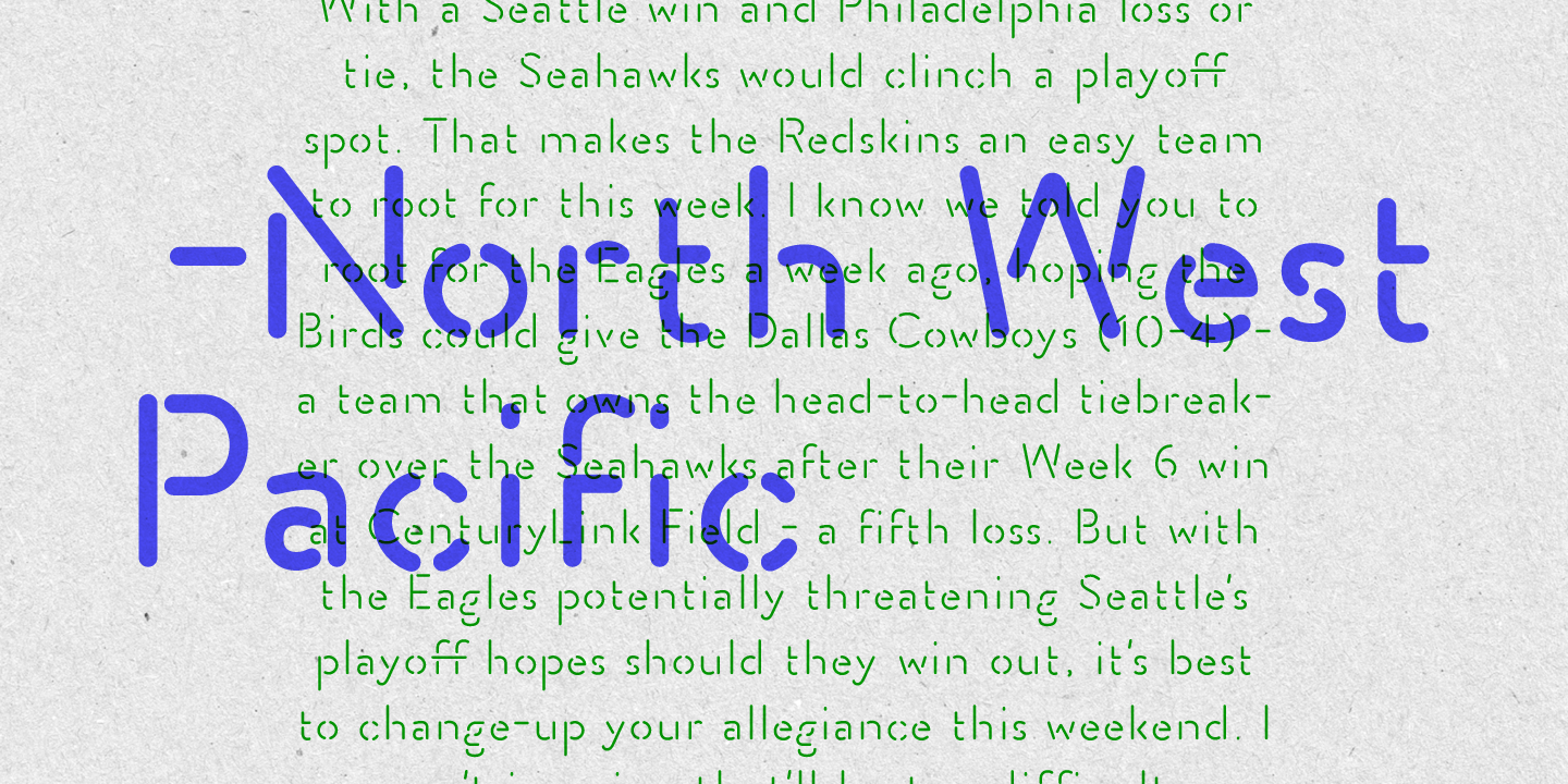
Stencil Creek font family is a rounded stencil typeface that comes in eight weights and two rough versions.
It is inspired by classic sans serifs and influenced by street signs of the North West Pacific.You can also overlap some of the weights and get an extra inline font.
Stencil Creek is a legible typeface family designed for contemporary typography, especially for use in headlines, but also for reading purposes, includes extensive language support and many more OpenType features.
This font contains, different swashes and alternates.
We recommend to combine Stencil Creek with:Turquoise, Nautica Lines
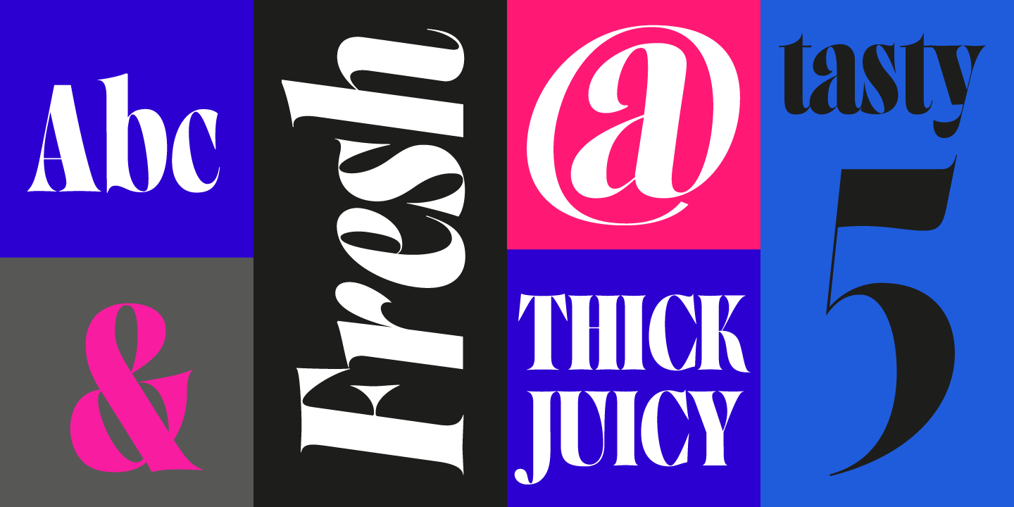
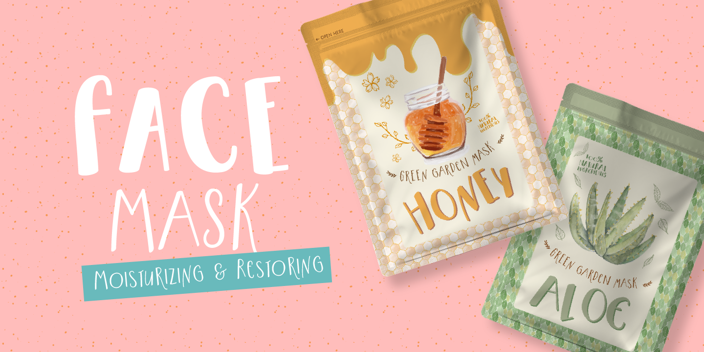
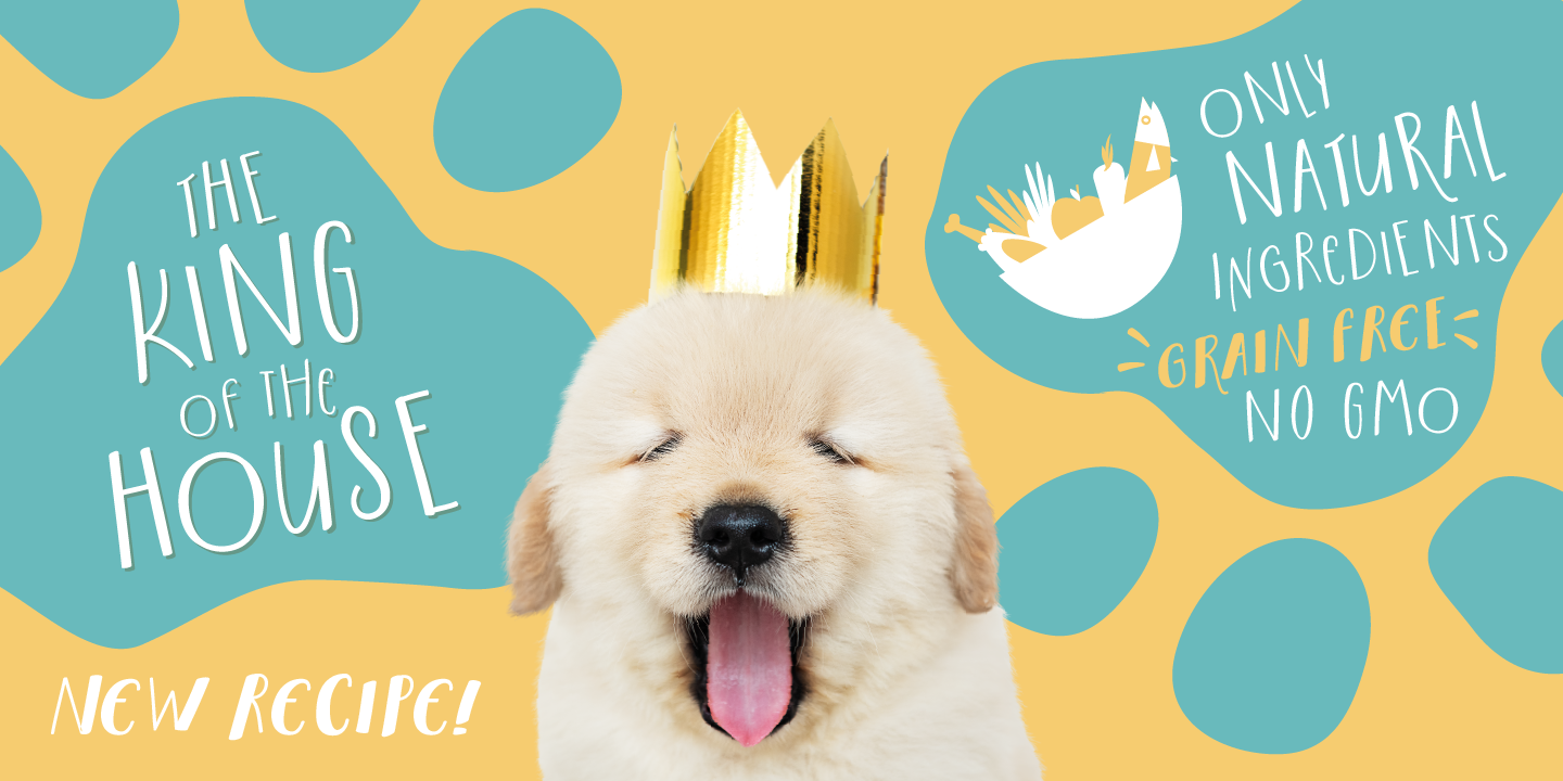
Fresh is best! Say hello to this playful and bouncing font designed by Resistenza. This all-caps have been specially created to add a lively mood to your graphics. You’ll be able to create catchy quotes combining these all-caps fonts or you can use them individually.
Including 2 sets of letters on each font (uppercase & lowercase), so you can choose an alternate for each glyph just using your keyboard or the opentype glyphs panel on Indesign, illustrator and other apps with opentype features.
Have fun with this friendly font family and give a whimsical touch to your projects. Perfect to create headlines, posters, DIY hand-lettered artwork, books, holiday cards, wrapping paper, invitations, T-shirts, labels, packaging, fashion supplies, food products, artisanal goods, and an endless array of options.
We recommend to combine Hello Fresh with: Turquoise, Nautica Lines
Fonts in use.
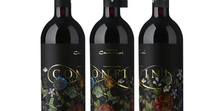
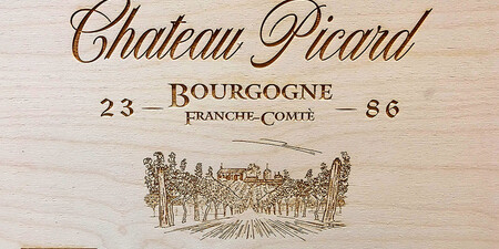


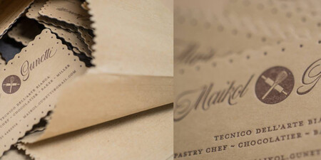
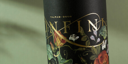
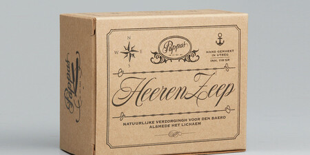


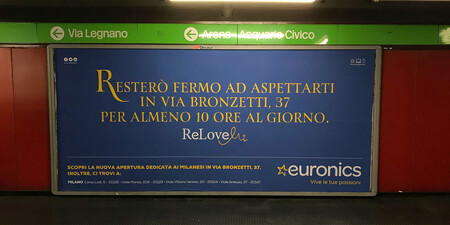
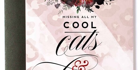

Resistenza specializes in type-design, branding, calligraphy & lettering. Giuseppe Salerno and Paco González are the two founders, italian and spanish, their passion for writing and handcrafted lettering became their strengths. Brushy types, calligraphic strokes, originality in faces are their best distinguished characteristic. The first type was Afrobeat, a multiline circular type that grows up very fast and became their first product on the list. But afterwards many other experiments and more expressive designs like Berliner Fraktur, or an english copperplate like Copperlove bring Giuseppe Salerno’s hand into a typeface.

Co-Founder
Paco Gonzalez
Paco González is a Spanish graphic designer from Valencia. His background varies from working in the travel industry and marketing to graphic design. He develops visual identities and typographic projects. His typographic work is focused on handwritten typefaces, scripts and illustrative icons, dingbats and little sketches.

Co-Founder
Guiseppe Salerno
Giuseppe Salerno mixes his calligraphic skills with his type knowledge, he has been in the creative field for 14 years passing through Berlin, Madrid, Valencia, Seattle to work for clients all over the globe. Together with Paco González they founded Resistenza.es studio. Brushy types, calligraphic strokes, orginality in the typefaces are their most distinguished style characteristic. They create typefaces to improve their graphic design projects and they practice calligraphy as a basic method for the script typefaces.
