Fonts from DSType.

DSType is an independent type foundry, founded in 1994. Since then we had the opportunity to work with some of the world’s most recognised companies, brands and publications, while creating an extensive and comprehensive catalogue of high quality typefaces.
Popular DSType fonts.
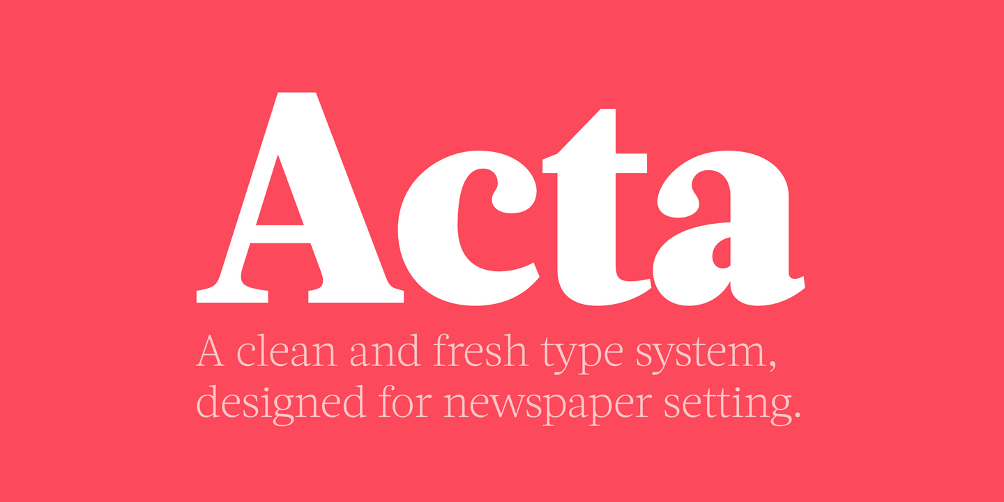
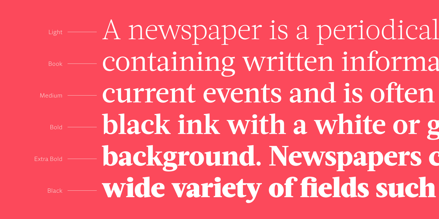
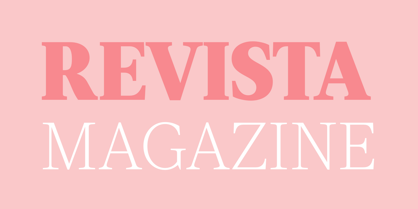
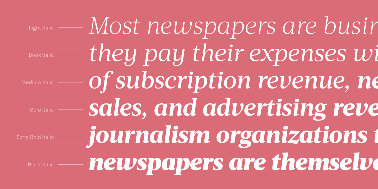
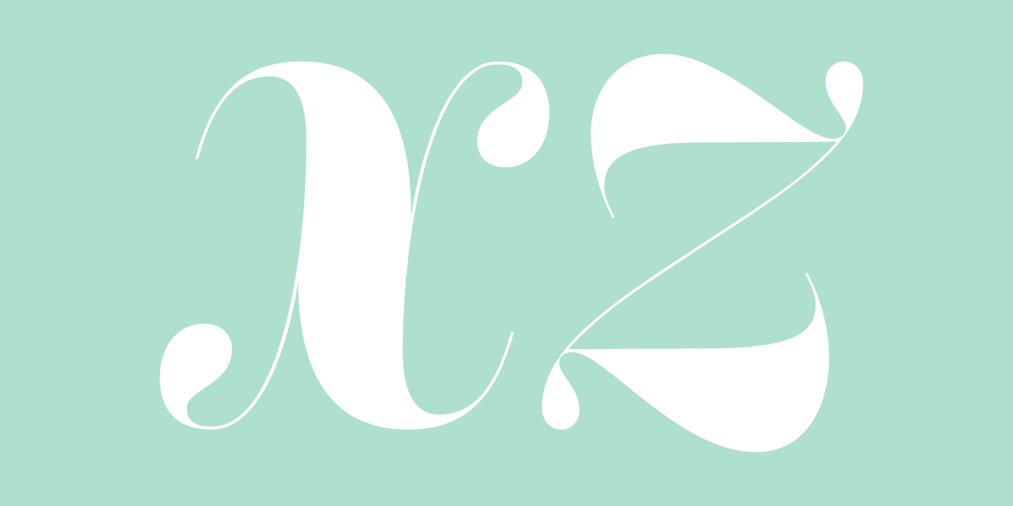
First designed for chilean newspaper La Tercera in 2010, Acta family is a clean and fresh type system, while enough conservative for newspaper setting. The complete Acta Type System contains Acta, Acta Deck, Acta Headline and Acta Display both with six weights with matching italics; Acta Symbols with an amazing collection of symbols specially designed for newspapers and magazines and Acta Poster, a heavyweight version, elegant and eye catching in three styles with plenty of ligatures and alternates.
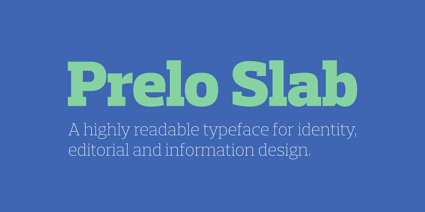
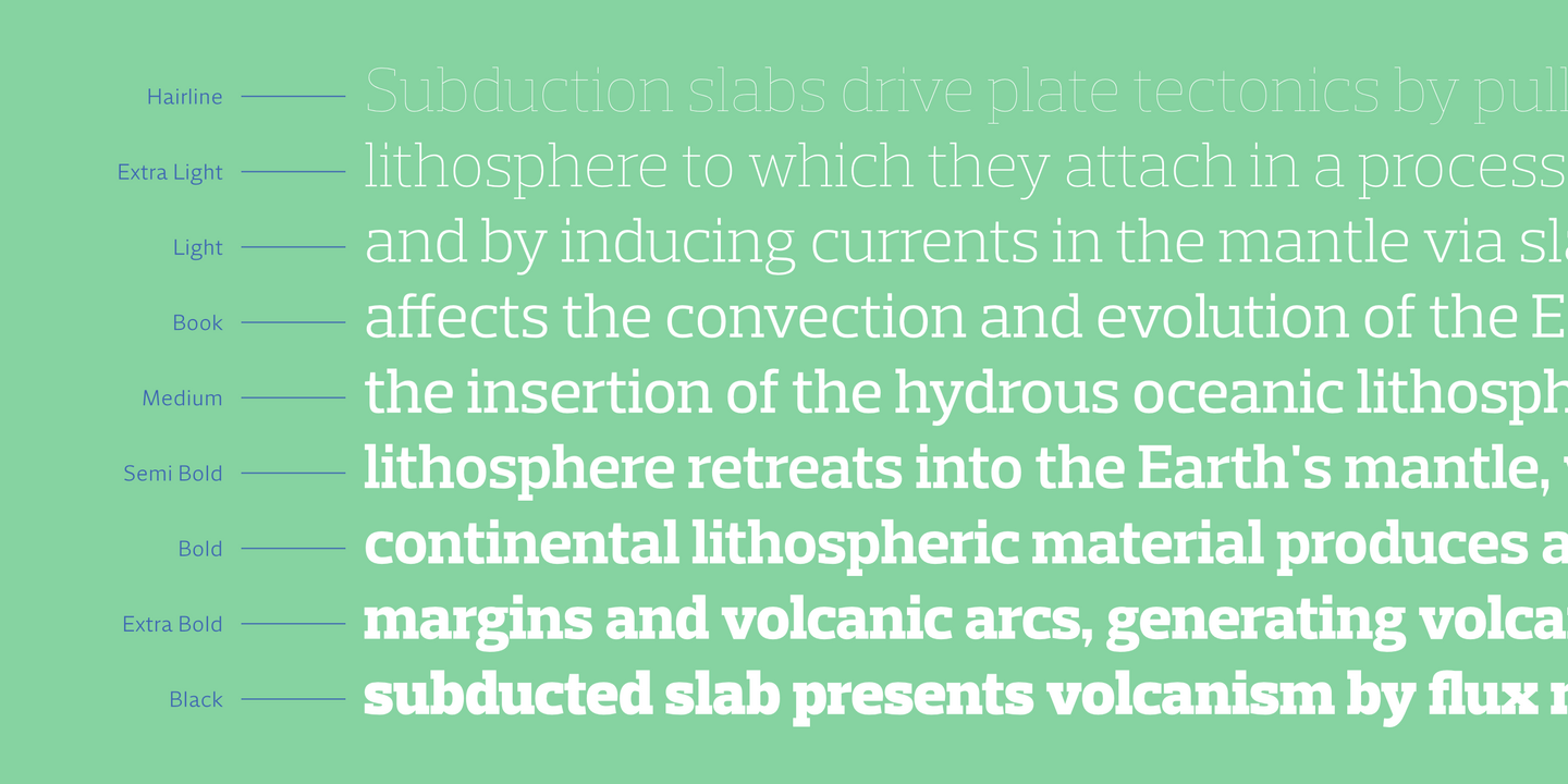
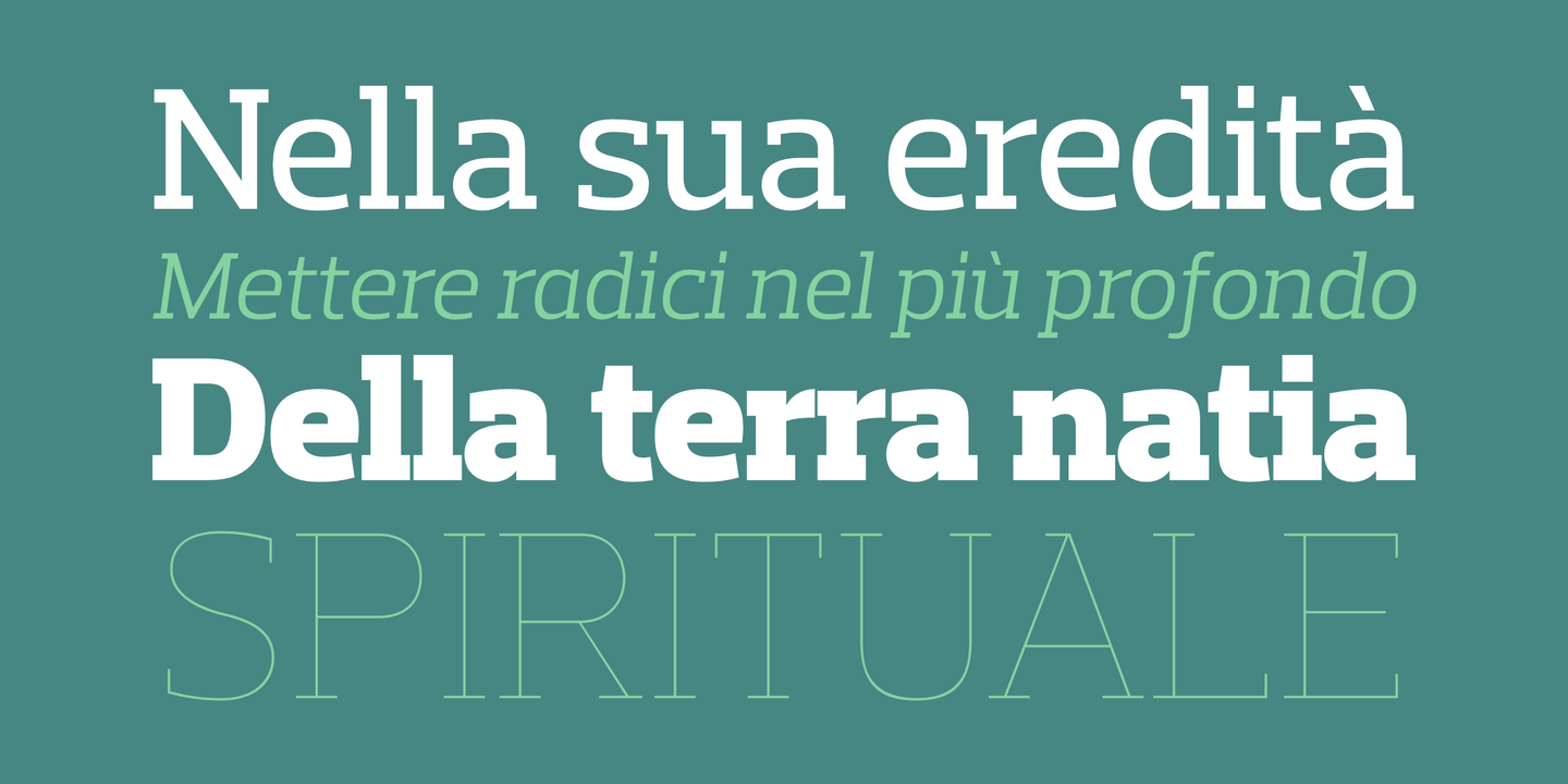
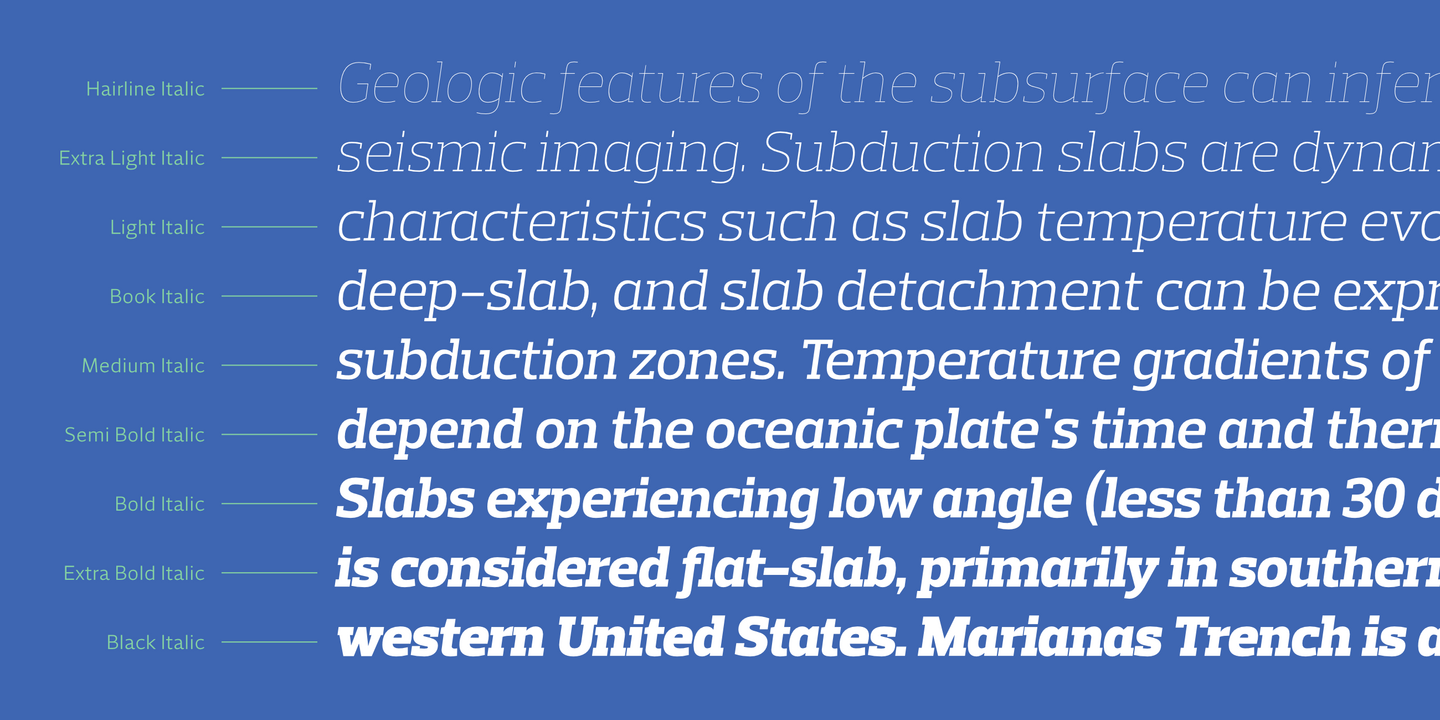
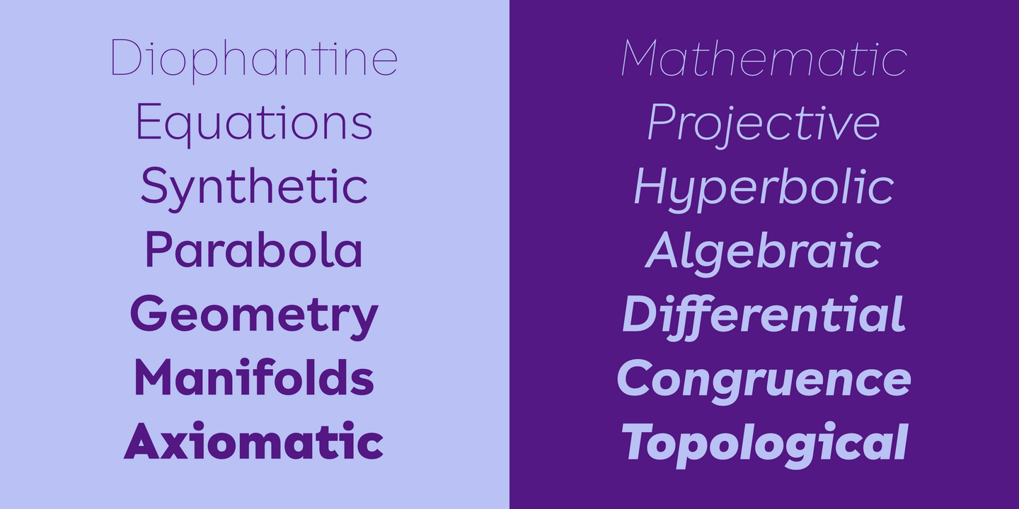
Prelo was designed to be a neutral, highly readable typeface for identity, editorial and information design. With nine weights and nine true italics from Hairline to Black, Prelo is a workhorse typeface full of OpenType features such as small caps, tabular figures, central European characters and historical figures, among others. Like other DSType fonts, most of the diacritics were designed to fit the gap between the x-height and the caps height, avoiding some common problems with the accented characters. The curves are soft and smooth, providing legibility even in very poor conditions, and the neutrality allows this typeface to be used with any serif companion.
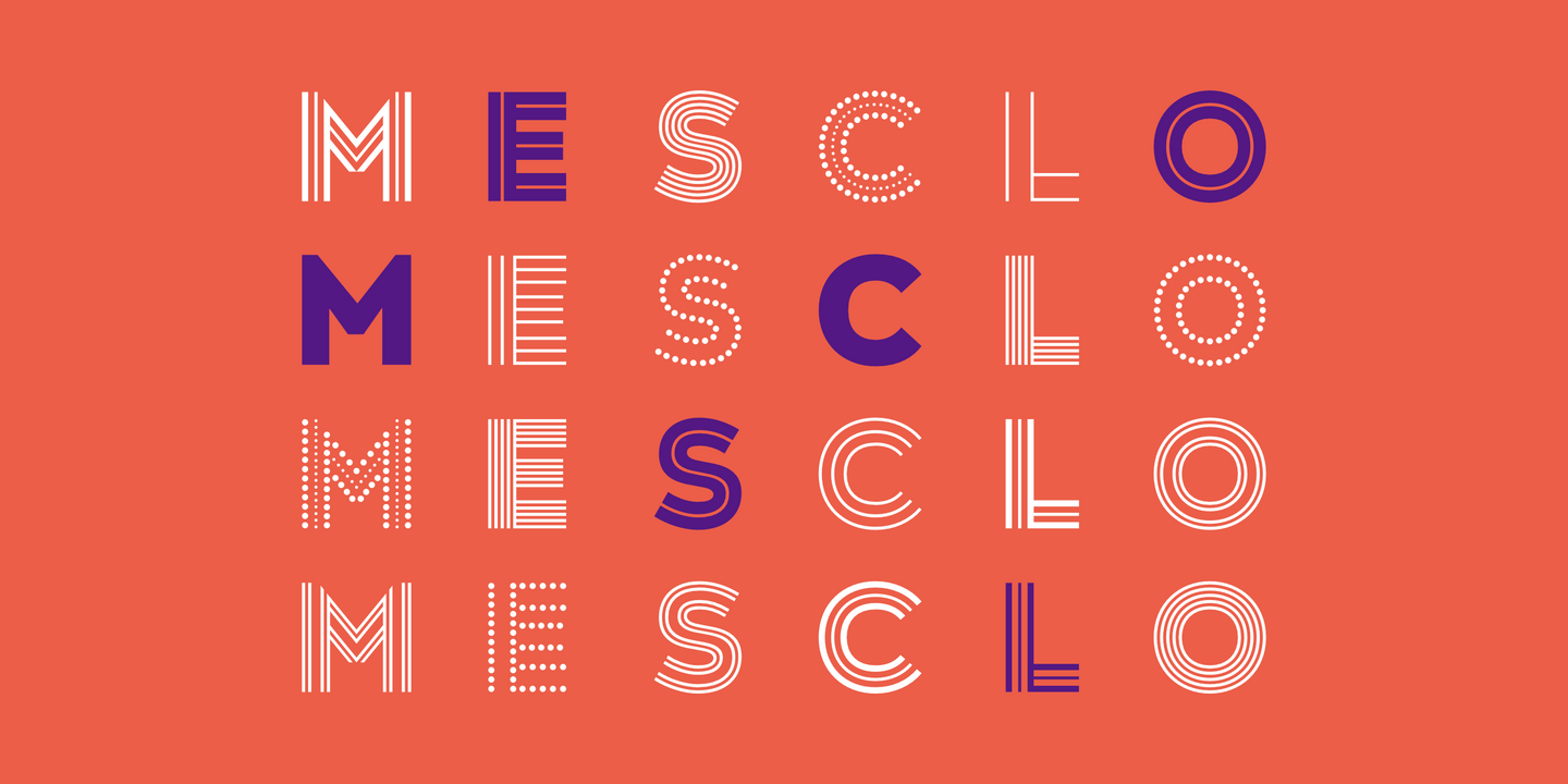
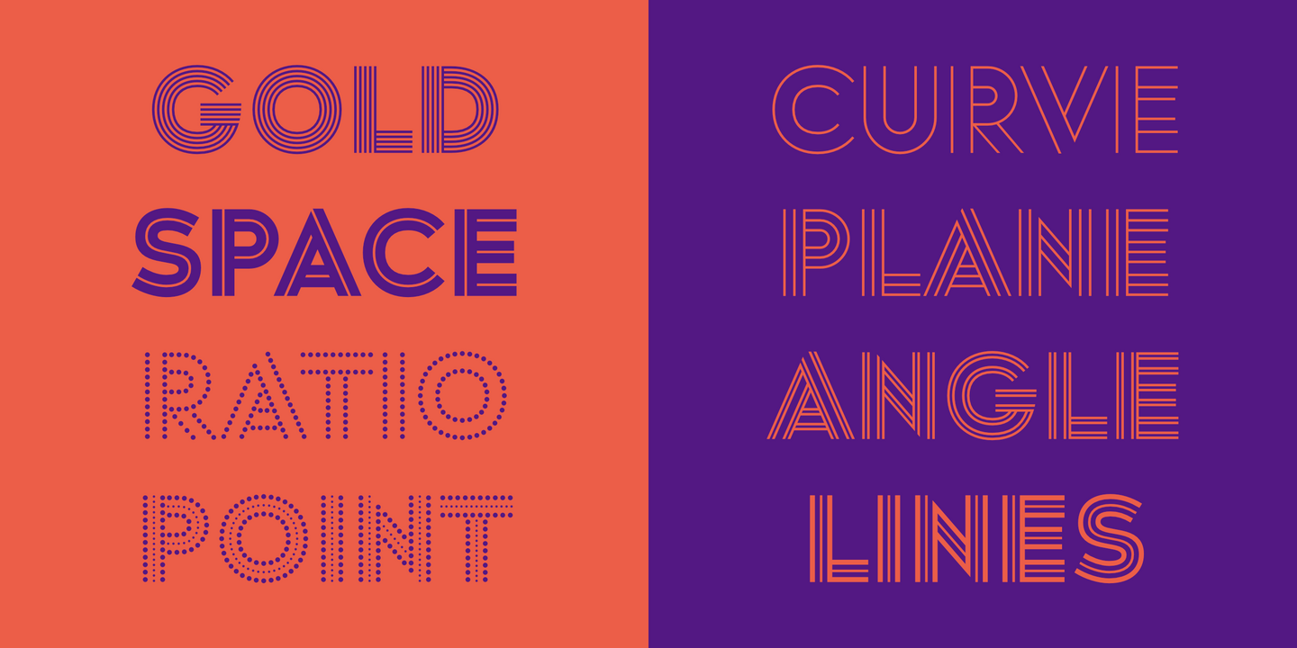
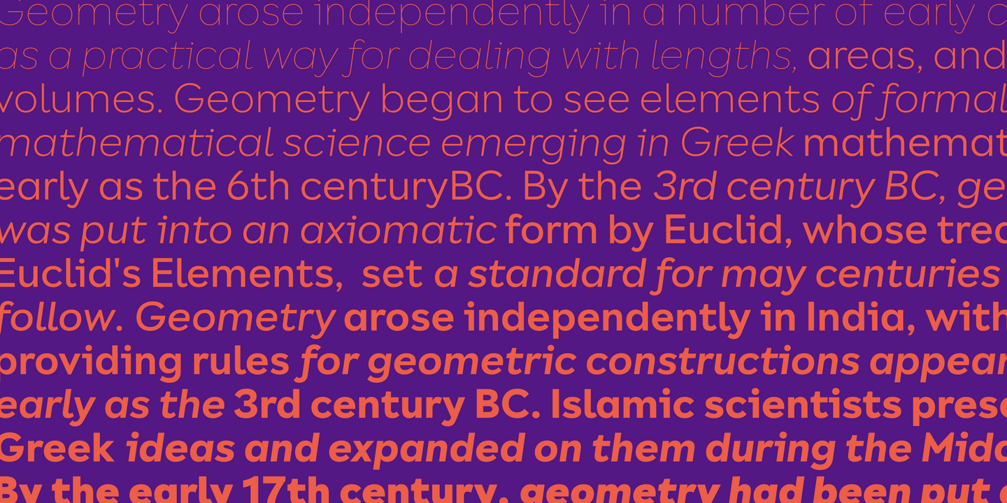
Mesclo is our personal take on the geometric typefaces genre. With mono-linear appearance, humanistic elements and subtle hints of Art Deco, Mesclo is a timeless typeface with dramatic oblique terminals and a welcoming, friendly roundness. The outstanding dynamic rhythm and legibility of the text contrasts with the inflexible geometry of the unusual complementary caps-only typefaces, specially developed to fulfil and enrich this type family.
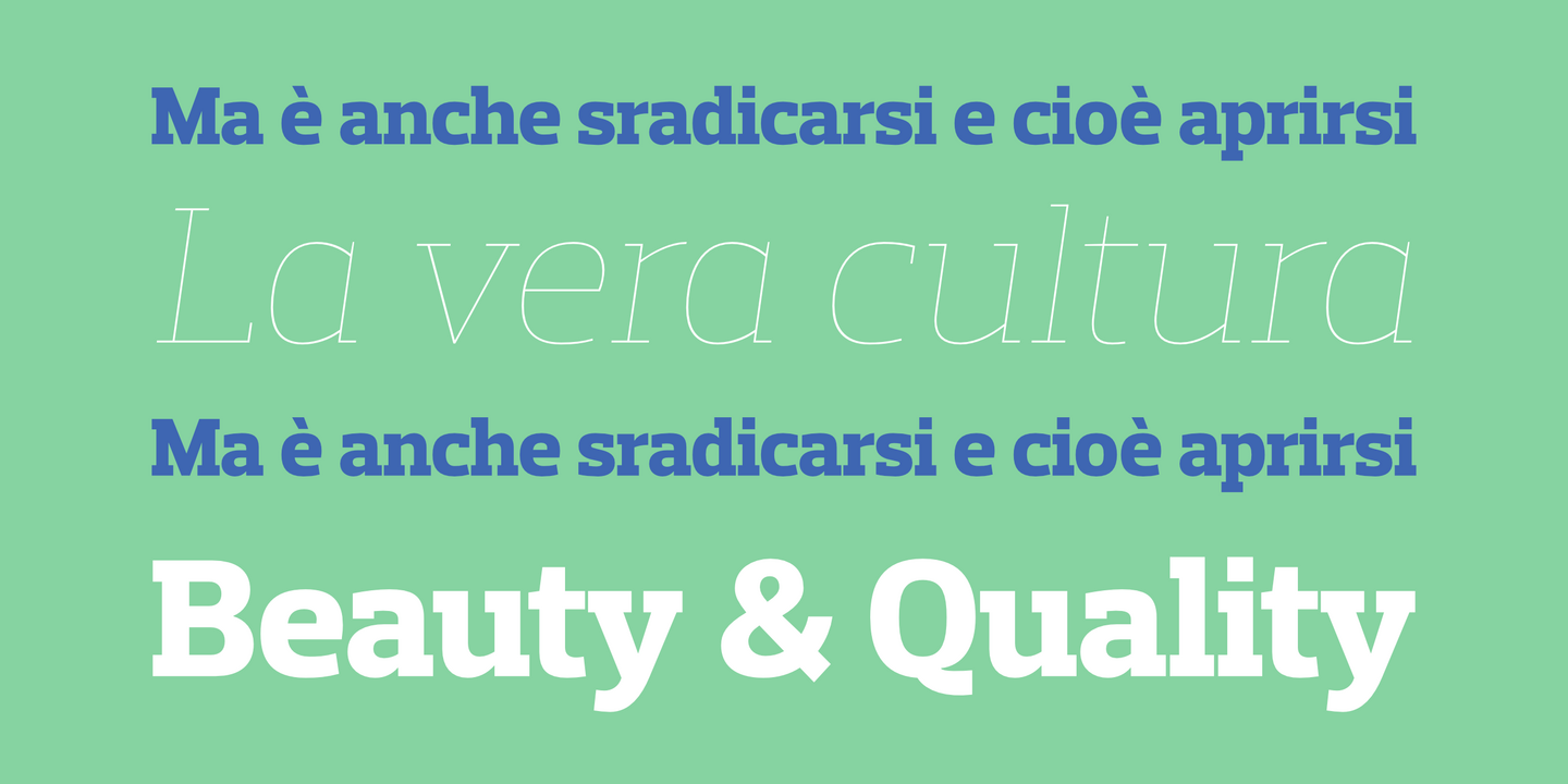
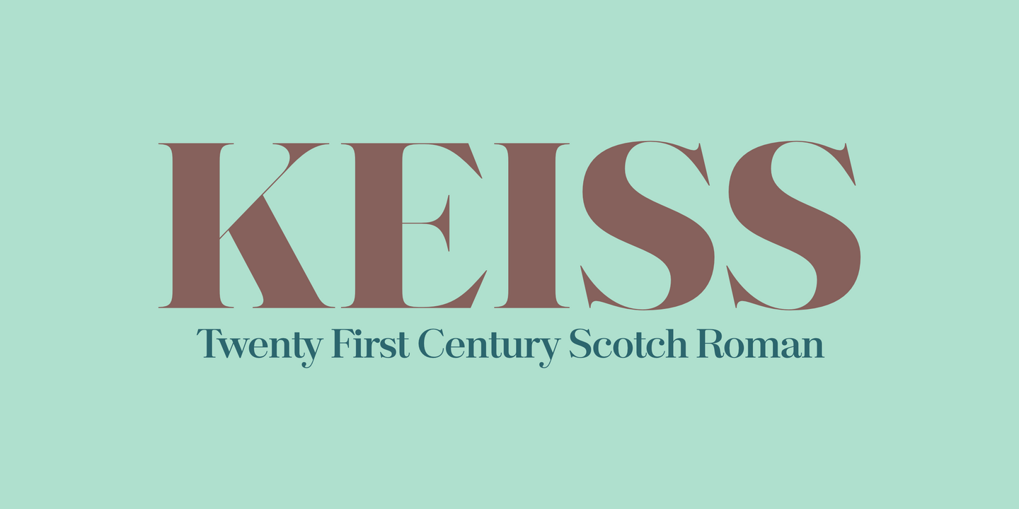
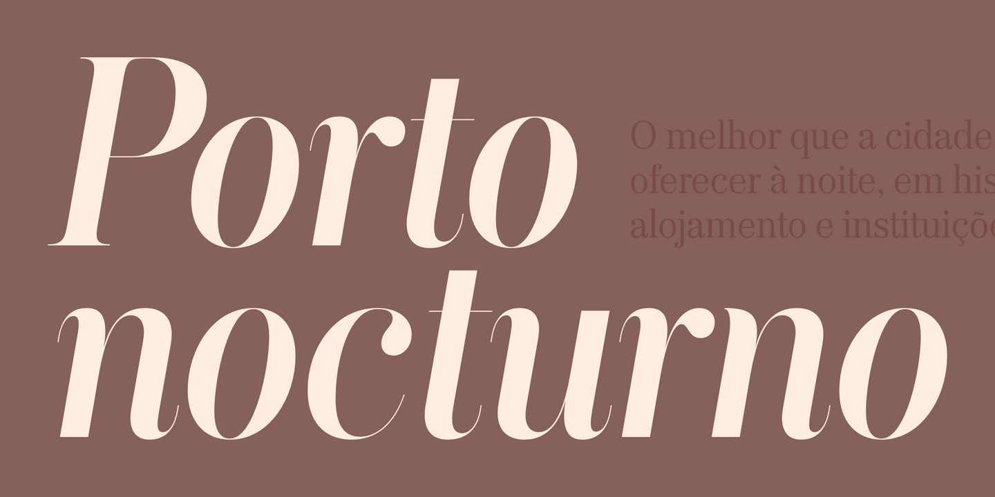
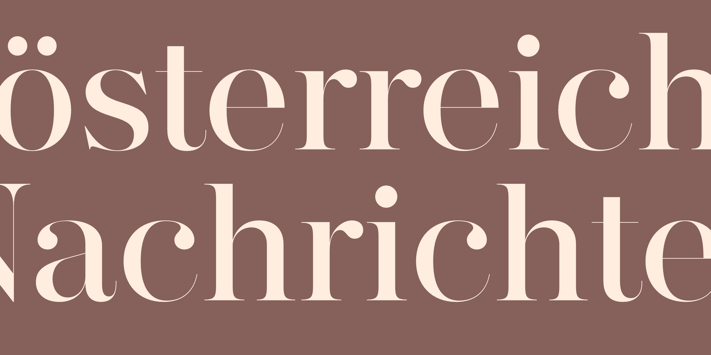
The Keiss type family is our interpretation of the popular nineteen century Scotch Roman typefaces. We intended to keep a very classic approach while introducing a couple of new elements that differentiate this type family from it’s ancestors. This design, with short descenders and ascenders, along with three very distinct optical sizes makes this type family well suited for contemporary newspapers. The Title and Big versions range from Thin to Heavy, with matching italics, in order to be used in big sizes and stand out in the design. The Text ranges from Thin to ExtraBold and is a standalone type family for text usage, with narrow proportions and wider and open italics for improved text setting. The Condensed versions, ranging from Thin to Bold, don’t have italics, although they can be matched with the italics of the Title and Big versions, due to the fact they are very condensed.
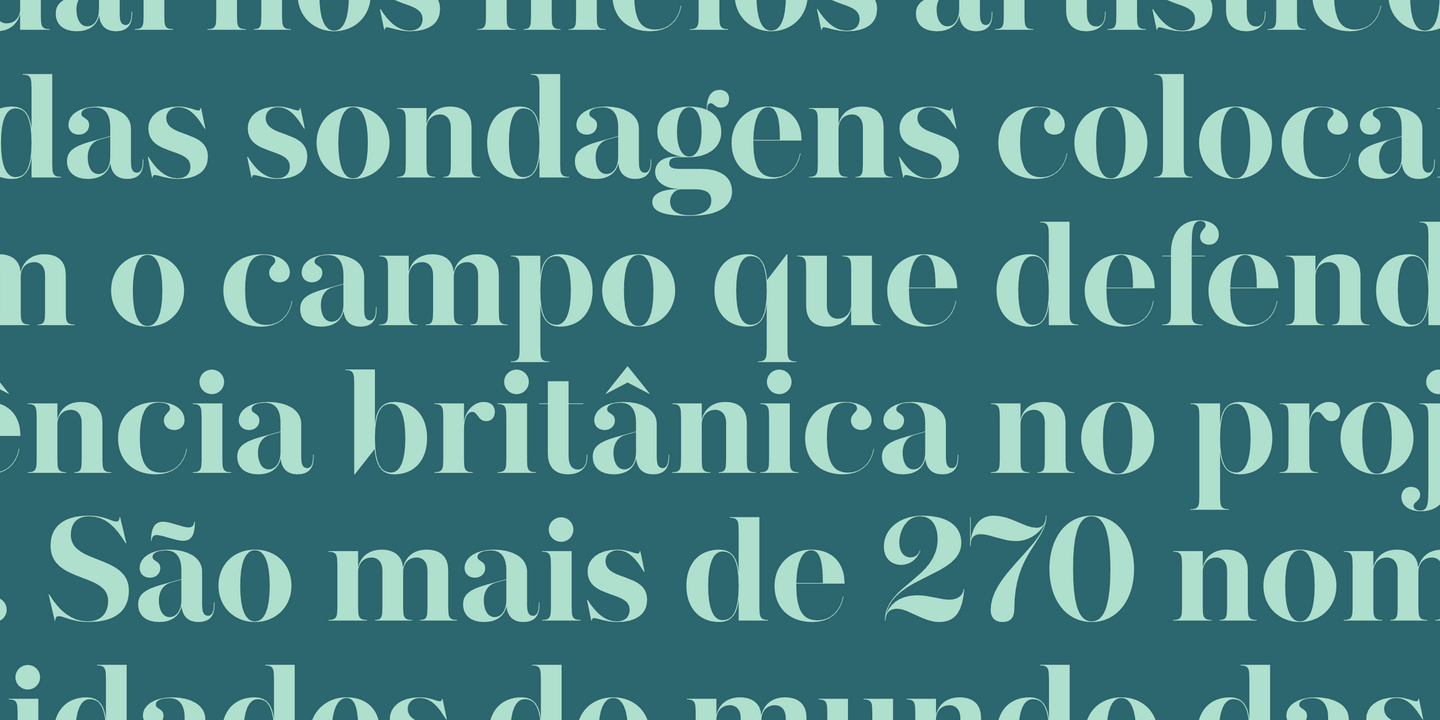
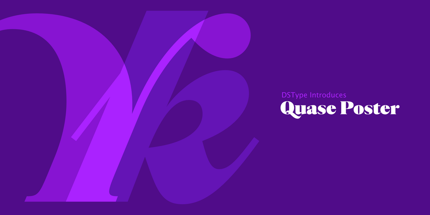
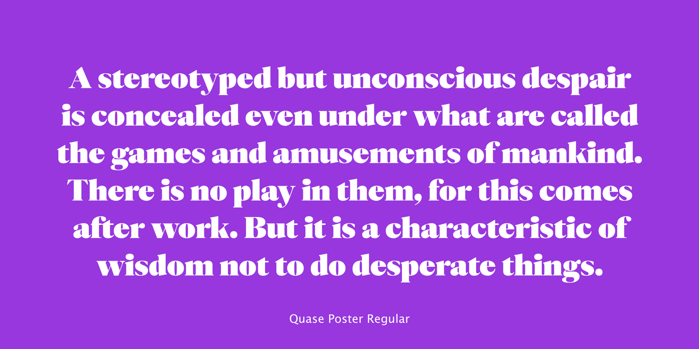
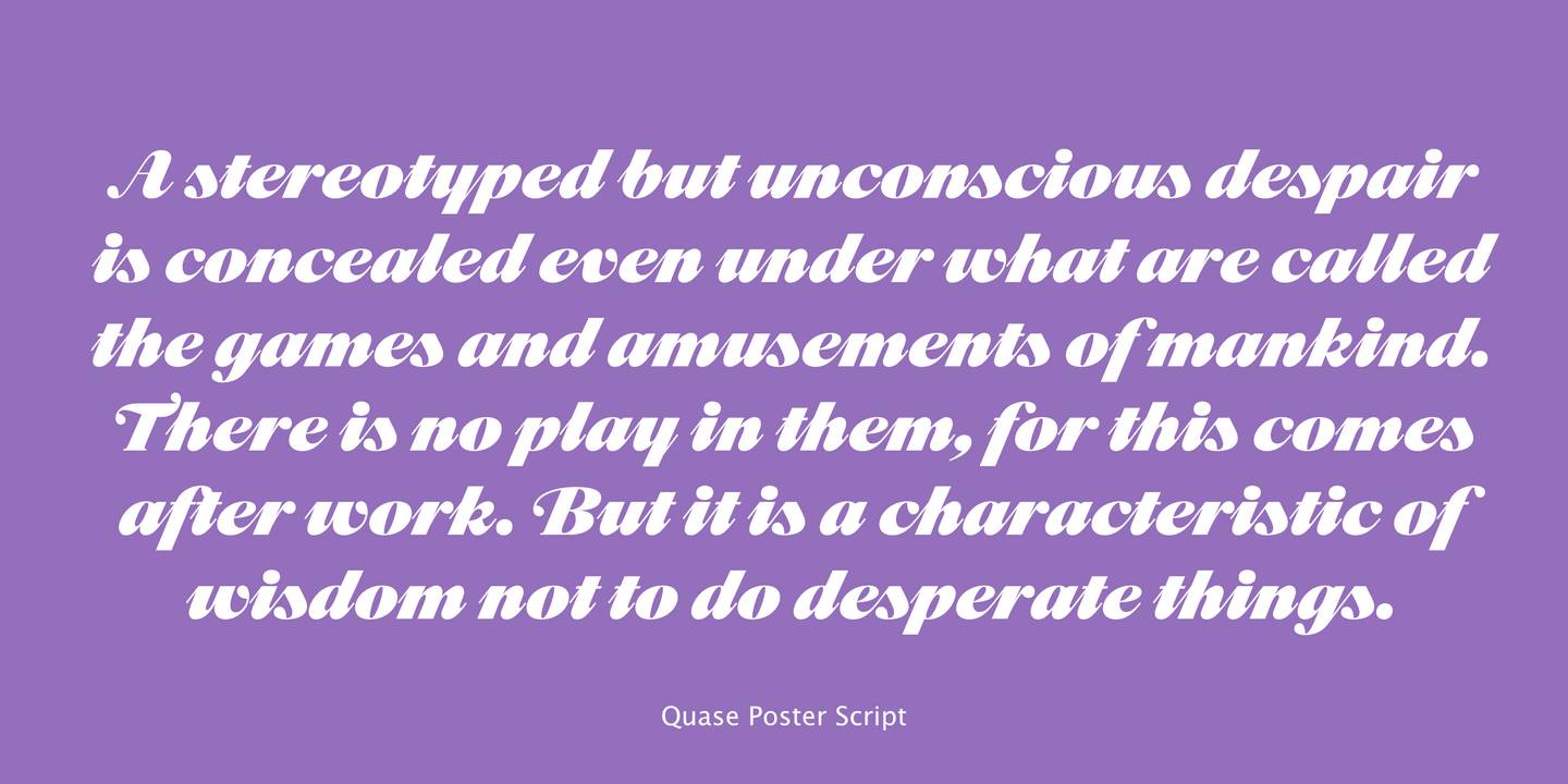
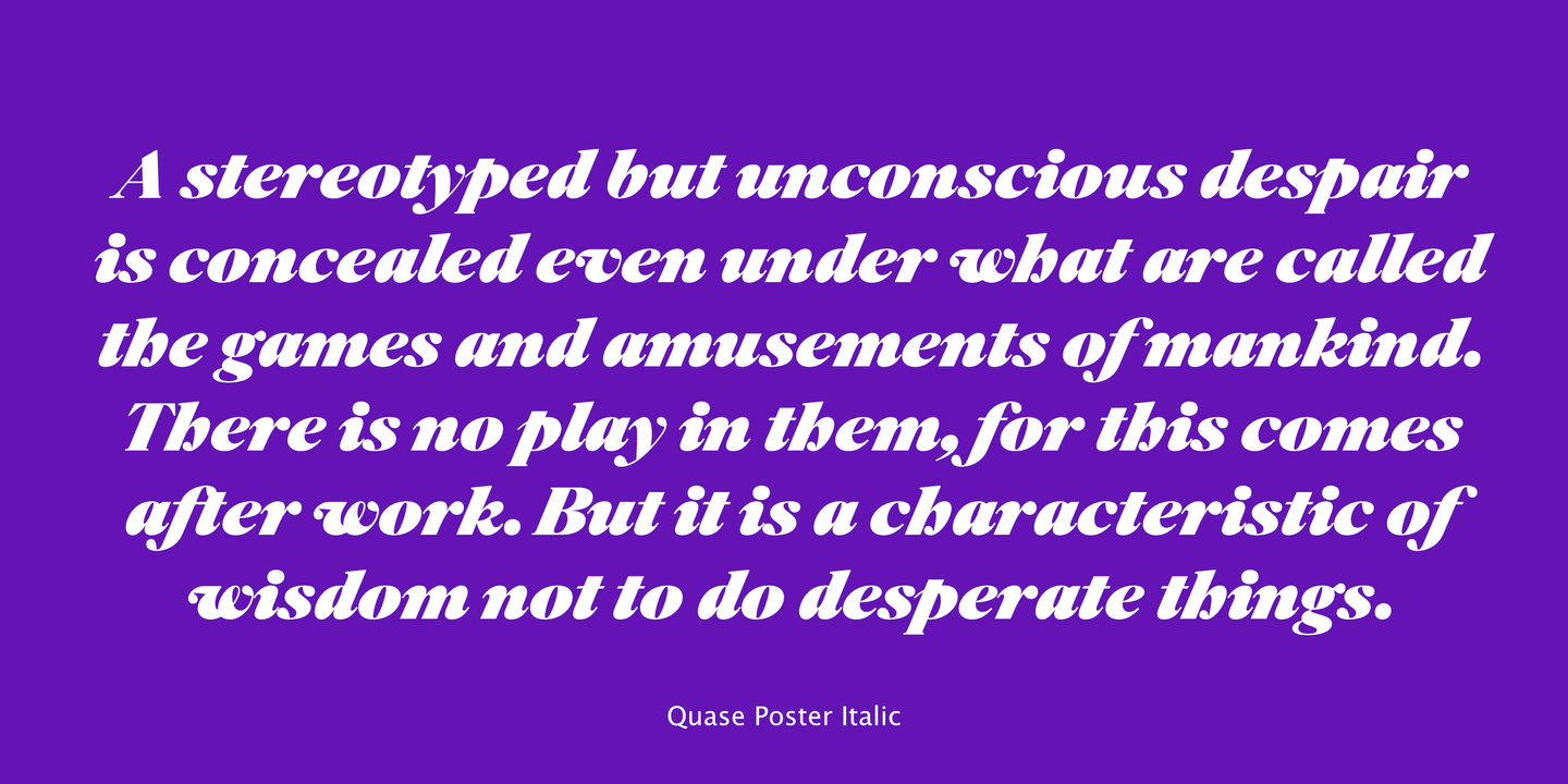
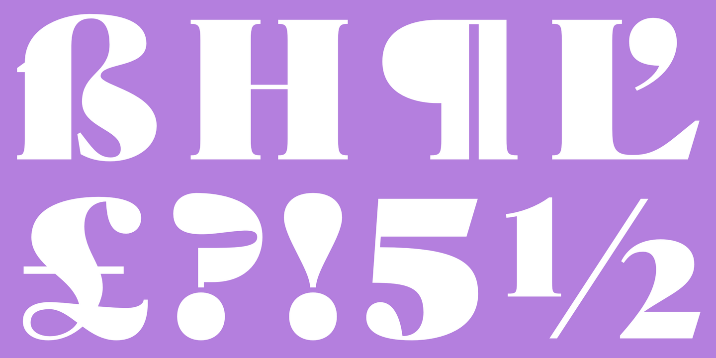
Quase is a very free interpretation of the types found in the “Specimen of Printing Types” by William Caslon from 1785. We didn’t want to follow any of the models introduced in the Specimens, but rather gather a series of typographic aspects that we found useful and interesting from the several sizes and styles available and then give them consistency and new proportions so they could fit our very own purpose. We wanted to start with Caslon and then transform it into an editorial typeface, hence the increase of the x-height and the radical reduction of the ascenders and descenders. Despite the Display, Headline and Text fonts we also wanted to make a single weight Poster version with, inspired by the mechanical script introduced in the Double-Pica Script, to be used in magazines or as a complementary display typeface.
Fonts in use.
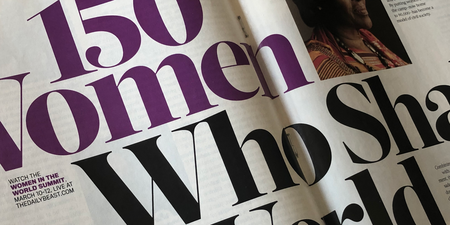
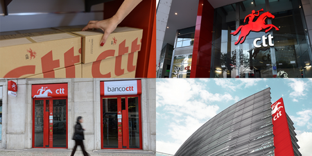
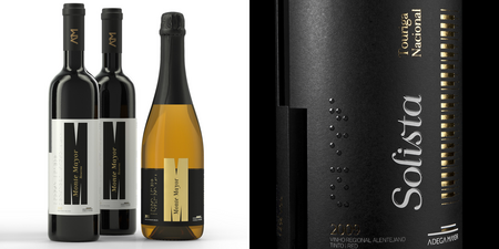
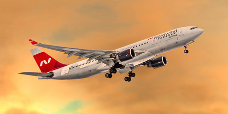
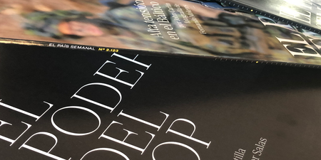
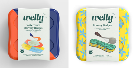
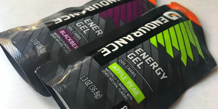

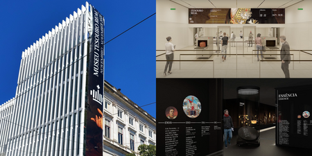
Fonts from DSType

We have received numerous awards, including a Certificate of Excellence in Type Design by the Type Directors Club and we have been featured in several magazines, newspapers, books and exhibitions worldwide. You will be able to see our work in most newsstands, several packagings, world known brands and global scale events.

Partner & Designer
Antonieta Costa
Graduated in Industrial Design, taught History of Arts and Design for more than 20 years. Antonieta is a key element of the team, with a different perspective on type and typography, she’s responsible for the historical research and critical thinking.

Creative Director & Type Designer
Dino dos Santos
Born in 1971, is the founder of DSType. Graduated in Graphic Design and Master in Multimedia Arts, designed typefaces for clients like The New York Times Magazine, Fifa World Cup 2022 and Expo 2020 Dubai. Awarded with the Certificate of Excellence in Type Design by the Type Directors Club of New York.

Type Designer
Pedro Leal
A proud member of the DSType Foundry team since 2010. His body of work was recognised with the TDC Ascenders Award in 2018, a competition that honours type-based portfolios of designers who are 35 years of age and under.
