Fonts from Font Bureau

Font Bureau was founded in 1989 by type designer David Berlow and media strategist Roger Black. Throughout the last quarter of a century, Font Bureau has designed custom typefaces for almost every major American publication and has built a retail library that houses some of the most popular fonts on the market such as bestsellers Interstate and Benton Sans.
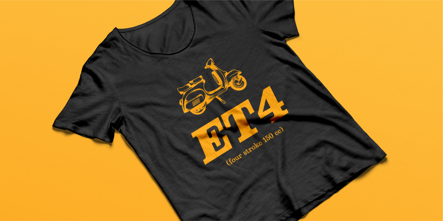
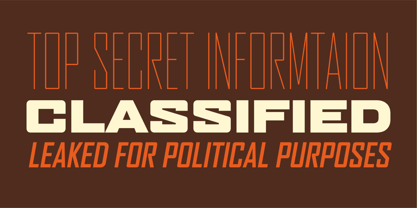
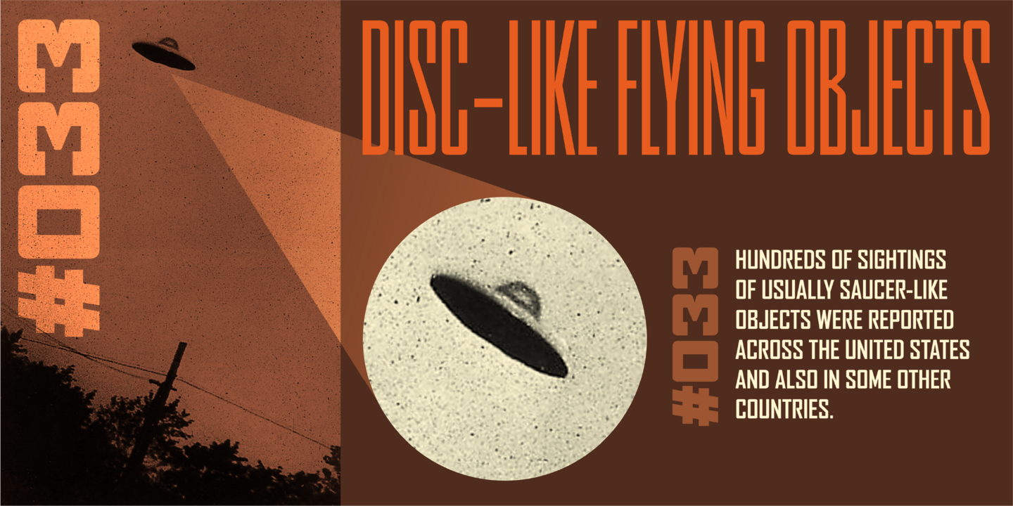
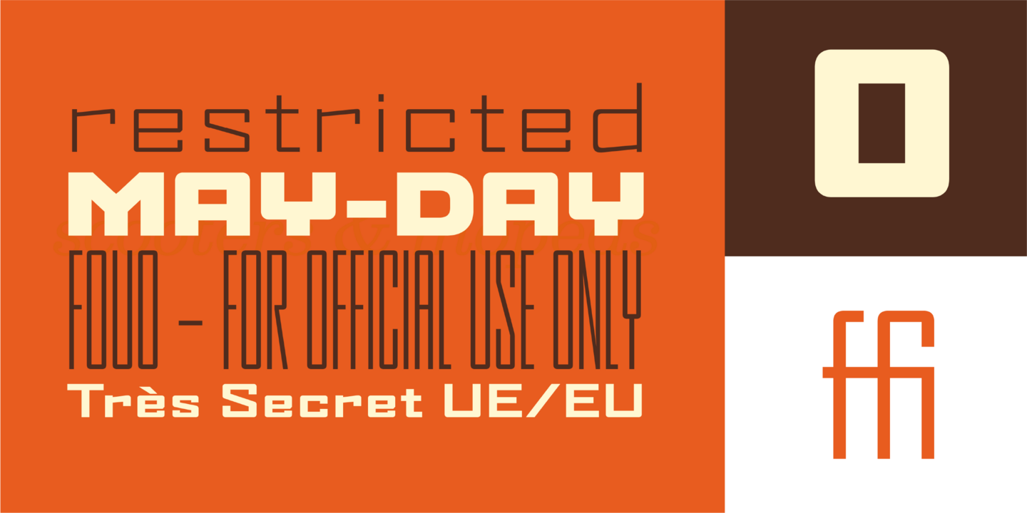
Popular Font Bureau fonts.
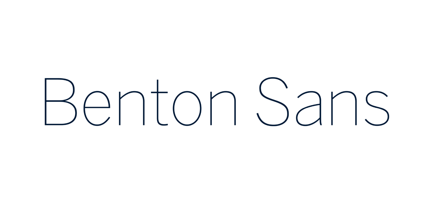
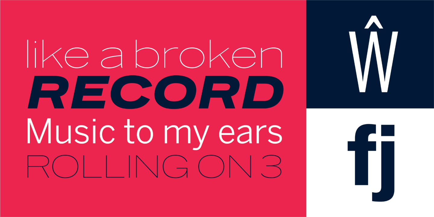
In 1903, faced with the welter of sanserif typefaces offered by ATF, Morris Fuller Benton designed News Gothic, which became a 20th-century standard. In 1995 Tobias Frere-Jones studied drawings in the Smithsonian and started a redesign. Cyrus Highsmith reviewed News Gothic, and with the Font Bureau studio expanded it into Benton Sans, a far-reaching new series, with matched weights and widths, offering performance well beyond the limits of the original; FB 1995-2012
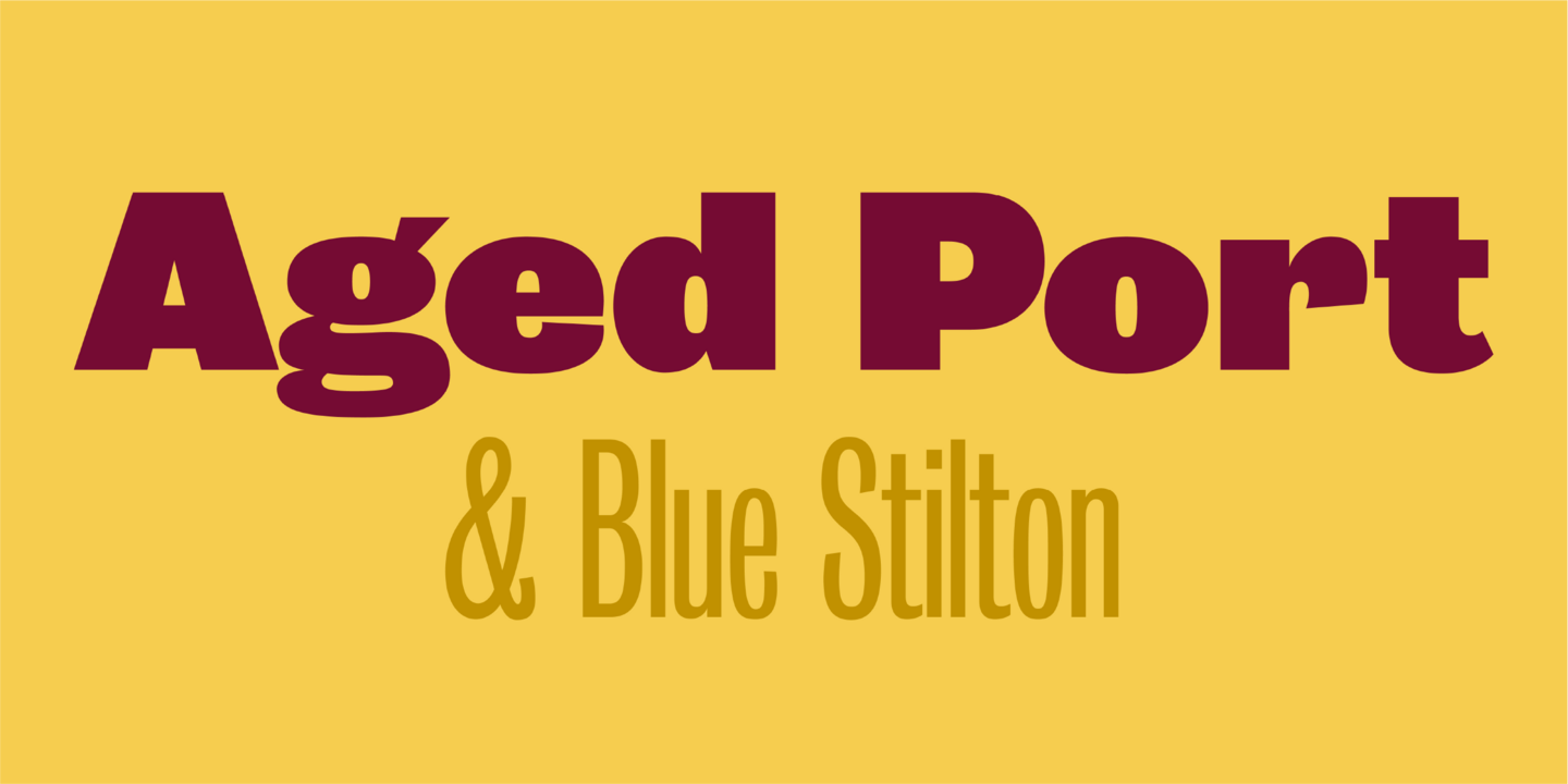
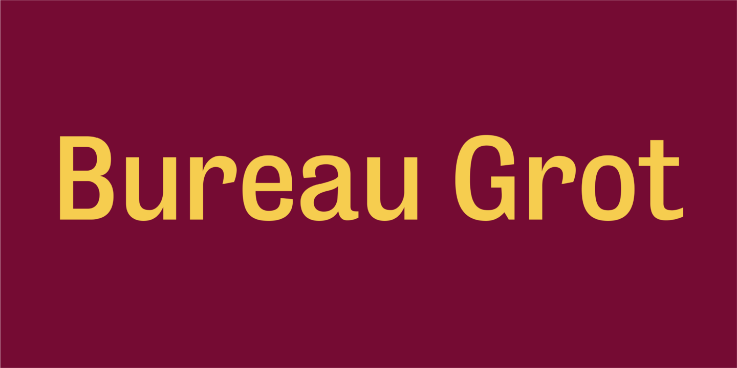
Bureau Grot is now accepted as the essence of tooth and character in an English 19th-century sans. The current family was first developed by David Berlow in 1989 from original specimens of the grotesques released by Stephenson Blake in Sheffield. These met with immediate success at the Tribune Companies and Newsweek, who had commissioned custom versions at the behest of Roger Black. Further weights were designed by Berlow for the launches of Entertainment Weekly and the Madrid daily El Sol, bringing the total to twelve styles by 1993. Jill Pichotta, Christian Schwartz, and Richard Lipton expanded the styles further, at which point the family name was shortened from Bureau Grotesque to Bureau Grot; FB 1989–2006
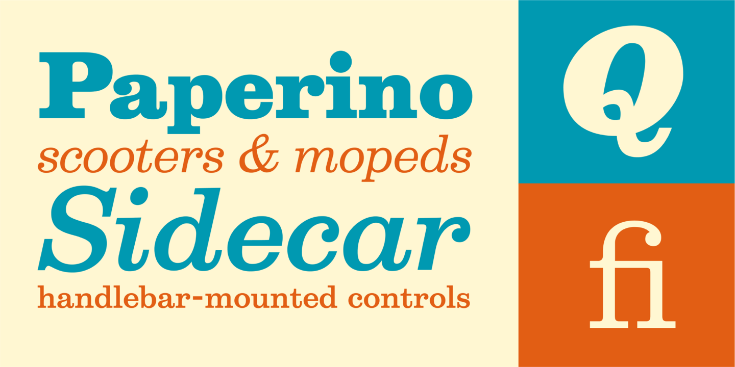
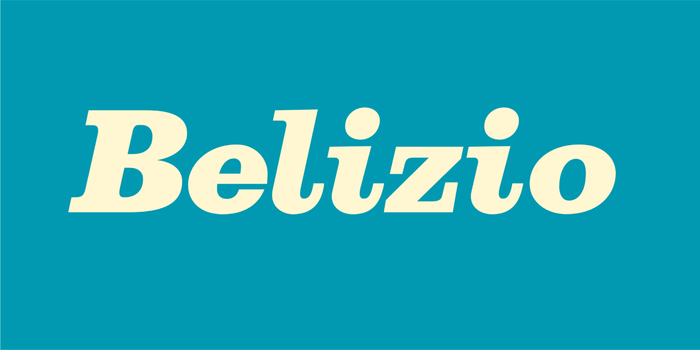
The eight-part Belizio series updates the first Font Bureau typeface. David Berlow’s family is based on Aldo Novarese’s Egizio, designed in 1955 for Nebiolo. It was first prompted by the popularity of Haas Clarendon, designed by Hoffmann and Eidenbenz, an impeccably Swiss revival of the traditional English letterform. Aldo Novarese was among the first to investigate a true italic designed in the Clarendon style; FB 1987–98
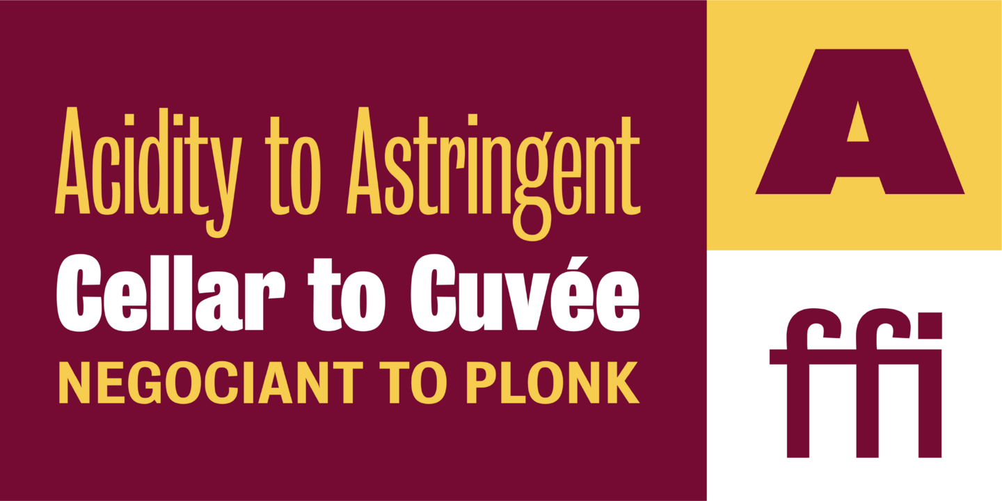
ATF Agency Gothic was designed by Morris Fuller Benton in 1932 as a lone titling typeface. In 1990, David Berlow saw potential in the squared forms of the narrow, monotone capitals. He designed a lowercase and added a bold to produce Font Bureau Agency, an immediately popular hit. Sensing its potential to be than just a useful condensed face, Font Bureau developed Agency into a major series offering five weights in five widths; FB 1990-95
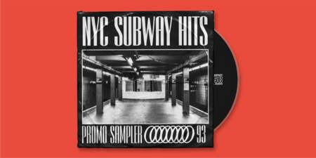
Fonts in use.
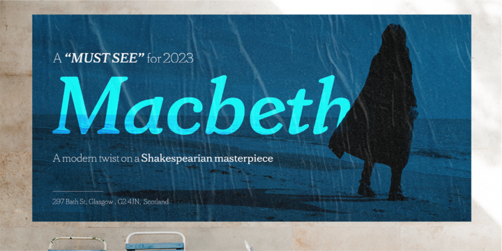
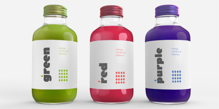
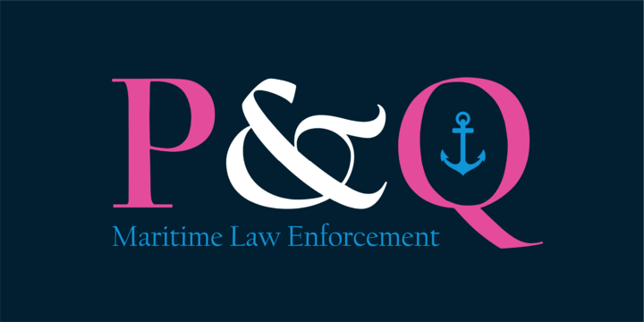
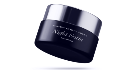
Fonts from Font Bureau

“The decisions about what designs to produce and how to craft them draw upon a base of typographic knowledge built firmly on hundreds of years of tradition. This remains the essence of what Font Bureau does.” Berlow’s illustrious career in type design was celebrated when he won the Type Directors Club medal in 2014. “Type designers who lived hundreds and occasionally thousands of years ago are still teaching me because type design is pretty much infinite,” he says, “and all it takes is a letter you’ve never seen before to incite learning, I think.”

Type Designer
David Berlow
David Berlow is a type designer based in Boston. Started type career in 1978 working for Mergenthaler. Helped to develop the retail library of Bitstream, where he worked from 1982 to 1989. Started Font Bureau with Roger Black and other ex-Bitstream people in 1989. Initially worked for corporate clients, including Apple and Microsoft, for whom he helped build the first TrueType fonts. On July 15, 2014, the Type Directors Club awarded its 27th Medal of Excellence to David for his outstanding work as a type designer and for his role in co-founding Font Bureau and leading it to its present position of eminence in the industry.

Monotype fonts
Font Bureau fonts are included with Monotype fonts.
