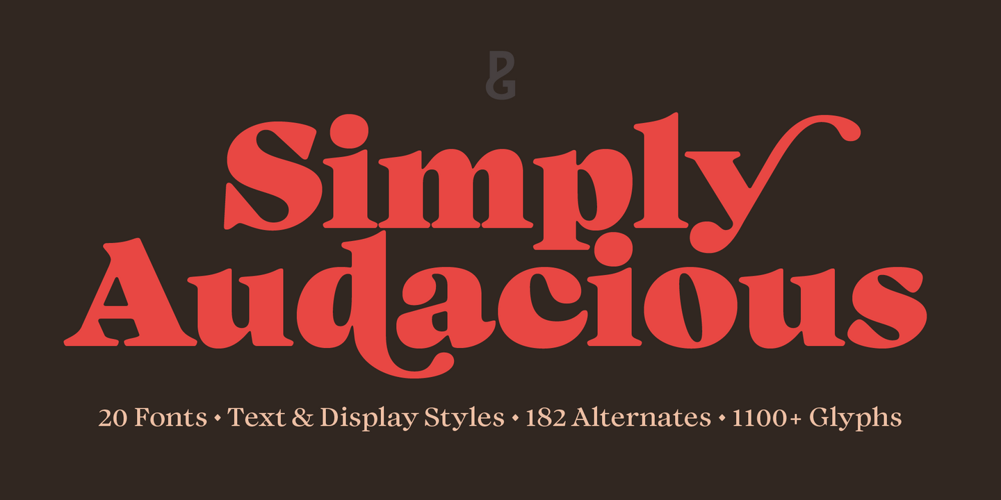
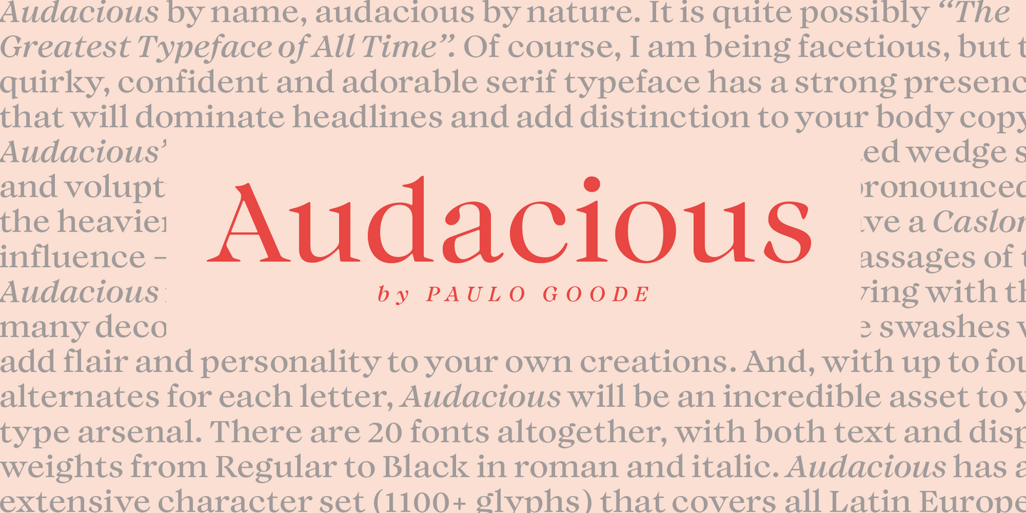
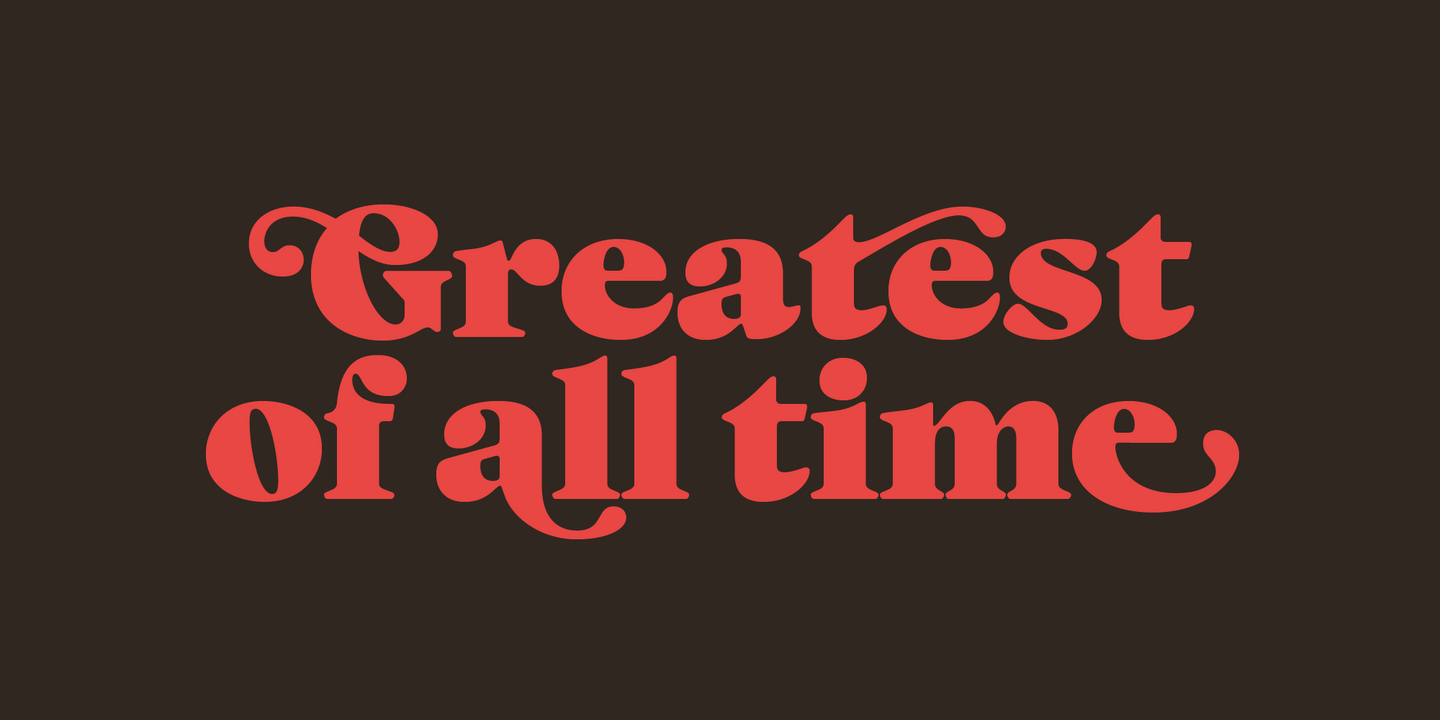
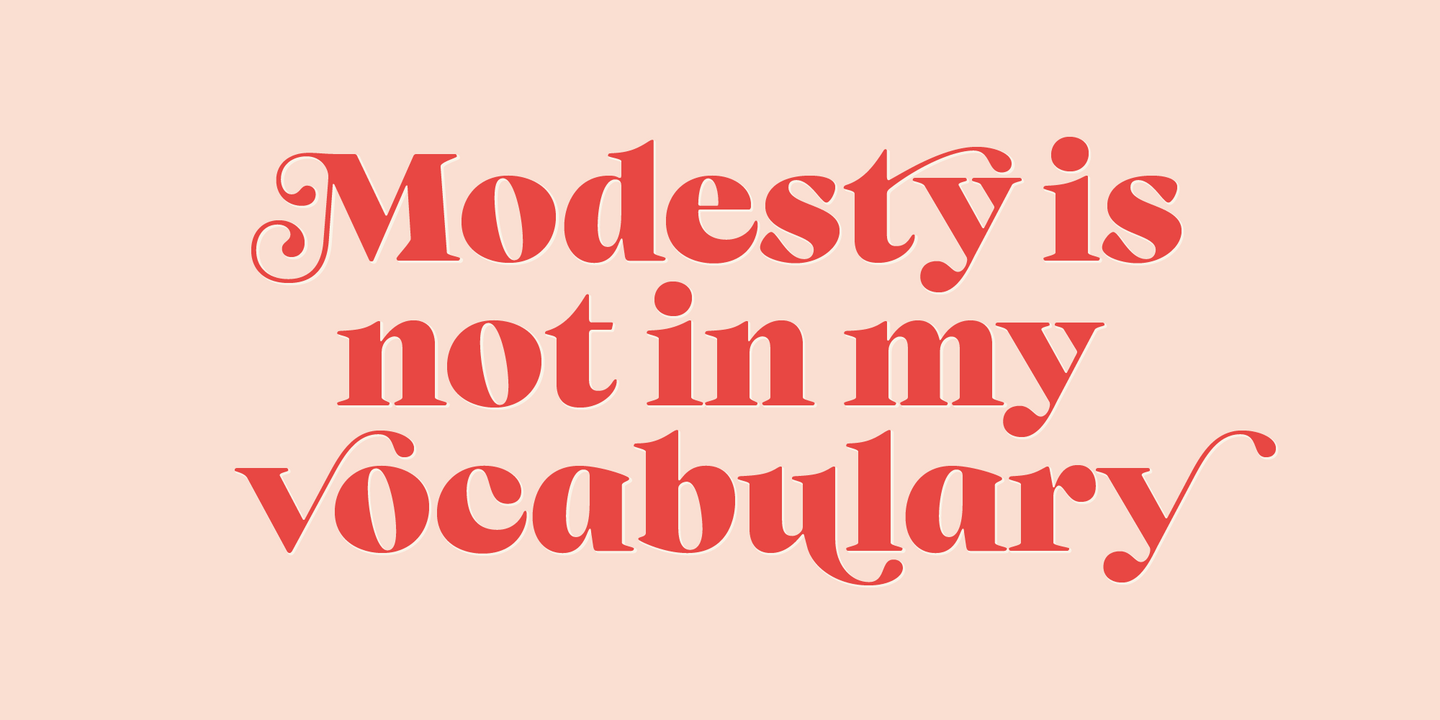
Fonts from Paulo Goode.

Paulo had a long and varied creative career behind him before trying his hand at type design in 2014. He calls upon his 30 years’ experience as a technical illustrator, graphic designer, and website designer/developer when designing his typefaces and, as a creator of type, fully understands what is required as a user of type. Paulo’s releases mainly focus on type for branding purposes.
Popular Paulo Goode fonts.
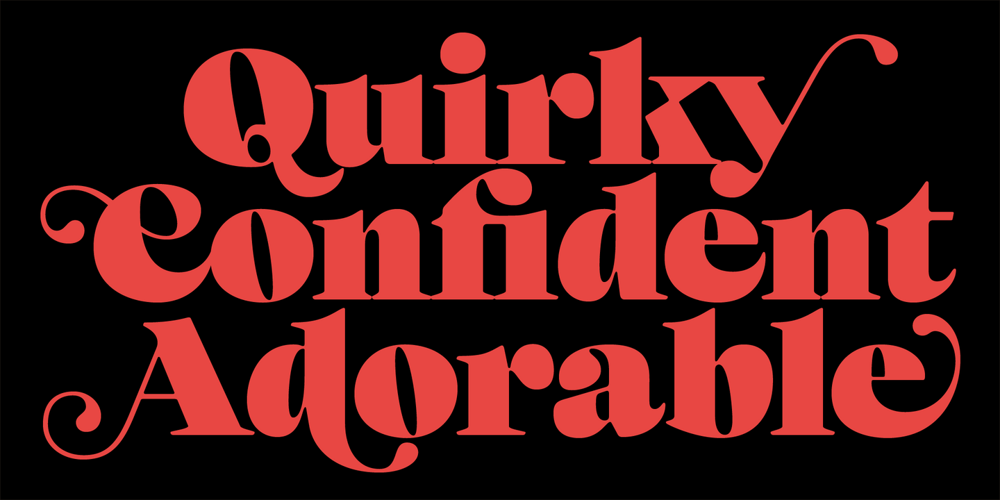
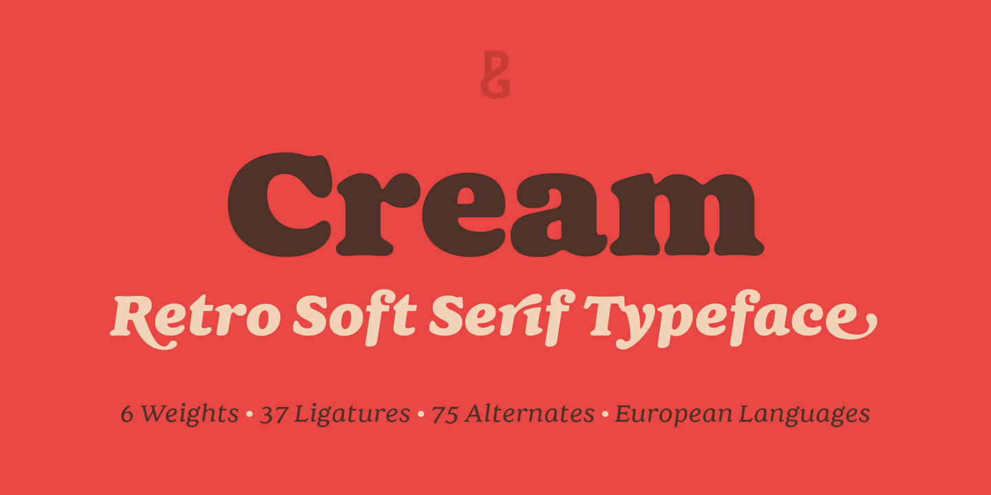
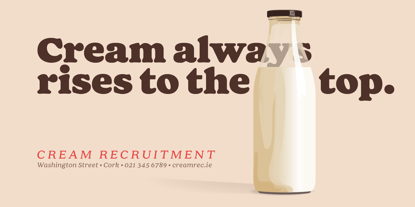
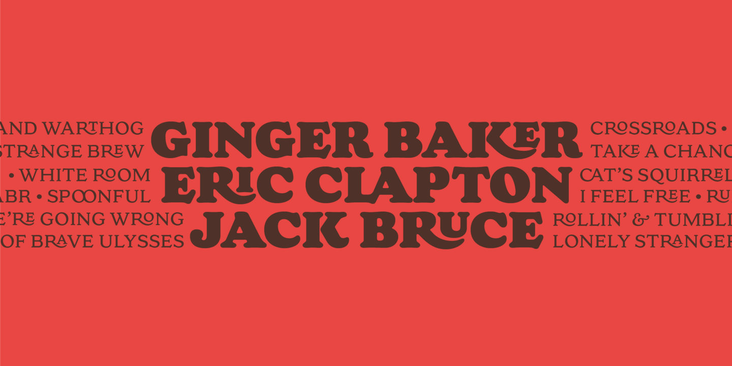
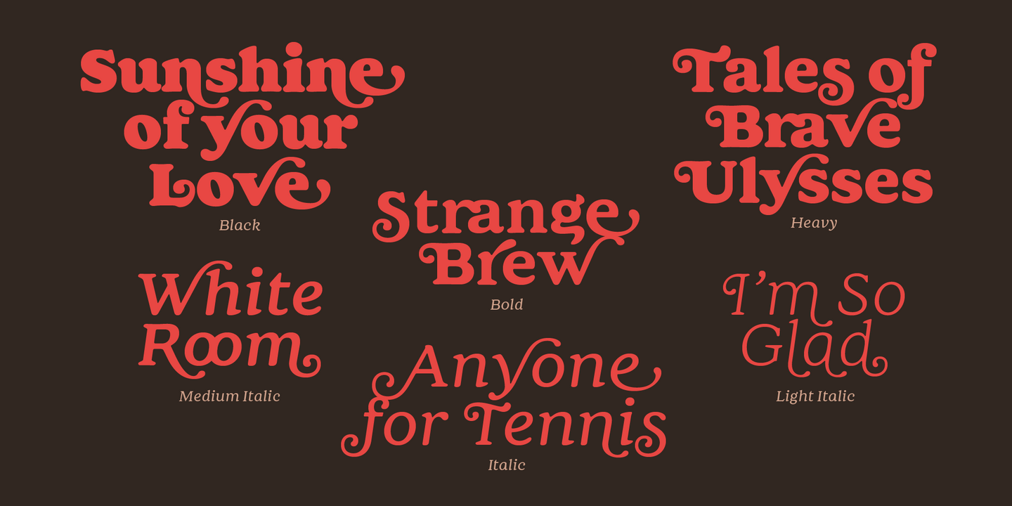
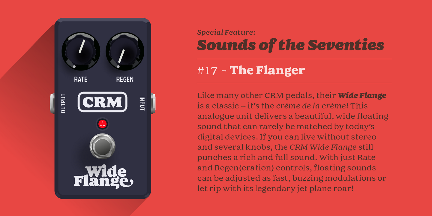
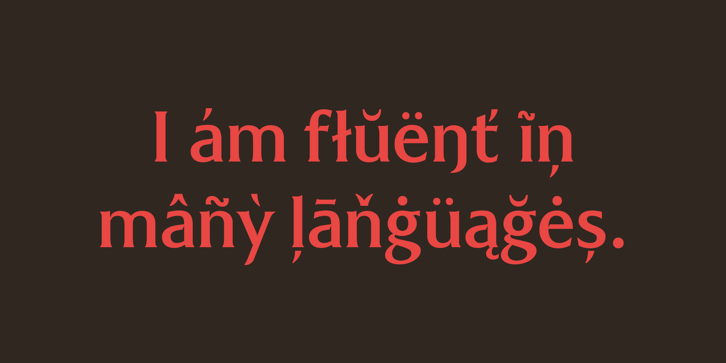
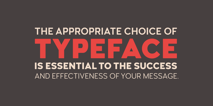
Cream is a soft serif typeface inspired by Oswald Bruce Cooper’s eponymous type family designed 1918-1924. I am sure you can immediately see the influence, but Cream has its own unique flavour; I have aimed to achieve a more uniform and balanced typeface that has smoother curves and more consistent lines – along with a plethora of useful features.
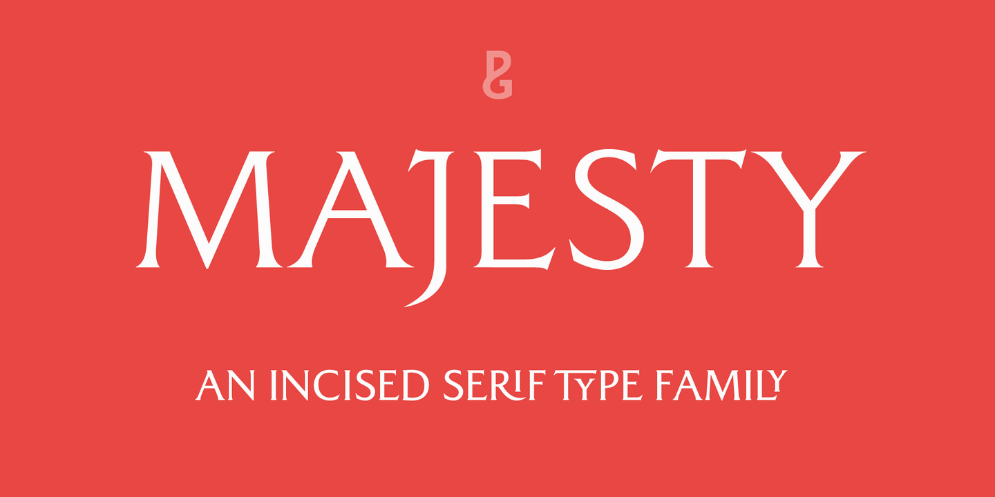
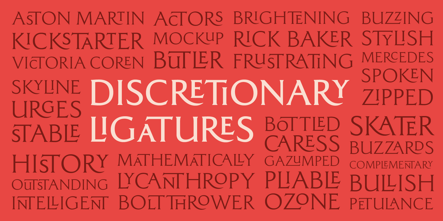
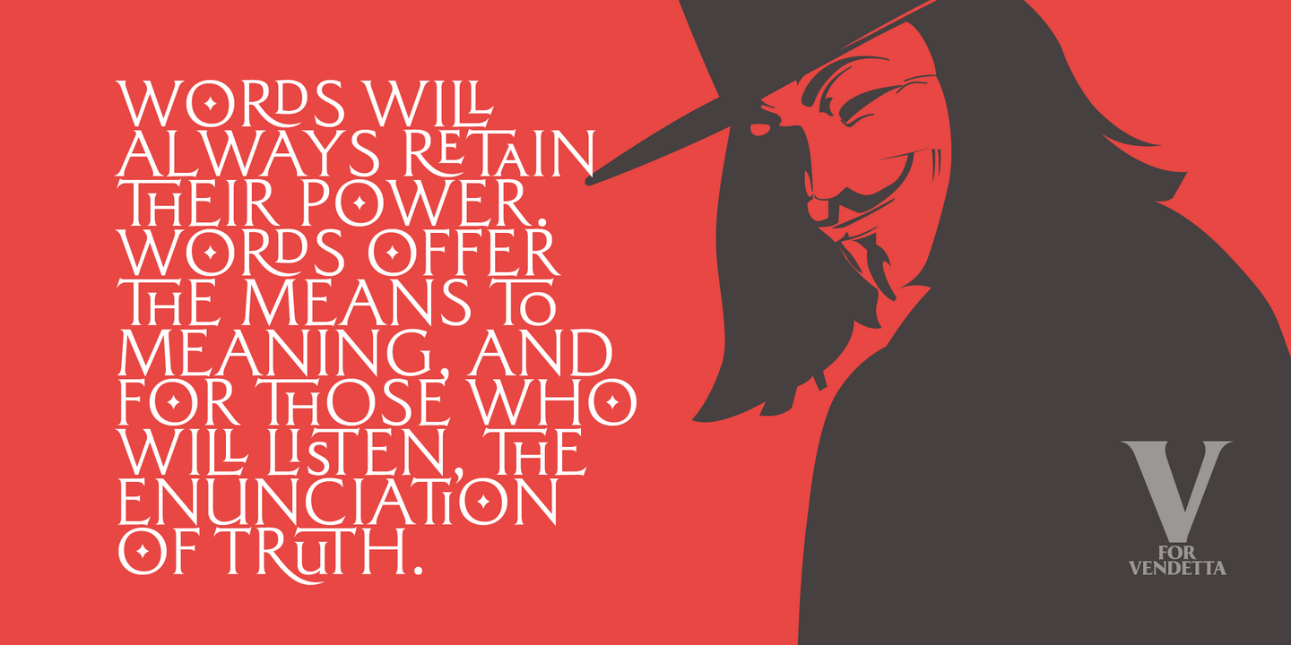
Majesty was designed with the intention of adding a touch of refined class to any implementation of it. An incised typeface, having a friendly resonance without being too austere, Majesty sits somewhere between the Trajan and Albertus type families, being inspired by the tradition of engraved type over the centuries.
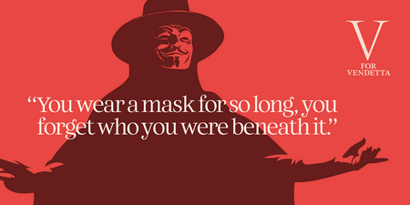
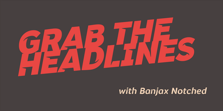
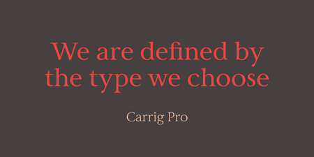
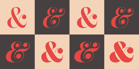
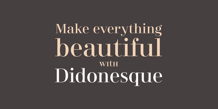
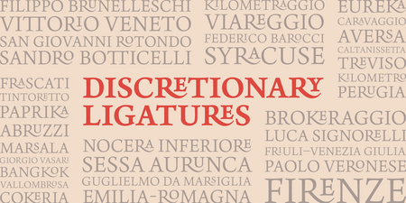
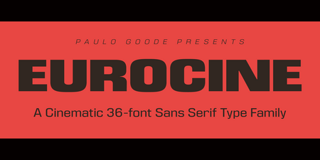
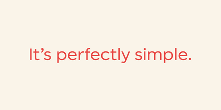
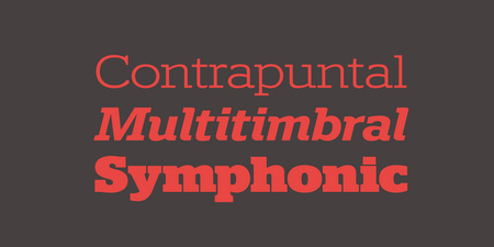
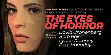
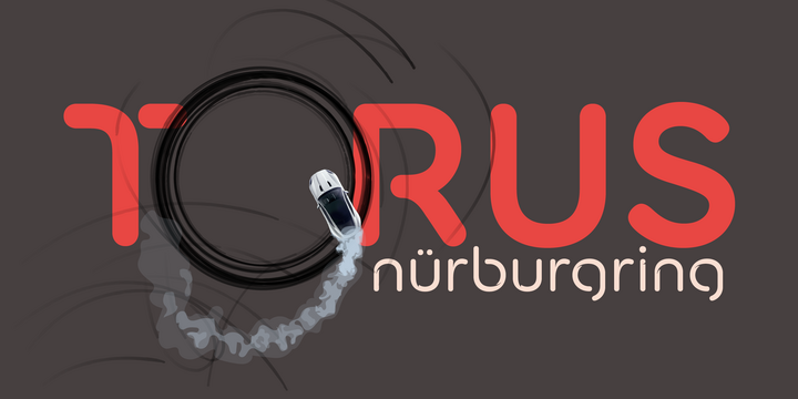
Fonts in use.





Type Designer
Paulo Goode
As a child I was fascinated by the multitude of letterforms that surround us, I would spend hours drawing words (and cars) in my sketchbooks. I don't know what happened to those sketches, but I certainly never made it as an automobile designer! Maybe there's a chance my fonts will prove more successful? As I grew up, I developed my artistic skills and became a technical illustrator and moved into graphic design with the advent of the Macintosh computer. At the age of 45 I rekindled my interest in typeface design and fell in love with the process of font creation and producing some interesting typefaces of distinction. I'm still fascinated by the multitude of letterforms that surround us, and am very happy to be contributing my own.

Monotype Fonts
Paulo Goode fonts are included with Monotype Fonts

