Fonts from Zapf Alphabets.

Discover the alphabets of Gudrun and Hermann Zapf, the legendary duo who elevated the art of calligraphy and type design to new heights. Born in 1918, their extraordinary journey has left a significant mark on the design landscape, with Hermann often hailed as one of the greatest type designers of all time.
Popular Zapf Alphabets Fonts.
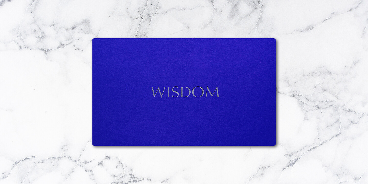
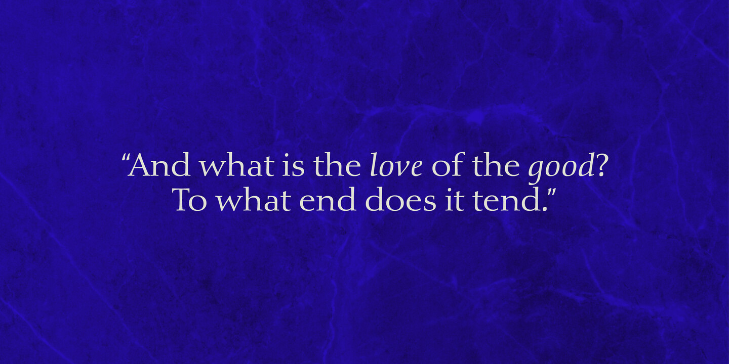
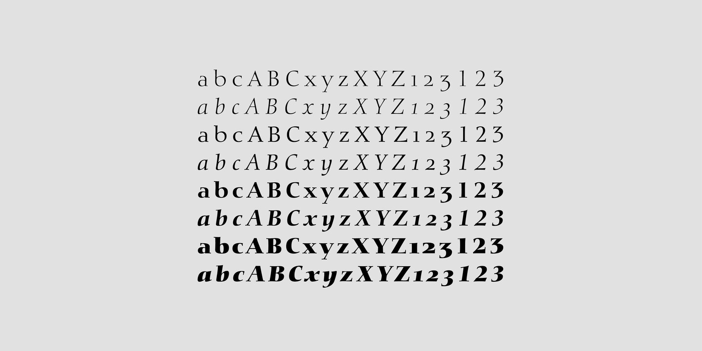
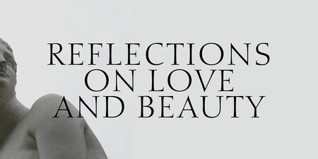
Rumor has it that Diotima is one of the most beautiful typefaces ever cast in metal. Decorated with the name of one of Plato’s protagonists from a dialogue about love, Gudrun created the design out of her calligraphic work for D. Stempel AG in 1948. And love is indeed a theme surrounding this typeface. In 1950 during an exhibition at the Staedel School in Frankfurt, the typeface caught the attention of one particular guest - Hermann Zapf - who was taken away by its mastery and its creator. A few years later, the couple married and continued their devotion for letters on a joint path. The most recent type family of Diotima Classic, co-created with Akira Kobayashi, includes four weights and is particularly suitable for festive and decorative designs.
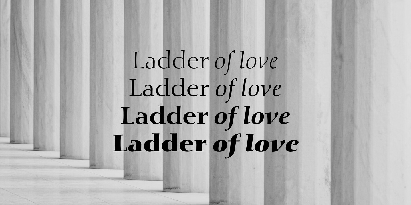
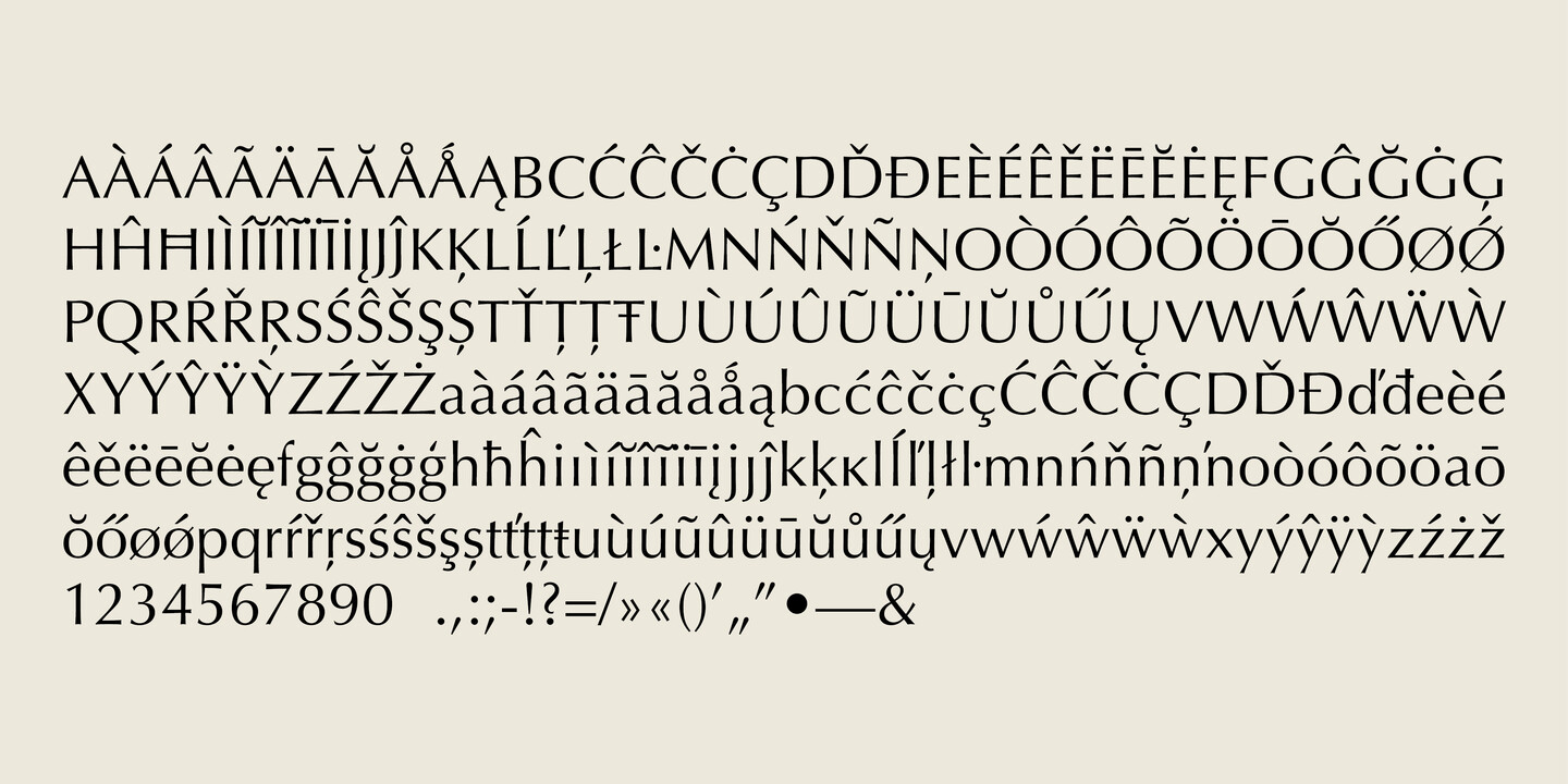
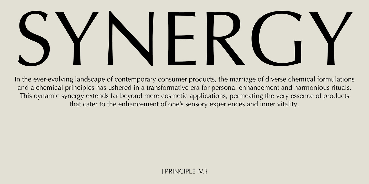
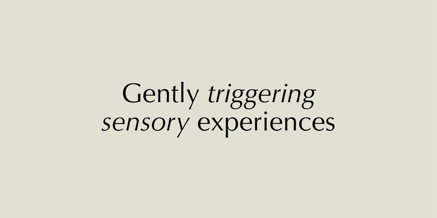
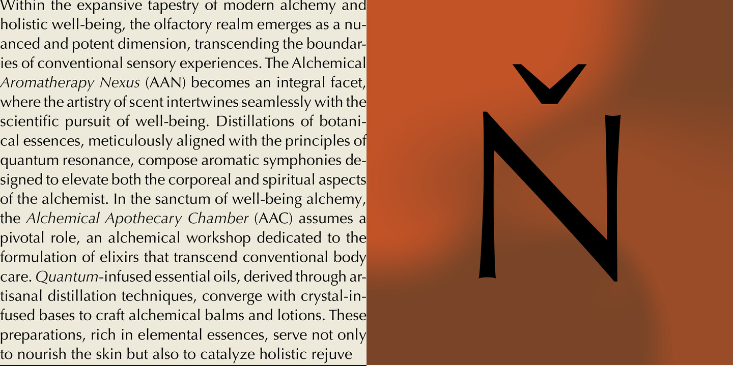
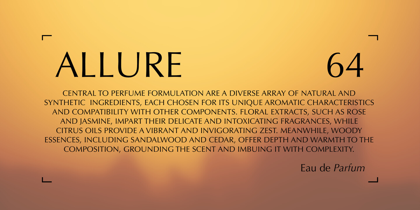
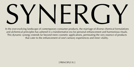
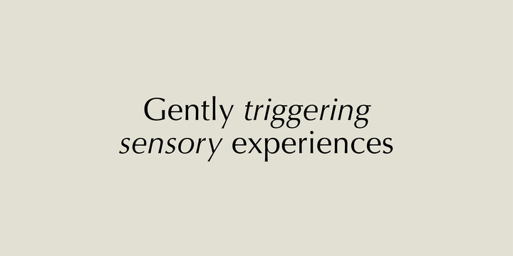
Inspired by Michelangelo’s grave inscriptions in Florence, Hermann sketched the first letters of Optima in 1949 on a 1000 lire note. Since then, it has enjoyed global popularity being the choice of large corporations, leading science institutions and inscribed on some of the most visited memorials like the Vietnam Veterans Memorial in Washington DC. Optima embodies the perfect blend of distinction and legibility, timeless elegance and the spirit of modernity. Its flexibility in line and letter spacing allows for seamless integration into diverse design compositions, complementing both serif and sans serif typefaces. The Optima family is available in twelve styles, from roman to extra black, each with an italic counterpart.
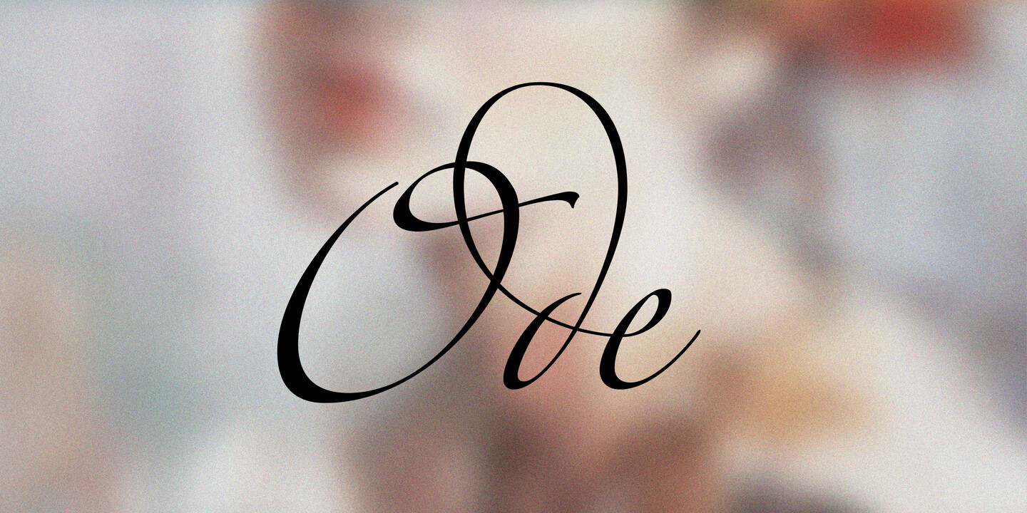
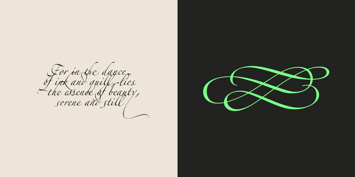
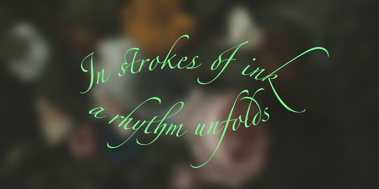
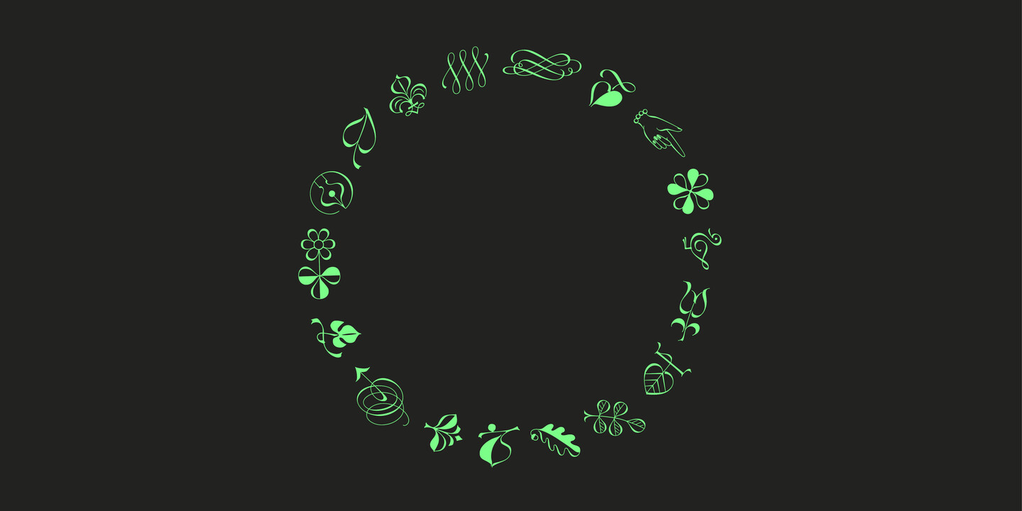
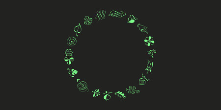
With its delicate swashes, it is hard to imagine that Zapfino revolutionized the world of digital typesetting. This typeface realised Hermann’s dream to recreate handwriting on the computer. The basic Zapfino font family, released in 1998, consists of four alphabets with many additional stylistic alternates that allows to emulate the variations in handwritten text. In collaboration with Akira Kobayashi, Hermann completed Zapfino Extra, a large expansion of the Zapfino family with plenty new characters. It includes exuberant hyper- flourishes, elegant small caps, dozens of ornaments, more alternates and ligatures, index characters, and a very useful “forte” (bold) version.
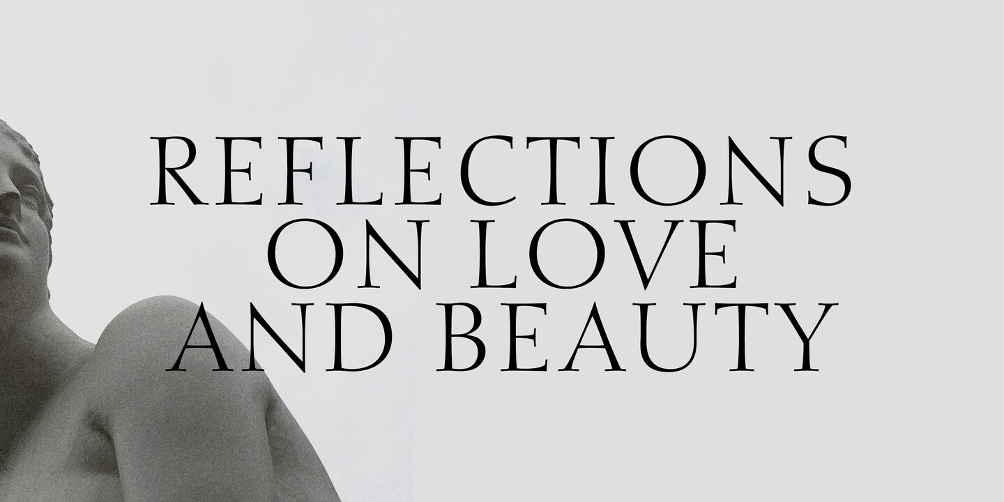
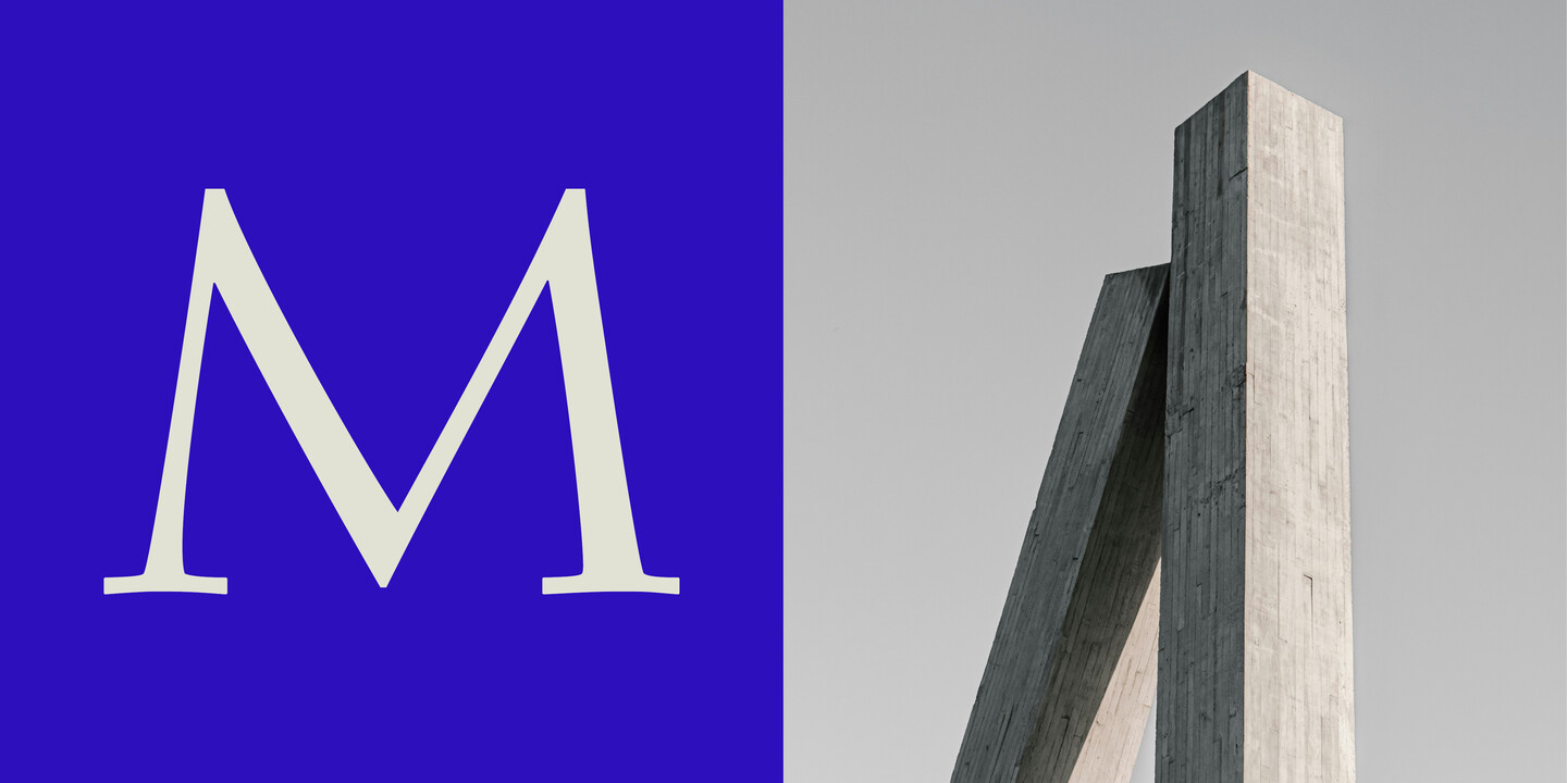
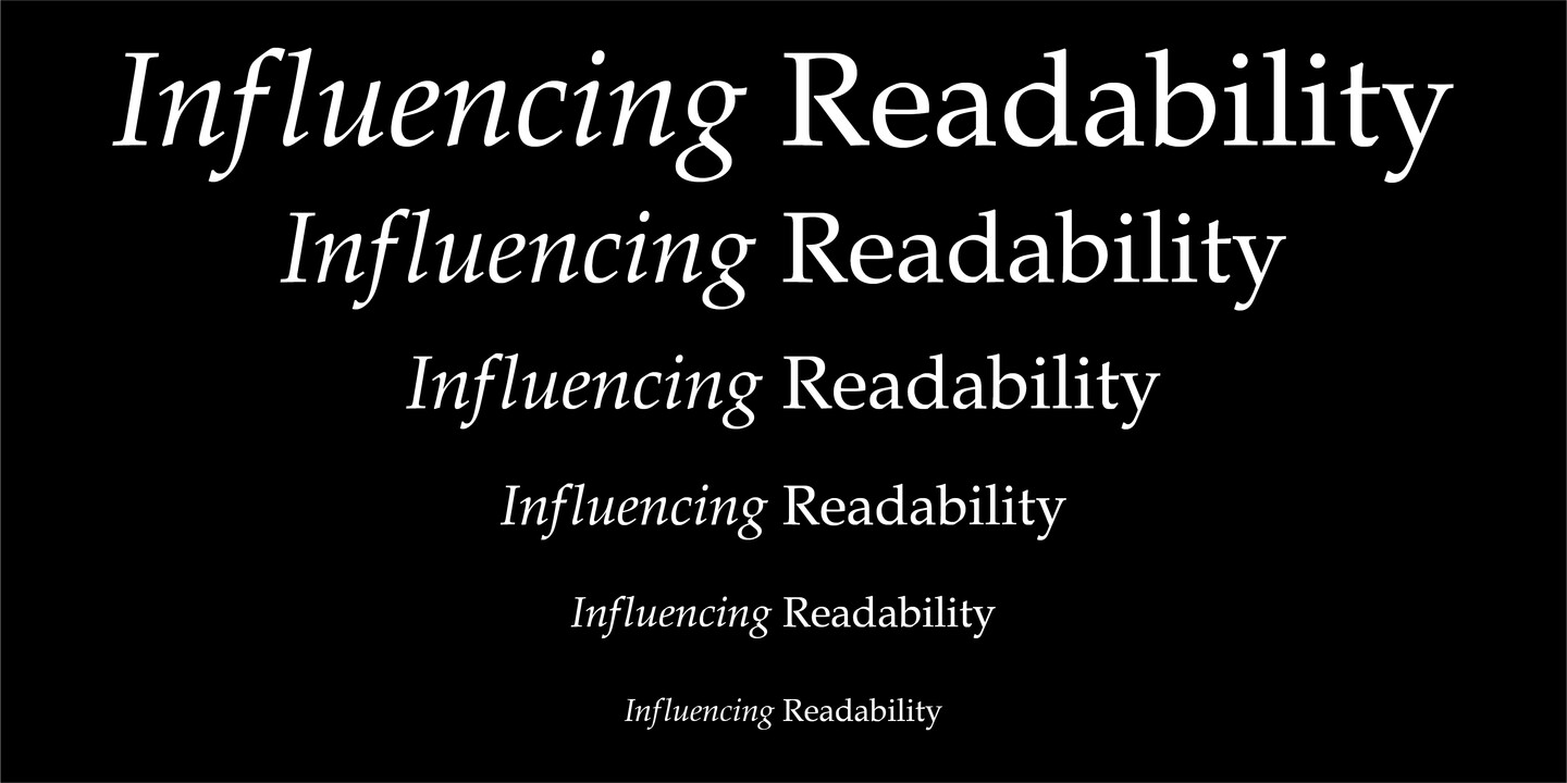
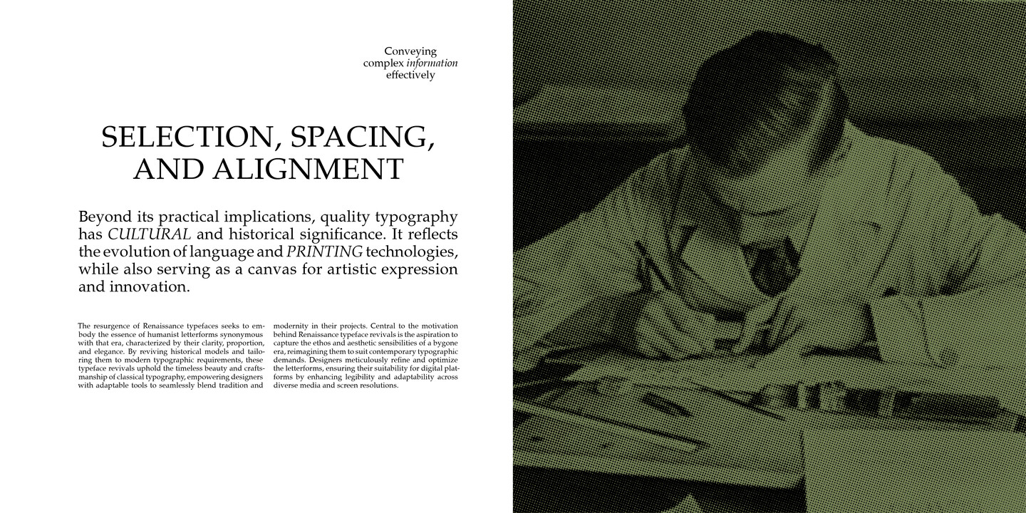
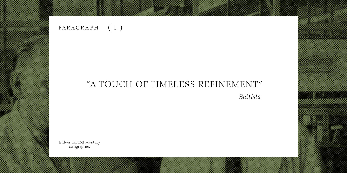
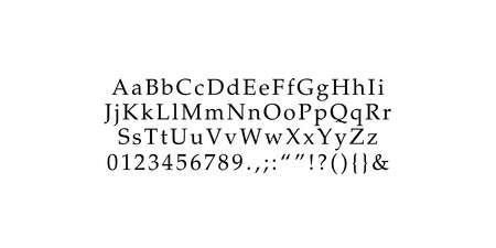
Embracing its calligraphic background, Palatino has its own unmistakable style, giving an impression of quiet restraint and strength with its graceful, clear shapes. Hermann drew the first letters for D. Stempel AG in 1948 which were cut by his long term collaborator August Rosenberger. The typeface instantly became an international success. It’s no coincidence then that Palatino is named after the Italian writing master Giovanni Battista Palatino, a contemporary of Michelangelo and Claude Garamond. The Palatino type family encompasses a variety of styles including Palatino Cyrillic and Arabic. Palatino Nova, the extension of the family, was co-created with Akira Kobayashi and released by Linotype in 2005.
Fonts in use.




Zapf Alphabets brings together the work of the acclaimed type designers Hermann and Gudrun Zapf who have been highly influential in paving the future of type design, calligraphy and computerised type setting. Today, the legacy is carried on by their three granddaughters Frieda, Isabel and Susanna.

Type Designer & Calligrapher
Hermann Zapf (1918-2015)
A Master of calligraphy, a digital pioneer of his time as well as a dedicated teacher of his craft: Hermann Zapf is celebrated for creating iconic fonts like Palatino, Optima and Zapfino. His innovative blend of traditional calligraphy with modern typography techniques established him as one of the most influential figures in the field.

Type Designer, Calligrapher & Book-binder
Gudrun Zapf-von Hesse (1918-2019)
A book bound by Gudrun is an art form in itself. And also her typeface designs many of which she cut herself in metal are of particular elegance and beauty, always rooted in the tradition of calligraphy. Throughout her career, she has created numerous fonts such as Diotima, Columbine and Hesse Antiqua.

Creative Director
Frieda Zapf
Frieda is the creative master mind behind Zapf Alphabets. Holding degrees in fine art from Central Saint Martins and sociology from LSE, she uses her knowledge of the cultural sector to spread awareness of typography in innovative ways. She has worked for leading cultural institutions and artists and is currently based in Berlin, Germany.

Co-director
Isabel Zapf
As a strategy consultant at McKinsey & Company, Isabel oversees the business side of Zapf Alphabets. With alphabets and design surrounding her since an early age, she highly appreciates aesthetics in daily life and sees typography as a powerful tool to get the right massages across.

Co-director
Susanna Zapf
Trained in business and law, Susanna has her eyes on the legal operations of the foundry. She is the youngest of the three sisters and passionate about letters as a tool for communication and debate of the critical topics in society.

Monotype fonts
Zapf Alphabets fonts are included with Monotype fonts.


