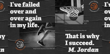
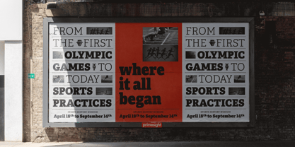
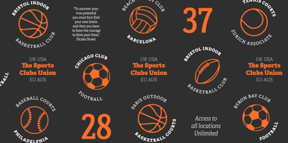
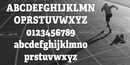
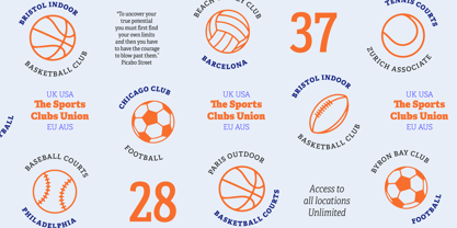
While Adelle is a slab serif typeface conceived by Veronika Burian and José Scaglione specifically for intensive editorial use, mainly in newspapers, magazines, and online, its personality and flexibility make it a true multipurpose typeface. Adelle’s superior screen rendering and cross-platform consistency has also made it one of our most popular webfonts.
The intermediate weights deliver a neutral look when used in text sizes, providing the usual robustness expected in a newspaper font. The unobtrusive appearance, excellent texture, and slightly dark colour allow it to behave flawlessly in continuous text, even in the most unforgiving editorial applications. As it becomes larger in print, Adelle shows its personality through a series of measured particularities which make it easy to remember and identify. Its energetic character, so inherent to slab serif fonts, becomes evident when used for subheadings and headlines.
A condensed series of seven weights with matching italics expand Adelle’s possibilities. This extension provides flexible solutions in situations where saving space is vital but losing legibility is not an option. The new condensed series shares the same personality, proportions, and skeleton of the Adelle family, creating an harmonious texture when combined.
Be sure to check out the companion to Adelle, Adelle Sans, to complete the look of your design with the intended personality and flexibility.
Awards
– Third prize for Latin text typeface in the 2009 Granshan Type Design Competition
– Won Gold for Original Typeface in the 2010 European Design Awards
– Selected in the first Ukrainian typeface competition in 2010
– Exhibited at the Rutenia Calligraphy & Typography Festival (http://rutenia.org.ua/en/index_u.html) in Kyiv, 2010
– Selected in the 2011 Type Directors Club Tokyo Exhibition
– Selected in Communication Arts 2011 Typography Annual
– Selected in Yearbook of Type I, 2013
– Part of the exhibition «Call for Type» and subsequent book Neue Schriften (New Typefaces)
About TypeTogether
Veronika Burian and José Scaglionemet and developed a respectful kinship while completing their Master’s degrees in type design at University of Reading, UK. Established in 2006, TypeTogether is an independent, cosmopolitan type foundry that creates text typography for intensive digital and print editorial use. We have grown into a core team living worldwide and invested in the daily work, networked with other type designers who intermittently cooperate on specific projects.
Through our unique, diverse, curated font platform, TypeTogether creates innovative and stylish solutions to the greatest problems in the professional typography market.
The advantage of being a small but highly specialized company is that we are able to work closely with our clients to accomplish their goals and to respond quickly to their requirements. To carry an organisation’s unique voice across all communications, TypeTogether creates custom type solutions for discerning clients worldwide. Distinct advantages in your market can be gained through logotype creation, commissioning a brand new typeface, modifying existing typefaces, or extending language support.
TypeTogether creates cross-platform OpenType fonts of recognised aesthetic and technical excellence and which perform well in continuous reading. Our internationally awarded catalogue — honoured for its high quality, usefulness, personality, and ability to grab attention — spans many languages and scripts and is diligently expanding each year.
Read more
Read less

