


Filters
Price
19
36
$
$
Only show free fonts
Visual properties
Weight
A
A
A
Regular
Width
A
A
A
Normal
X-Height
xA
xA
XA
Medium
Contrast
Low
Slant
I
I
I
Small
Advanced typography
- Kerning
Languages
Styles
- display
- Sans Serif


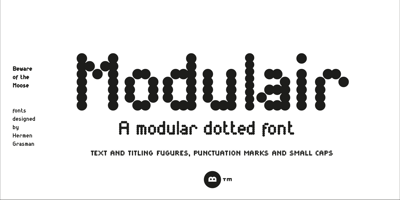
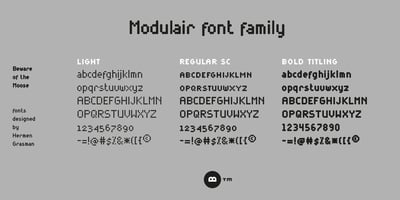
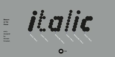
Beware of the moose
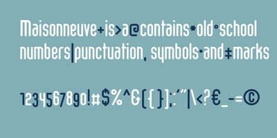
Beware of the moose is a Dutch font foundry of Hermen Grasman (1964) who was educated at the same art school as Wim Crouwel. The fonts usually form the basis of a clear geometric grid that partly determines the shape choices. They have a complete set of punctuation marks, numbers and special characters. Missing characters can be completed on request.
Related
48px
Images


2 styles
RegularFrom $35.99 USD