Select this license type when you are developing an app for iOS, Android, or Windows Phone, and you will be embedding the font file in your mobile application's code.
Biondi Sans
by Typodermic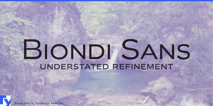

- Aa Glyphs
-
Best ValueFamily Packages
- Individual Styles
- Tech Specs
- Licensing
About Biondi Sans Font Family
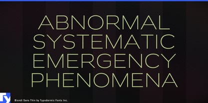
Introducing Biondi Sans, a typeface that captures the refined spirit of early 20th-century design while speaking fluently to modern sensibilities. Inspired by Morris Fuller Benton’s iconic Copperplate, Biondi Sans reimagines the elegance of engraved nameplates for the digital age.
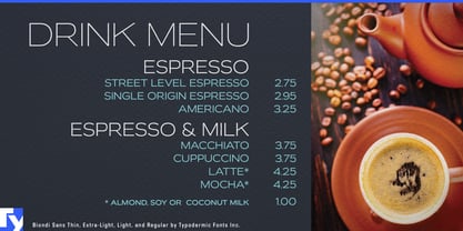
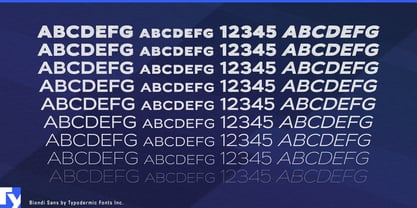
This typeface isn’t just a nod to the past—it’s a bridge between eras. Its clean, geometric letterforms pay homage to the charm of old American architectural lettering while offering the clarity and versatility demanded by contemporary design. Each character is a testament to the enduring power of thoughtful typography. Biondi Sans comes equipped with small caps and nine weight options, including slanted styles, providing designers with a rich palette to work from. Whether you’re crafting a headline that demands attention or body text that whispers sophistication, Biondi Sans delivers with precision and grace.
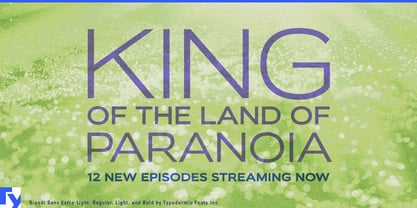
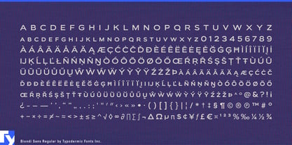
But Biondi Sans isn’t just about looking good—it’s about communicating effectively across borders. With support for a wide range of Latin-based European languages, from Afrikaans to Zulu, this typeface ensures your message retains its elegance in any tongue. Choose Biondi Sans when you need typography that speaks of heritage and innovation in the same breath. It’s equally at home gracing the pages of a high-end magazine, anchoring a corporate identity, or adding a touch of class to digital interfaces.
In a world of fleeting trends, Biondi Sans stands as a beacon of timeless design. It doesn’t just catch the eye—it holds the gaze, inviting readers to appreciate the artistry in every curve and line.
Experience the power of Biondi Sans and elevate your designs from merely current to genuinely classic. Because in the realm of typography, some impressions are meant to last forever.
Designers: Ray Larabie, Chikako Larabie
Publisher: Typodermic
Foundry: Typodermic
Design Owner: Typodermic
MyFonts debut: Mar 31, 2010

About Typodermic
Welcome to Typodermic Fonts, a spirited type foundry rooted in Nagoya, Japan, started by the Canadian typeface designer, Raymond Larabie in 2001. Our library brims with 500+ diverse typefaces to fuel creativity in graphic design, advertising, web, and app development. As digital type pioneers, we adopted web fonts and app licensing early, consistently pushing the design envelope. With Canadian heart and Japanese precision, we're your global partners in extraordinary typography. Explore Typodermic Fonts—where creativity meets character.
Read more
Read less
- Choosing a selection results in a full page refresh.