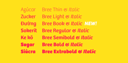
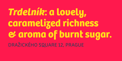
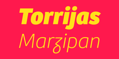
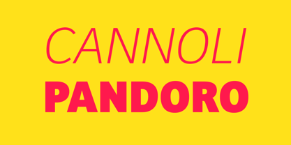
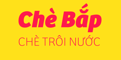
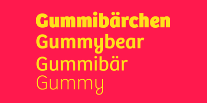
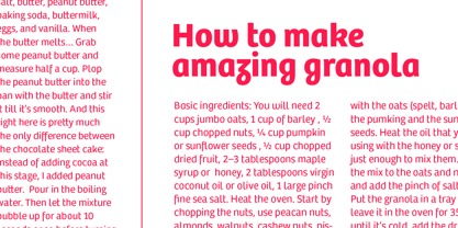
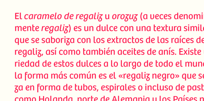
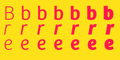
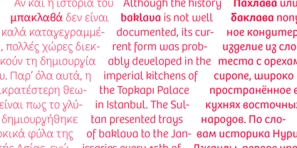
The Bree font family is a spry sans serif by Veronika Burian and José Scaglione that delivers a spirited look and feel for branding and headline usage. As an upright italic, Bree shows a pleasant mix of rather unobtrusive capitals with more vivid lowercase letters, giving text a lively appearance. Bree is clearly influenced by handwriting. As such, some of its most characteristic features are the single-story ‘a’, the cursive ‘e’, the outstroke curves of ‘v’ and ‘w’, the flourished ‘Q’, and the fluid shapes of ‘g’, ‘y’, and ‘z’. Alternates of these letters are available when a more neutral look is desired. Bree has a touch of cheekiness, a wide stance for each character, and an extra-large x-height. All this adds up to a big personality, so even when set in small text there is no skimming past the words Bree voices.
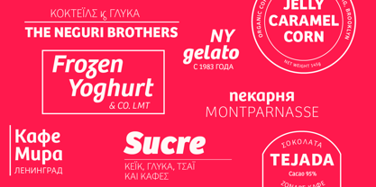
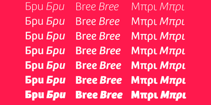
In 2019, the Bree font family got a huge update. A few shapes were updated or added (the ‘k’ and German capital ‘ß’), two entirely new weights were added (Book and Book Italic), and spacing was perfected. More than that, Vietnamese support was added to Bree Latin, and the Bree Greek and Bree Cyrillic scripts were designed from scratch to parallel the Latin’s tone. Additionally, Bree was designed in variable font format for those who want complete control over the font’s appearance while simultaneously saving digital weight in the form of kilobytes and megabytes. Bree is in the perfect position for the next digital revolution.
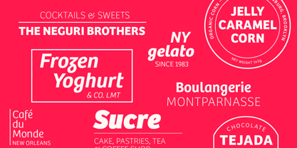
The complete Bree font family, along with our entire catalogue, has been optimised for today’s varied screen uses. Bree has been chosen for such wide-ranging uses as Breast Cancer Awareness Month in the US, the branding for the country of Peru, and numerous layouts including mobile apps, magazines, newspapers, and books.
Awards
– Tipos Latinos exhibition 2008
– Several best-of-the-year typeface lists of 2008
MyFonts Top 10 Fonts of 2008
Smashing Magazine: 60 Brilliant Typefaces For Corporate Design
https://www.smashingmagazine.com/2008/03/60-brilliant-typefaces-for-corporate-design/
Die besten Schriften 2008
http://www.fontwerk.com/619/die-besten-schriften-2008/
– Selected for Typographica’s Best Typefaces of 2008
– Won Bronze for Original Typeface in the 2009 European Design Awards
About TypeTogether
Veronika Burian and José Scaglionemet and developed a respectful kinship while completing their Master’s degrees in type design at University of Reading, UK. Established in 2006, TypeTogether is an independent, cosmopolitan type foundry that creates text typography for intensive digital and print editorial use. We have grown into a core team living worldwide and invested in the daily work, networked with other type designers who intermittently cooperate on specific projects.
Through our unique, diverse, curated font platform, TypeTogether creates innovative and stylish solutions to the greatest problems in the professional typography market.
The advantage of being a small but highly specialized company is that we are able to work closely with our clients to accomplish their goals and to respond quickly to their requirements. To carry an organisation’s unique voice across all communications, TypeTogether creates custom type solutions for discerning clients worldwide. Distinct advantages in your market can be gained through logotype creation, commissioning a brand new typeface, modifying existing typefaces, or extending language support.
TypeTogether creates cross-platform OpenType fonts of recognised aesthetic and technical excellence and which perform well in continuous reading. Our internationally awarded catalogue — honoured for its high quality, usefulness, personality, and ability to grab attention — spans many languages and scripts and is diligently expanding each year.
Read more
Read less

