Select this license type when you are developing an app for iOS, Android, or Windows Phone, and you will be embedding the font file in your mobile application's code.
CA Capoli
by Cape Arcona Type Foundry
- Aa Glyphs
-
Best ValueFamily Packages
- Individual Styles
- Tech Specs
- Licensing
Per Style:
$19.50 USD
Pack of 2 styles:
$39.00 USD
About CA Capoli Font Family
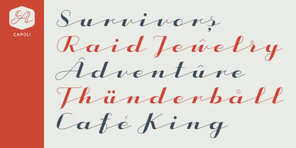
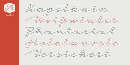
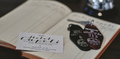
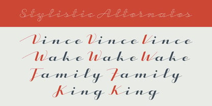
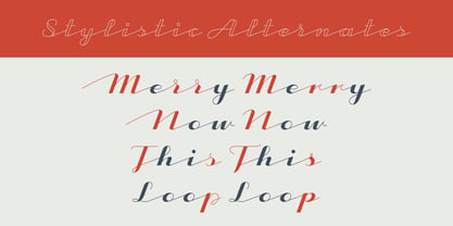
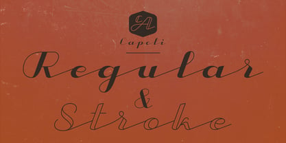
CA Capoli is a fine script typeface with a vintage touch. Perfect for illustrative titles or logotypes. It comes in two styles, Regular and Stroke. The inspiration came during our trip to Italy, where we took a short rest in a bar during a hot day. We discovered a simple ceramic ashtray on the table. The word “Nido” was inscribed in a typeface that looked like it dated back to the 1950s. We made some investigations about the word, its meaning and origin but it still remains a big mystery. Was it the name of a hotel or a restaurant or some vintage Italian cigarettes? We don’t know. We were so amazed about the design of the logo that we decided to create a typeface out of it. A sophisticated endeavor because we just had four letters. How could the rest of the letters – if it ever existed – have looked like? Our hypothesis is CA Capoli. A typeface with a full Central European character set and some nice alternative letters to chose from. When we thought about “Nido” and its possible derivation of hotel business, we felt like creating a small side project for this typeface, a brand for a fictional hotel called Hotel Capoli with business cards, letterheads, a reception book, key fobs and embroidered patches for the service dress of the hotel service stuff. The Hotel Capoli is located at the wonderful beach of Cape Arcona on the fictional country of Arcona Islands where our type foundry is located.
Designers: Thomas Schostok
Publisher: Cape Arcona Type Foundry
Foundry: Cape Arcona Type Foundry
Design Owner: Cape Arcona Type Foundry
MyFonts debut: Dec 18, 2015
About Cape Arcona Type Foundry
The Cape Arcona Type Foundry is a type studio based in Essen/Germany run by Stefan Claudius and Thomas Schostok, established in 2002. In our work, we are aiming for typefaces with a non-conformist personality. Over the years, the field of business expanded from individual typeface design to custom font production, corporate and logo design and complex text-font families. This is the kind of work we love: Thinking beyond the ordinary, imagining better worlds and better fonts.
Read more
Read less
- Choosing a selection results in a full page refresh.