Select this license type when you are developing an app for iOS, Android, or Windows Phone, and you will be embedding the font file in your mobile application's code.
Cormac
by Typedepot
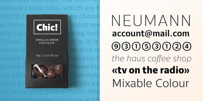
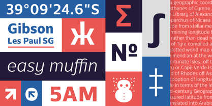
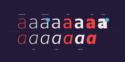
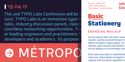
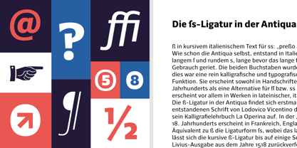
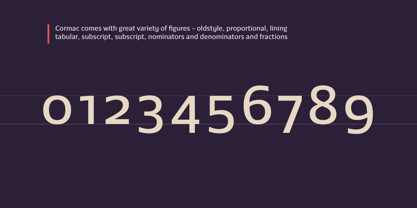
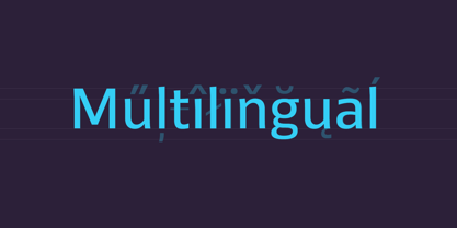
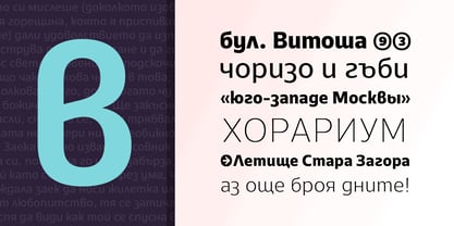
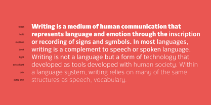
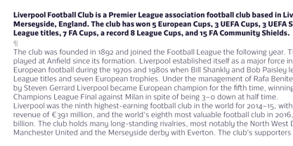
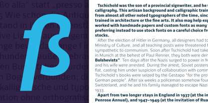

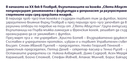
- Aa Glyphs
-
Best ValueFamily Packages
- Individual Styles
- Tech Specs
- Licensing
About Cormac Font Family
Designers: Alexander Nedelev
Publisher: Typedepot
Foundry: Typedepot
Design Owner: Typedepot
MyFonts debut: Jan 18, 2017
About Typedepot
Typedepot co-founders Alexander Nedelev and Veronika Slavova say, “In the beginning, Typedepot was a side project, nothing serious – just experimenting with letterforms. Then, in a moment it just felt more right to do this than anything else.” Based in Sofia, Bulgaria, the duo first came upon type design while working as graphic designers in advertising. “We had absolutely no background in type design,” Alexander says, “but we had this project, a logotype for a small company, which we developed to become the Glide typeface.” Two years later they rented an office, took the plunge and started designing type full time. “Now it’s the thing we do and the thing we love to do.” So far they’ve seen great success with Best Seller Centrale Sans. The modern sans serif typeface was featured as one of MyFonts Most Popular Fonts of 2011 and was featured in our Rising Stars Newsletter that same year. The self-taught designers whose foundry started out as a way to experiment with type, say that their main focus is “to design original typefaces for retail and custom use.”
Read more
Read less
- Choosing a selection results in a full page refresh.