Select this license type when you are developing an app for iOS, Android, or Windows Phone, and you will be embedding the font file in your mobile application's code.
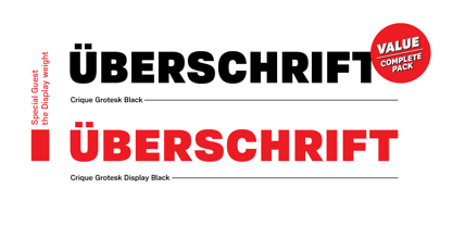
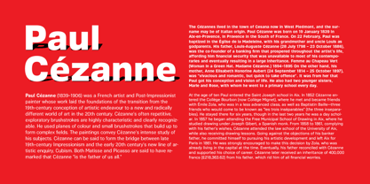
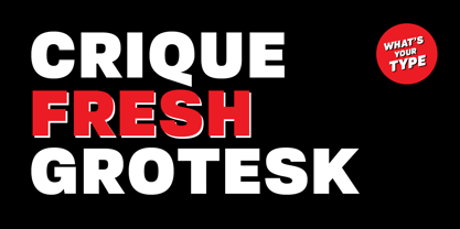
Crique Grotesk
by Stawix
- Aa Glyphs
-
Best ValueFamily Packages
- Individual Styles
- Tech Specs
- Licensing
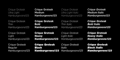
Crique Grotesk Normal Pack
17 fontsPer Style:
$8.76 USD
Pack of 17 styles:
$149.00 USD
Crique Grotesk Display Pack
16 fontsPer Style:
$9.31 USD
Pack of 16 styles:
$149.00 USD
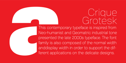
About Crique Grotesk Font Family
About Stawix
Located in the Thonglor district of Bangkok, Stawix was founded in 2012 and named for its founder, Stawix Ruecha. The foundry has since strived to reach its three main objectives. “First, our foundry was founded in the hope of starting a movement by designing Latin fonts and Thai alphabets that are suitable, in terms of design, for both languages while providing new possibilities,” Stawix says. “Second, we aim to enhance and maintain the standards of the Thai Type Design industry with fresh ideas. And lastly, we want to continue to pass on our knowledge of type design to the next generation of designers.” Stawix made his MyFonts debut with Seravee, a modern, rounded serif with a geometric base. His foundry has since grown to include designer Kawisara Vacharaprucks and has produced bestsellers like Soin Sans and Amsi Pro, which was inspired by the century-old typeface Block Berthold Condensed. “From our point of view, what makes our foundry unique is the enthusiasm and attentiveness we have towards our clients when they suggest changes or give us comments about our work,” Stawix says. “We believe that the font and the client’s need must be in related, therefore, we are always ready to improve the quality of our font in order to get the best possible outcomes.”
Read more
Read less
- Choosing a selection results in a full page refresh.