Skip to content
Home / Fonts / Paulo Goode / Eschaton
Eschaton

Eschaton

by Paulo Goode
Individual Styles from $36.00 USD
60% Off
Complete family of 36 fonts: $360.00 USD
Eschaton Font Family was designed by Paulo Goode and published by Paulo Goode. Eschaton contains 36 styles and family package options.

More about this family
FREE 30-DAY TRIAL of Monotype Fonts to get over 150,000 fonts from more than 1,400 type foundries. Start free trial
Start free trial

About Eschaton Font Family


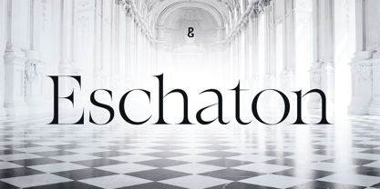
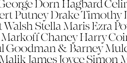
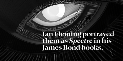
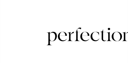
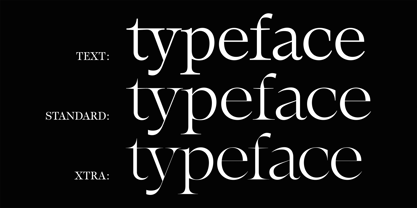
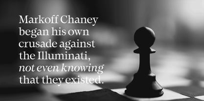
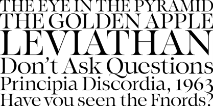
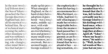
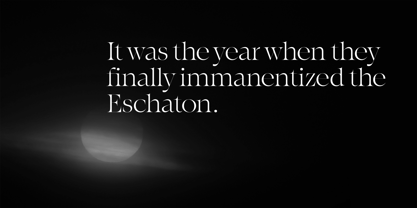
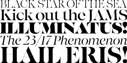
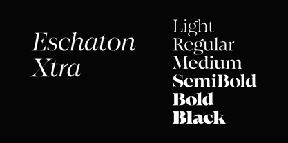
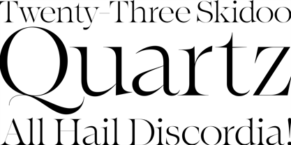
Eschaton is an exquisite transitional typeface whose delicate, high-contrast style exudes confidence – delivering your message with composure and clarity. This 36-font type family has a purposeful, contemporary stance that excels on screen and in print by way of its three optical sizes.

Eschaton’s elegantly clean and simple forms allow your text, your headlines, your message to stand proud and be heard – finding a moment of clarity in today’s world of continual visual bombardment.

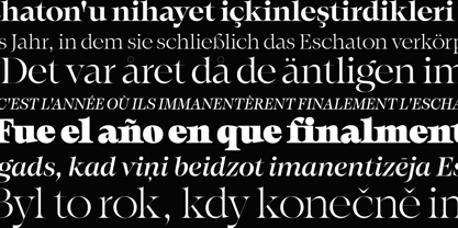
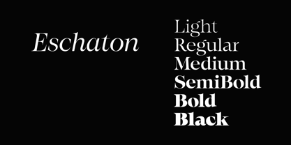
Eschaton is a refined display typeface in its standard form, the full family includes Text (lower contrast) and Xtra (extreme contrast) optical sizes to cater for further typographic demands. Weights range from light to black in both roman and italic styles. The default figure type is set to old-style, however, proportional figures are just a click away if you prefer. Eschaton has an extensive character set that covers all Latin European languages.

See full details and hi-res examples at https://paulogoode.com/eschaton

Key Features

• Six Weights

• Roman & Italic

• Three Optical Sizes

• 450+ Glyphs

Designers: Paulo Goode

Publisher: Paulo Goode

Foundry: Paulo Goode

Design Owner: Paulo Goode

MyFonts debut: Aug 22, 2024

Eschaton

About Paulo Goode

As a child I was fascinated by the multitude of letterforms that surround us, I would spend hours drawing words (and cars) in my sketchbooks. I don’t know what happened to those sketches, but I certainly never made it as an automobile designer! Maybe there’s a chance my fonts will prove more successful? As I grew up, I developed my artistic skills and became a technical illustrator and moved into graphic design with the advent of the Macintosh computer. At the age of 45 I rekindled my interest in typeface design and am thoroughly enjoying the process of font creation and producing some interesting typefaces of distinction. I'm still fascinated by the multitude of letterforms that surround us — and am very happy to be contributing my own.The Premium foundry page can be viewed Here.

Read more

Read less