Select this license type when you are developing an app for iOS, Android, or Windows Phone, and you will be embedding the font file in your mobile application's code.
Fremont Coffee
by Komet & Flicker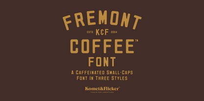




- Aa Glyphs
-
Best ValueFamily Packages
- Individual Styles
- Tech Specs
- Licensing
Per Style:
$12.66 USD
Pack of 3 styles:
$38.00 USD
About Fremont Coffee Font Family
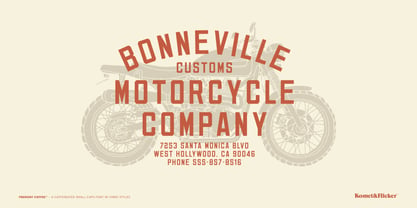
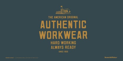
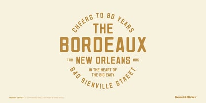
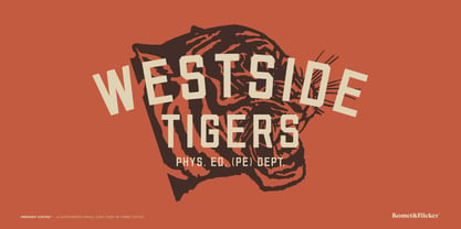
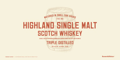
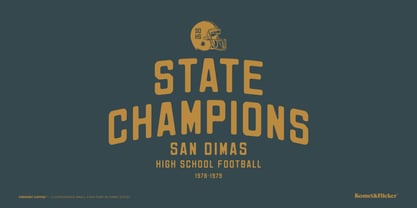
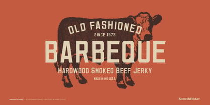
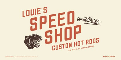
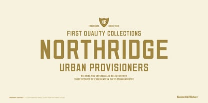
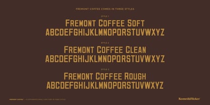
Get a shot of artisanal charm with Fremont Coffee, a font inspired by the chic menu boards of your favorite hipster coffee shop. This versatile typeface offers three distinct styles to suit your design needs: Fremont Coffee Clean, Fremont Coffee Soft and Fremont Coffee Rough.
The clean version brings a sharp, contemporary edge to your projects, perfect for adding a touch of sophistication without compromising on style. Ideal for menu designs, branding, and modern typography needs, this version provides a bold and crisp look.
With it’s rounded letterforms, the soft version evokes a rustic and well-worn feeling and is perfect for casual settings, from hip coffee shop menus to friendly flyers.
The rough version captures the gritty, hand-crafted feel of well weathered signage with its deliberately imperfect edges and textured appearance. This style comes with two unique glyph versions, allowing you to mix uppercase and lowercase letters for a more realistic look.
Embrace the blend of modern and rustic with Fremont Coffee, and let your designs brew up something special!
THIS FONT INCLUDES
• Full A-Z uppercase basic latin characters
• Select European specific characters
• Numbers, punctuation, and select symbols
Designers: David Phillips
Publisher: Komet & Flicker
Foundry: Komet & Flicker
Design Owner: Komet & Flicker
MyFonts debut: Sep 5, 2024
About Komet & Flicker
Founded in 2004 in Seattle, Washington by graphic designer and illustrator David Phillips, Komet & Flicker was started to blend David’s love of typography with functional and aesthetically pleasing fonts. Named after the memory of his beloved two cats, Komet & Flicker has grown to include a range of innovative and diverse of typefaces that blend tradition with contemporary aesthetics.
Read more
Read less