Select this license type when you are developing an app for iOS, Android, or Windows Phone, and you will be embedding the font file in your mobile application's code.
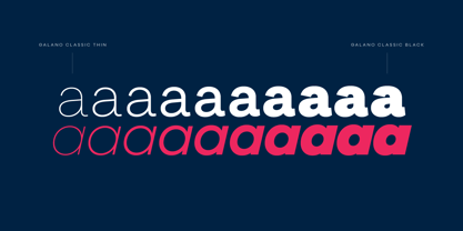
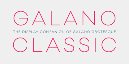
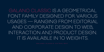
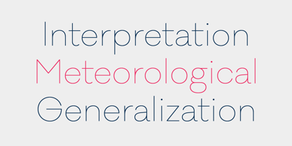
Galano Classic
by René Bieder


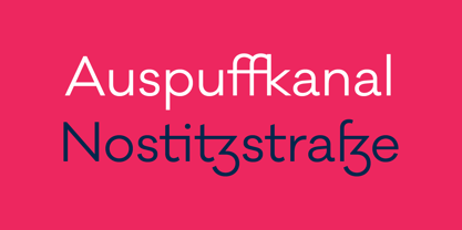
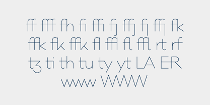
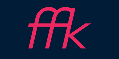
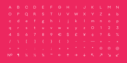




- Aa Glyphs
-
Best ValueFamily Packages
- Individual Styles
- Tech Specs
- Licensing
Galano Classic Family
20 fontsPer Style:
$9.50 USD
Pack of 20 styles:
$190.00 USD
Galano Classic Alt Family
20 fontsPer Style:
$9.50 USD
Pack of 20 styles:
$190.00 USD
Galano Classic Uprights Starterpack
10 fontsPer Style:
$15.00 USD
Pack of 10 styles:
$150.00 USD
Galano Classic Italics
10 fontsPer Style:
$15.00 USD
Pack of 10 styles:
$150.00 USD
Per Style:
$15.00 USD
Pack of 10 styles:
$150.00 USD
Galano Classic Alt Italics
10 fontsPer Style:
$15.00 USD
Pack of 10 styles:
$150.00 USD
Per Style:
$20.00 USD
Pack of 5 styles:
$100.00 USD
Per Style:
$20.00 USD
Pack of 5 styles:
$100.00 USD
Per Style:
$20.00 USD
Pack of 5 styles:
$100.00 USD
Per Style:
$20.00 USD
Pack of 5 styles:
$100.00 USD
About Galano Classic Font Family
Designers: René Bieder
Publisher: René Bieder
Foundry: René Bieder
Design Owner: René Bieder
MyFonts debut: Dec 31, 2014

About René Bieder
René Bieder (*1982) is a trained Graphic designer and Art Director and self taught type designer. Before setting up his own studio as a type designer in 2013, he was employed in various small and large advertising agencies as an Art Director and Graphic Designer working for national and international clients. During his agency time he developed a deep interest in type design and started designing typefaces as a side project. His second commercial release has won the title "Myfonts Most popular typeface of the year 2012". Since then his typefaces were a constant on the Myfonts best seller lists. Today, you can find his work all around the world. From the Nemo Science Museum in Amsterdam to the University of Florida.The Premium foundry page can be viewed Here.
Read more
Read less
- Choosing a selection results in a full page refresh.