Select this license type when you are developing an app for iOS, Android, or Windows Phone, and you will be embedding the font file in your mobile application's code.
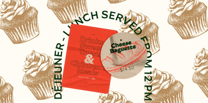
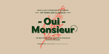
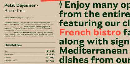
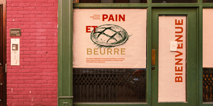
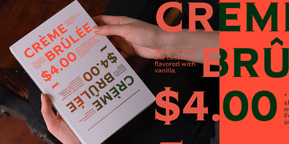
Garcon Grotesque
by Thomas Jockin
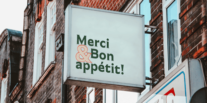
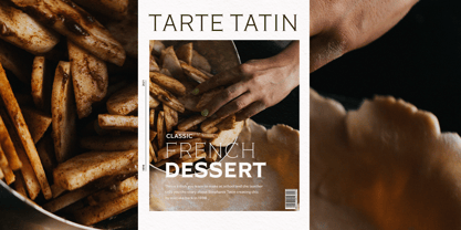
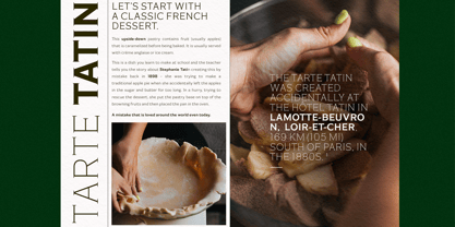
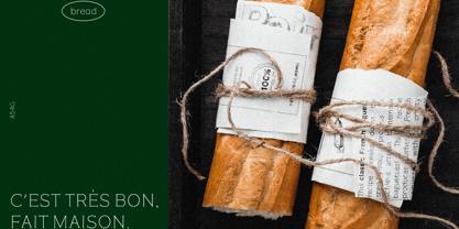
- Aa Glyphs
-
Best ValueFamily Packages
- Individual Styles
- Tech Specs
- Licensing
Per Style:
$45.00 USD
Pack of 5 styles:
$225.00 USD
About Garcon Grotesque Font Family
Designers:
Publisher: Thomas Jockin
Foundry: Thomas Jockin
Design Owner: Thomas Jockin
MyFonts debut: May 14, 2012
About Thomas Jockin
“I love the tough design briefs,” Thomas Jockin says. “A retail typeface is the chance to tackle bigger, and more complex, design problems.” Located in Williamsburg, Brooklyn, Thomas is a member at a co-working space called The Bakery. “I love the mix of different creative disciplines working in the same space,” he said in his #fontface feature. “I’m easily the messiest of my studio mates. I tell myself that my charming personality makes up for the gnarly feng-shui.” Thomas first became interested in type design when he met Joshua Darden, the chief designer and founder of the Brooklyn-based foundry Darden Studio. He spent three years as Joshua’s apprentice before moving on to study at the inaugural Type@Cooper program under Jesse Regan. He started his own foundry in 2011 with the release of his debut typeface, Garçon Grotesque. Since then, he’s gone on to release two more families: Ductus, a five-weight face whose style is as ancient as it is contemporary; and more recently, Azote, a multiline type family inspired by the 1968 Mexican Olympics that adds lines for weight. “One of my great joys in 2015 is the type design meet-up I organize called TypeThursday,” Thomas said. “It’s a monthly type critique meets social mixer meets a great time. With so much type talent and interest in New York, a meeting place for us all to catch up, share our work and relate outside Twitter made sense to me.”
Read more
Read less
- Choosing a selection results in a full page refresh.