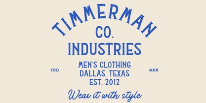
Hockey Display Typeface: Regular, Rough, and Texture Versions
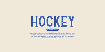
The Hockey Display Typeface is a versatile and bold typeface that captures the essence of the sport it’s named after. Available in three distinct versions—Regular, Rough, and Texture—this typeface offers a range of styles to suit different design needs while maintaining a consistent theme of strength and dynamism.
### Key Features:
1. Three Distinct Versions:
- Regular:
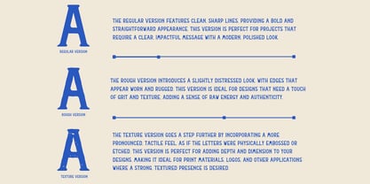
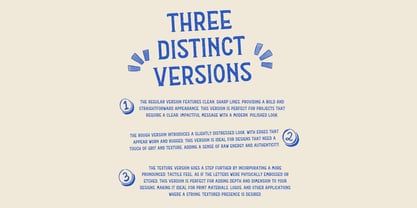
- The Regular version features clean, sharp lines, providing a bold and straightforward appearance. This version is perfect for projects that require a clear, impactful message with a modern, polished look.
- Rough:
- The Rough version introduces a slightly distressed look, with edges that appear worn and rugged. This version is ideal for designs that need a touch of grit and texture, adding a sense of raw energy and authenticity.
- Texture:
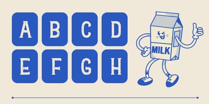
- The Texture version goes a step further by incorporating a more pronounced, tactile feel, as if the letters were physically embossed or etched. This version is perfect for adding depth and dimension to your designs, making it ideal for print materials, logos, and other applications where a strong, textured presence is desired.
2. Sport-Inspired Design:
- All three versions are inspired by the fast-paced, high-energy nature of hockey, featuring bold characters with a sense of motion and power.
3. Versatility Across Styles:
- The availability of three different styles allows designers to choose the version that best fits their project, whether it’s a clean, modern look with Regular, a rugged, dynamic feel with Rough, or a deep, tactile impact with Texture.
4. High Readability:
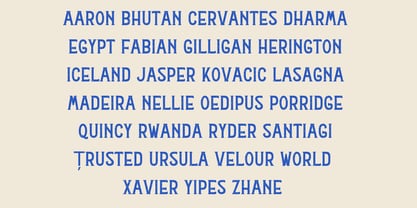
- Despite the variations in texture and style, each version maintains excellent readability, ensuring that your message is clear and impactful, whether on a small or large scale.
### Applications:
- Sports Branding:
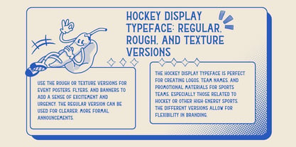
- The Hockey Display Typeface is perfect for creating logos, team names, and promotional materials for sports teams, especially those related to hockey or other high-energy sports. The different versions allow for flexibility in branding, from a clean look with Regular to a more rugged or textured feel with Rough or Texture.
- Event Promotions:
- Use the Rough or Texture versions for event posters, flyers, and banners to add a sense of excitement and urgency. The Regular version can be used for clearer, more formal announcements.
- Merchandise Design:
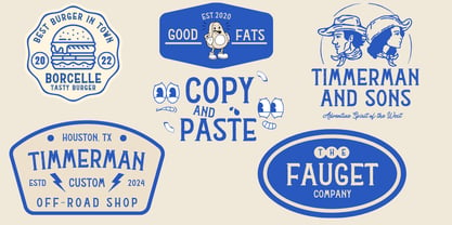
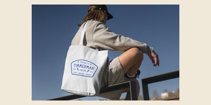
- All three versions work well on apparel, accessories, and other branded merchandise. The Texture version, in particular, adds a tactile feel that can make printed items stand out.
- Headline Typography:
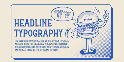
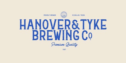
- The bold and dynamic nature of the Hockey typeface makes it ideal for headlines in magazines, websites, and advertisements. The Rough and Texture versions can add an extra layer of visual interest.
### Conclusion:
The Hockey Display Typeface, with its three distinct versions—Regular, Rough, and Texture—provides a versatile toolkit for designers looking to convey strength, energy, and dynamism in their projects. Whether you need a clean, modern look, a rugged edge, or a textured impact, Hockey delivers with style and readability, making it perfect for sports branding, event promotions, and any design that requires a bold, athletic presence.
