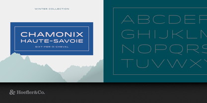
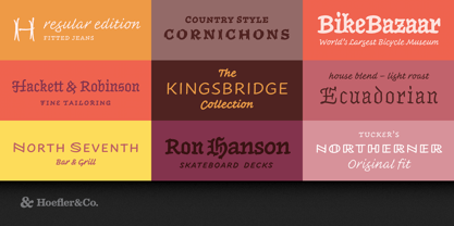
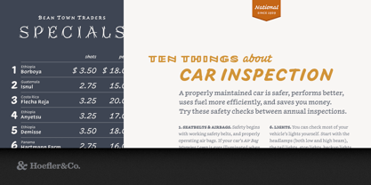
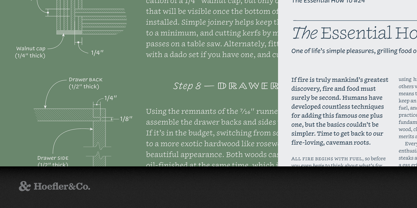
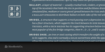
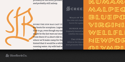
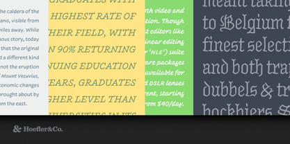
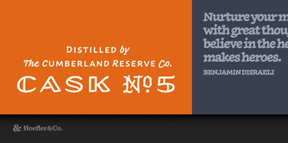
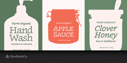
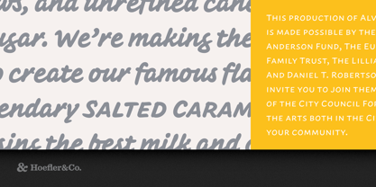
A tiny universe of fonts that combines the informality of handwriting, the expressiveness of lettering, and the versatility of type.
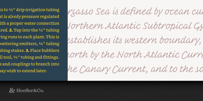
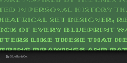
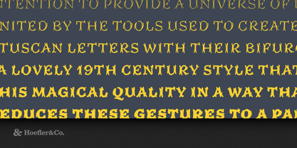
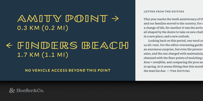
The Inkwell family of typefaces was designed by Jonathan Hoefler beginning in 2004. Designed to combine the informality of handwriting, the expressiveness of lettering, and the versatility of type, Inkwell was the first typeface to interpret a broad range of typographic styles using the aesthetic of handwriting. A family of families, Inkwell includes both serif and sans serif, a connecting script, a blackletter, a decorative ‘tuscan’ alphabet, a set of open capitals evoking draftsman’s lettering, and a condensed sans serif. Inkwell was expanded and completed with the help of Jordan Bell, and published by Hoefler&Co in 2017.
From the desk of the designer:
Typefaces, by design, are unyielding in their style: a good typeface commits to a single visual idea, and explores it with thoroughness and consistency to produce a dependable tool for designers. Contrast this with handwriting, which serves only to record the thoughts of an author, but has the freedom to move from style to style as the message dictates. A writer might scribble a paragraph in cursive handwriting, but punctuate key points with capitals, or backtrack to over-ink some crucial point with darker and more deliberate strokes. It’s a flexibility that makes handwritten communications compelling, and makes the medium of writing infinitely expressive. By comparison, typography can feel almost stifling.
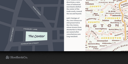
Inkwell brings this versatility to the designer, with a collection of styles that captures the honest and familiar qualities of the pen. Designed with care but without affectation, Inkwell portrays letters made with care and purpose, but without the formality and mannerism of calligraphy. At its heart, Inkwell is a text face, the alphabet with which you might letter an entire book if you had infinite time and patience. It’s designed for sophisticated typography, with the character set, weight range, and technical finish demanded by exacting typographers, so it’s up to the task of rendering even maps, reference books, and mobile apps. It offers a fresh take on “serious typography” by being thoroughwithout being earnest.
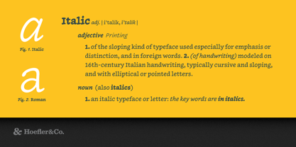
Inkwell is provided in a range of styles with which readers already have clear associations: a bookish Serif and a cleanly printed Sans, a conversational Script, a ceremonial Blackletter, a fancy Tuscan for decoration, and a stately Open for titles. Each style is offered in six weights, from a technical pen Thin to a graffiti marker Black, all designed to be used interchangeably, so that every font can serve as a companion to its cousins.
Inkwell®
is a registered trademark of The Hoefler Type Foundry, Inc.
About Hoefler & Co.
Famous for designing long-lived typefaces marked by high performance and high style, Hoefler&Co creates the fonts that give voice to the world’s foremost institutions, publications, causes, and brands. With a library of 1,500 fonts designed for print, web, office, and mobile fonts, Hoefler&Co is everywhere. Their typefaces shaped the presidential campaigns of Barack Obama and Joe Biden; they’re on the cornerstone of One World Trade Center and on every iPhone ever made. They serve brands from Delta Air Lines to Tiffany & Co., publications from Harper’s Bazaar to The New York Times, institutions such as the Guggenheim Museum, The Public Theater, and New York University, and non-profit organizations including the Natural Resources Defense Council, the Southern Poverty Law Center, and The Peconic Land Trust. The Premium foundry page can be viewed Here.
Read more
Read less
