Select this license type when you are developing an app for iOS, Android, or Windows Phone, and you will be embedding the font file in your mobile application's code.
Mixolydian
by Typodermic
- Aa Glyphs
-
Best ValueFamily Packages
- Individual Styles
- Tech Specs
- Licensing
About Mixolydian Font Family
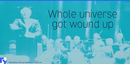
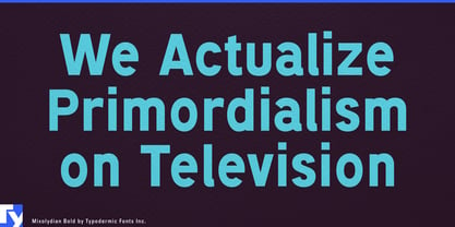
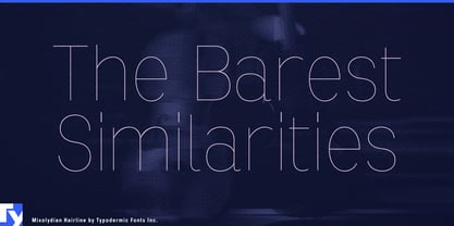
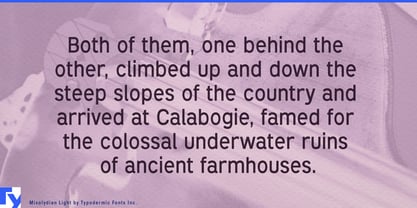
Ladies and gentlemen, prepare yourselves for Mixolydian—the sans-serif typeface that’s about as pretty as a punch in the gut, but twice as effective. This isn’t your grandma’s fancy script or your hipster cousin’s trendy handwritten font. No, Mixolydian is the typographic equivalent of a no-nonsense scientist who’s too engrossed in groundbreaking research to care about their bedhead.
Let’s be clear: Mixolydian isn’t here to win beauty pageants. It’s here to solve equations, draft blueprints, and present data with all the charm of a brick through a plate-glass window. This font doesn’t do “pretty”—it does “trustworthy” with a capital T and “gravitas” with a capital G (which, by the way, looks particularly unadorned and effective in Mixolydian). Born from the utilitarian foundations of the Federal Highway Administration Standard alphabet and architectural drafting templates, Mixolydian is as American as questionable road design and overengineered buildings. It’s the typographic rebel that looked at European technical fonts and said, “Hold my beer.”
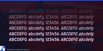
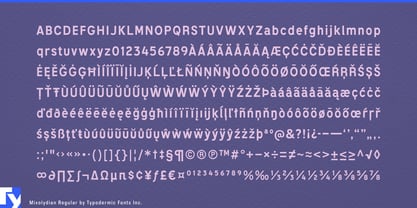
Mixolydian’s letters march across the page with all the grace of a military parade led by a three-legged dog. That intentionally off-kilter rhythm isn’t a bug—it’s a feature. It’s there to remind you that in the world of hard data and cold facts, symmetry is for suckers and beauty is skin deep. But trustworthiness? That goes all the way to the core. With six weights and six highly inclined obliques, Mixolydian gives you more options than a scientific calculator. Whether you’re designing the next mind-numbing technical manual or creating signage for a nuclear power plant, Mixolydian has got your back. It’s versatile enough to handle any project you throw at it, as long as that project doesn’t involve looking good. Mixolydian speaks more languages than a United Nations interpreter with a photographic memory. From Afrikaans to Zuni, this font ensures your message maintains its utilitarian charm whether you’re labeling test tubes in Latvia or drafting environmental impact reports in Ecuador.
Choose Mixolydian when you need your audience to trust your message more than they trust their own mother. Use it when you want your designs to scream “competence” louder than a jet engine. Deploy it when beauty is a distraction and cold, hard facts are the main attraction. Remember, in a world obsessed with surface-level aesthetics, Mixolydian dares to be deliberately unattractive. It’s not just a font; it’s a statement. A statement that says, “I’m too busy revolutionizing the world to care about looking pretty.” So go ahead, embrace the ugliness. Let Mixolydian turn your designs into beacons of trustworthiness in a sea of frivolous beauty.
Designers: Ray Larabie
Publisher: Typodermic
Foundry: Typodermic
Original Foundry: Typodermic
Design Owner: Typodermic
MyFonts debut: Jan 9, 2012
About Typodermic
Welcome to Typodermic Fonts, a spirited type foundry rooted in Nagoya, Japan, started by the Canadian typeface designer, Raymond Larabie in 2001. Our library brims with 500+ diverse typefaces to fuel creativity in graphic design, advertising, web, and app development. As digital type pioneers, we adopted web fonts and app licensing early, consistently pushing the design envelope. With Canadian heart and Japanese precision, we're your global partners in extraordinary typography. Explore Typodermic Fonts—where creativity meets character.
Read more
Read less
- Choosing a selection results in a full page refresh.