Select this license type when you are developing an app for iOS, Android, or Windows Phone, and you will be embedding the font file in your mobile application's code.
Penny Lane
by K-Type


- Aa Glyphs
-
Best ValueFamily Packages
- Individual Styles
- Tech Specs
- Licensing
Per Style:
$2.22 USD
Pack of 9 styles:
$20.00 USD
About Penny Lane Font Family
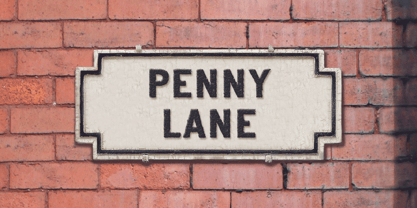
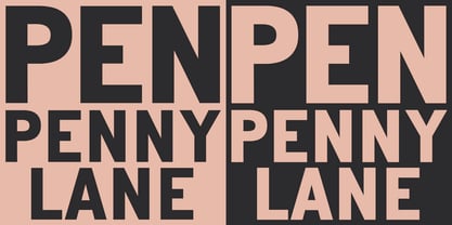
PENNY LANE is a sans serif derived from twentieth-century cast-iron signs displaying Liverpool street names. Although the lettering used for vintage street signs varies in width and style, the semi-condensed Penny Lane Bold is fairly typical. The waist of letters like X and Y is positioned on the midline so may appear unusually high, the G is without a crossbar, and pointed characters like the Z might seem at odds with generally grotesque letter shapes. Penny Lane is a straightforward, usable sans that looks modern and has a fresh lowercase with a healthy x-height designed for clarity; the fonts have been inspired by street sign lettering rather than insensitively tied to historical accuracy. A full complement of Latin Extended-A characters is included. Four nameplate frames can be found within each font for designing faux street signs, and a blank nameplate jpeg is also supplied. Five fonts for the price of one – Regular, Italic, Bold and Bold Italic weights, and also a distressed Corroded Bold, made to simulate the roughness of cast and painted letters when creating reproduction signs.
Designers: Keith Bates
Publisher: K-Type
Foundry: K-Type
Design Owner: K-Type
MyFonts debut: May 30, 2014

About K-Type
K-Type is a small, independent type foundry based in Manchester England, offering a unique range of high quality fonts which are modestly and simply priced for designers, small businesses and large organisations.In addition to creating new typefaces resulting from formal experimentation, many K-Type fonts show the influence of inspirational artists and designers, many exploring the mix of insular and eclectic that has forged the typographical landscape of Britain and America.K-Type is also keen to make affordable fonts from styles which possess cultural currency or an existing social presence, generally redrawn to include comprehensive character sets containing a full complement of Latin Extended-A glyphs. New, previously unavailable weights and italics are often designed and added.
Read more
Read less
- Choosing a selection results in a full page refresh.