Select this license type when you are developing an app for iOS, Android, or Windows Phone, and you will be embedding the font file in your mobile application's code.
Performa
by Resistenza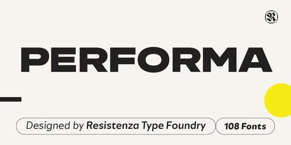

- Aa Glyphs
-
Best ValueFamily Packages
- Individual Styles
- Tech Specs
- Licensing
About Performa Font Family
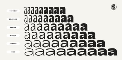
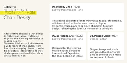
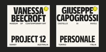
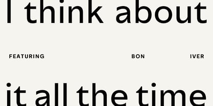
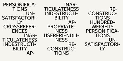
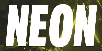
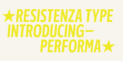
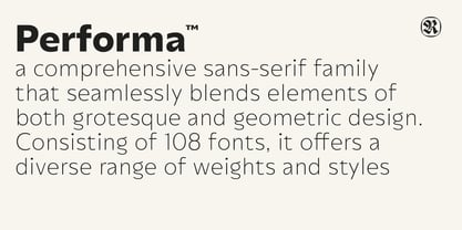
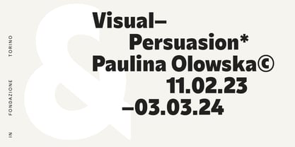
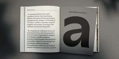
Meet Performa, a versatile sans-serif font family that seamlessly unites the structured aesthetics of geometric typefaces with the subtle sophistication of grotesque designs. Featuring an impressive 108-font collection, Performa spans a complete range of weights and widths—from Thin to Black and Compress to Wide. This expansive flexibility makes it an ideal choice for creative and professional projects, offering both style and functionality.
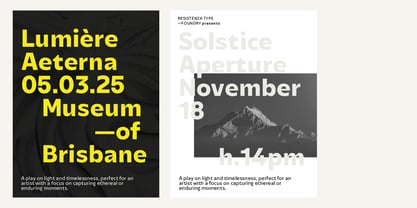
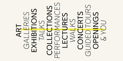
Performa was created to handle a wide variety of design needs with ease and reliability. It adapts effortlessly from detailed editorial layouts and striking packaging to dynamic user interfaces and cohesive brand systems. Rounded letterforms and open counterspaces ensure exceptional readability, while unique angular details add energy and character. Balancing geometric precision with a touch of grotesque influence, Performa offers an abundance of stylistic possibilities to tackle any design challenge with elegance and adaptability.
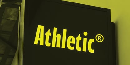
Designed with a focus on clarity and readability, Performa performs beautifully across all mediums, whether on digital screens, in print, or within environmental graphics. Its crisp, refined shapes ensure legibility at any size while adding a modern, approachable feel. This makes Performa perfect for editorial design, branding, web interfaces, and more, delivering a polished yet inviting visual presence.
Designers: Giuseppe Salerno, Paco González
Publisher: Resistenza
Foundry: Resistenza
Design Owner: Resistenza
MyFonts debut: Nov 13, 2024

About Resistenza
Resistenza specializes in type-design, branding, calligraphy & lettering. Giuseppe Salerno and Paco González are the two founder, italian and spanish, their passion for writing and handcrafted lettering became their strenghts. Brushy types, calligraphic strokes, orginality in faces are their best distinguished characteristic. The first type was Afrobeat, a multiline circular type that grows up very fast and becase their first product on the list. But afterwards may other experiments more expressive like Berliner Fraktur, or an english copperplate like Copperlove bring Giuseppe Salerno's hand into a typeface. The Premium Foundry page can be viewed Here.
Read more
Read less
- Choosing a selection results in a full page refresh.