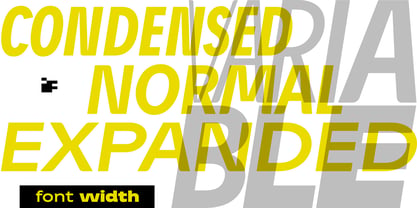
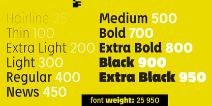
Petermann Condensed Hairline
Petermann Condensed Hairline Italic
Petermann Condensed Thin
Petermann Condensed Thin Italic
Petermann Condensed Extra Light
Petermann Condensed Extra Light Italic
Petermann Condensed Light
Petermann Condensed Light Italic
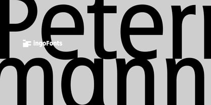
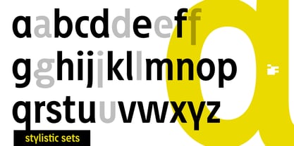
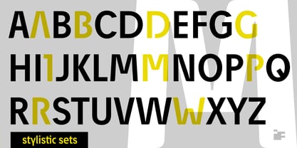
Petermann Condensed Regular
Petermann Condensed Italic
Petermann Condensed News
Petermann Condensed News Italic
Petermann Condensed Medium
Petermann Condensed Medium Italic
Petermann Condensed Bold
Petermann Condensed Bold Italic
Petermann Condensed Extra Bold
Petermann Condensed Extra Bold Italic
Petermann Condensed Black
Petermann Condensed Black Italic
Petermann Condensed Extra Black
Petermann Condensed Extra Black Italic
Petermann Hairline
Petermann Hairline Italic
Petermann Thin
Petermann Thin Italic
Petermann Extra Light
Petermann Extra Light Italic
Petermann Light
Petermann Light Italic
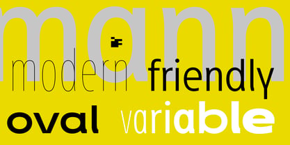
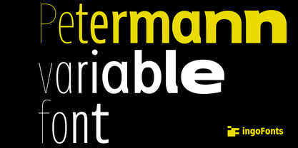
Petermann Regular
Petermann Italic
Petermann News
Petermann News Italic
Petermann Medium
Petermann Medium Italic
Petermann Bold
Petermann Bold Italic
Petermann Extra Bold
Petermann Extra Bold Italic
Petermann Black
Petermann Black Italic
Petermann Extra Black
Petermann Extra Black Italic
Petermann Expanded Hairline
Petermann Expanded Hairline Italic
Petermann Expanded Thin
Petermann Expanded Thin Italic
Petermann Expanded Extra Light
Petermann Expanded Extra Light Italic
Petermann Expanded Light
Petermann Expanded Light Italic
Petermann Expanded Regular
Petermann Expanded Italic
Petermann Expanded News
Petermann Expanded News Italic
Petermann Expanded Medium
Petermann Expanded Medium Italic
Petermann Expanded Bold
Petermann Expanded Bold Italic
Petermann Expanded Extra Bold
Petermann Expanded Extra Bold Italic
Petermann Expanded Black
Petermann Expanded Black Italic
Petermann Expanded Extra Black
Petermann Expanded Extra Black Italic
Petermann VF Italic Norm Italic
Petermann VF Normal