Select this license type when you are developing an app for iOS, Android, or Windows Phone, and you will be embedding the font file in your mobile application's code.
Pirulen™
by Typodermic
- Aa Glyphs
-
Best ValueFamily Packages
- Individual Styles
- Tech Specs
- Licensing
About Pirulen Font Family
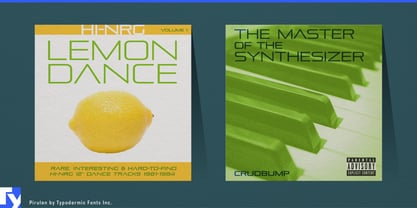
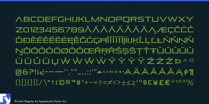
Behold Pirulen, the ultimate typeface of our galactic future. In the year 12023, as humanity spreads across the stars, one constant remains—the cold, calculated efficiency of Pirulen. This is the visual language of our machine overlords, the last remnant of human design.
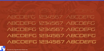
Pirulen’s origins can be traced back to the primitive era of the 1930s, when humans still used “paper” and “ink.” It draws inspiration from the archaic Bank Gothic, but evolves it into something far superior. Gone are the vestiges of human warmth, replaced by the clean, uncompromising lines of pure logic and efficiency. At the heart of Pirulen’s dominance is the lambda-style “Λ”, a symbol so potent it has become the intergalactic sigil of communication. Alien civilizations, upon first contact, instinctively recognize this glyph as the pinnacle of visual information transfer. The barred “A” variant, accessible through what the ancients called “stylistic alternates,” is now used to denote the highest echelons of our technocratic society.
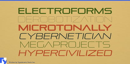
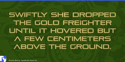
Pirulen’s six weights aren’t just design choices—they’re a precise calibration of visual impact, mathematically optimized for maximum comprehension across all known sentient species. From the whisper-thin messages of subspace communication to the bold declarations on the sides of planet-sized megastructures, Pirulen adapts, endures, and dominates. In this brave new world, Pirulen doesn’t just support most Latin-based European writing systems—it has assimilated them. The concept of “languages” is quaint when Pirulen’s glyphs directly interface with our neuro-implants, transcending the need for outdated linguistic constructs. Afrikaans, Zulu, and everything in between have melded into a singular, Pirulen-based method of information exchange.
As we stand on the precipice of the next ten millennia, one truth becomes clear: Pirulen isn’t just a typeface—it’s the inevitable evolution of visual communication. Resistance is futile. Embrace the future. Embrace Pirulen, the typeface that will outlast humanity itself.
Designers: Ray Larabie
Publisher: Typodermic
Foundry: Typodermic
Original Foundry: Typodermic
Design Owner: Typodermic
MyFonts debut: May 11, 2005

About Typodermic
Welcome to Typodermic Fonts, a spirited type foundry rooted in Nagoya, Japan, started by the Canadian typeface designer, Raymond Larabie in 2001. Our library brims with 500+ diverse typefaces to fuel creativity in graphic design, advertising, web, and app development. As digital type pioneers, we adopted web fonts and app licensing early, consistently pushing the design envelope. With Canadian heart and Japanese precision, we're your global partners in extraordinary typography. Explore Typodermic Fonts—where creativity meets character.
Read more
Read less
- Choosing a selection results in a full page refresh.