Detailed guided tour available
here.
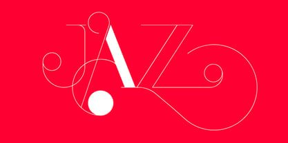
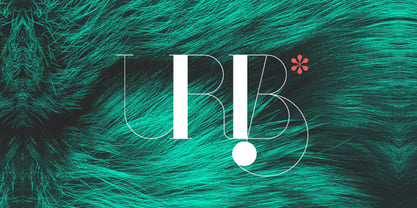
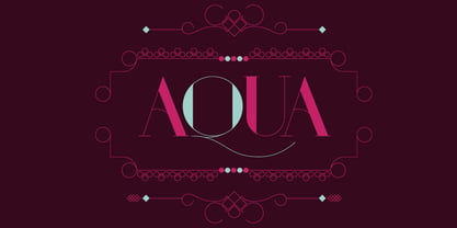
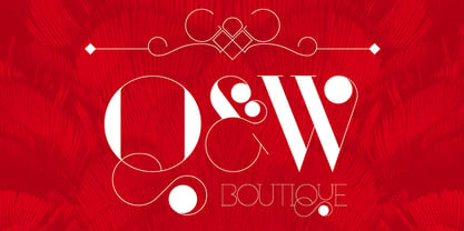
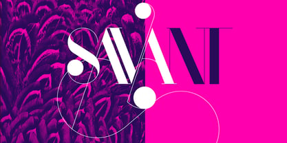
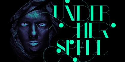
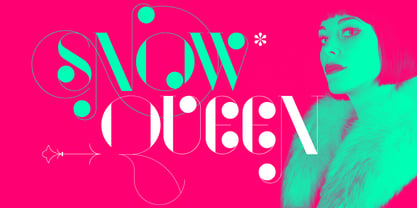
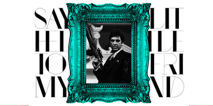
Port is an experimental Didone typeface with a modern twist, inspired in the well known forms of typography masters such as Bodoni and Didot and the exuberance and elegance of calligraphy typefaces.
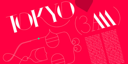
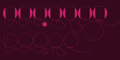
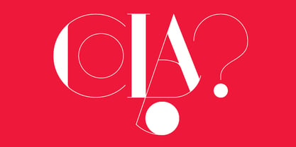
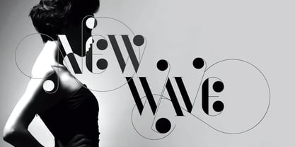
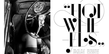
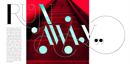
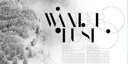
Port melds the straight lines and strong contrasts of the Didone typefaces with the elegant lines of calligraphy in a geometric way, resulting in exuberant characters with geometric swashes that can be combined in countless ways.
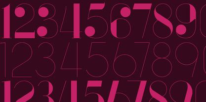
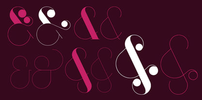
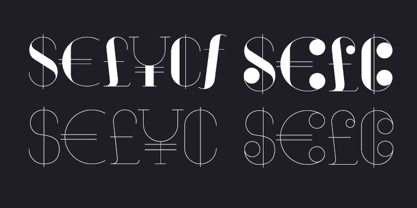
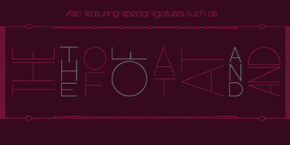
The result of this experiment is Port, an unique and rich display typeface meant to be used on big sizes and it’s main perk is the amount of alternative characters it features. Port is Open-Type programmed and includes hundreds of alternates, from swashes to titling alternates, ligatures and stylistic sets with each character having a thin version of itself, giving complete freedom to all your creative needs.
Port is available in several flavours:
Port Regular, being the base version and featuring the whole base character set;
Port Regular Decorated, featuring richer forms and containing more ornamentated and more extravagant characters; Port Medium and
Port Medium Regular, designed for the occasions you need a bit more thickness and the decoration variants:
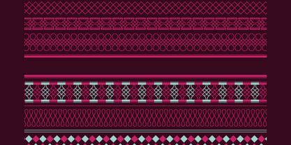
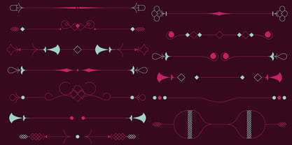
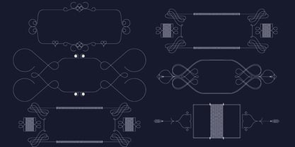
Port Ornaments, containing a wide set of elements meant for the creation of fillets, vignettes and fleurons, resulting in an almost infinite number of possible combinations to embellish your designs and
Port Words, a set of some of the most common words used in English, Spanish, French, German, Italian and Portuguese.
It’s strongly recommended that you use it on big sizes, for better performance you can also set the Photoshop text anti aliasing settings to Strong when you type, for a better understanding of all the uses of Port and the full character list I recommend the reading of the
manual.


