Select this license type when you are developing an app for iOS, Android, or Windows Phone, and you will be embedding the font file in your mobile application's code.
Portland
by Fenotype




- Aa Glyphs
-
Best ValueFamily Packages
- Individual Styles
- Tech Specs
- Licensing
Basic typesetting
Letter case
Numerals and scientific typesetting
Typographic variants
Reset
Per Style:
$16.25 USD
Pack of 4 styles:
$65.00 USD
About Portland Font Family
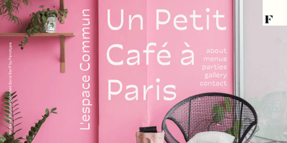
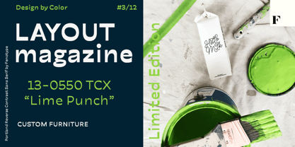
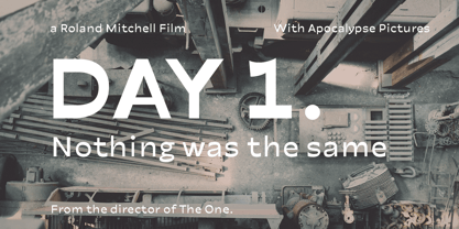
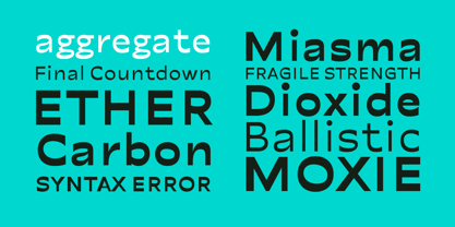
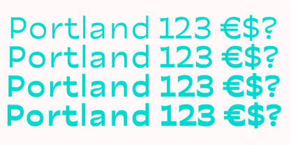
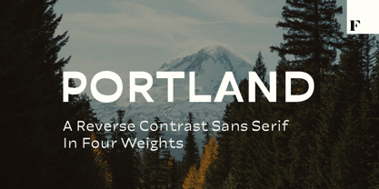
Made you look? There’s a peculiar feel to the letters – achieved by the reversed contrast. Perfectly legible yet there’s something about the characters that makes them stand out. As Viktor Shklovsky once coined, ”Habitualization devours objects” – the everyday world becomes invisible until we are forced to see it otherwise.
The Portland font family is a tool of choice when you want to effortlessly make your designs stand out.
Designers: Emil Karl Bertell, Erik Jarl Bertell, Teo Tuominen
Publisher: Fenotype
Foundry: Fenotype
Design Owner: Fenotype
MyFonts debut: Feb 14, 2020
About Fenotype
Emil Bertell has done it all. Having published his first font files at 16, he was considered to be an international free-font hero while still in his teens. He went on to attend design college, drop out, and become a well-known graphic designer and illustrator. Now one of the most successful type designers from the Nordic countries on MyFonts, the Finland-based designer said in his Creative Characters interview that he’s “had an obsession with visual culture from the beginning.” Before turning his ...
Read more


