Select this license type when you are developing an app for iOS, Android, or Windows Phone, and you will be embedding the font file in your mobile application's code.
Prog
by Talbot Type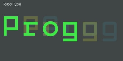
- Aa Glyphs
-
Best ValueFamily Packages
- Individual Styles
- Tech Specs
- Licensing
Per Style:
$12.66 USD
Pack of 3 styles:
$38.00 USD
About Prog Font Family
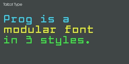
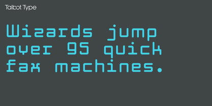
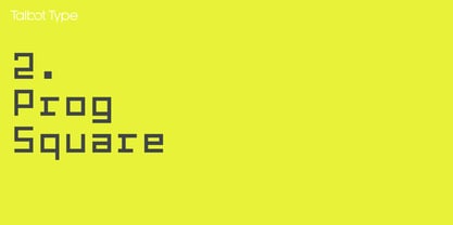
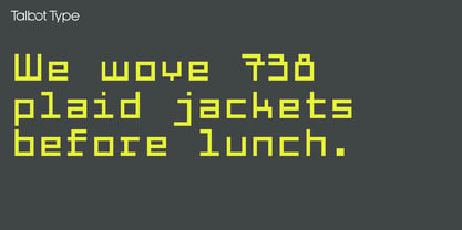
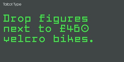
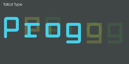
Prog is a modular font created on a five by nine square grid. The x-height, and consequently most of the lower case adheres to a five by five grid, with an additional two units above and two units below for capitals, ascenders and descenders.
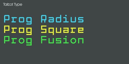
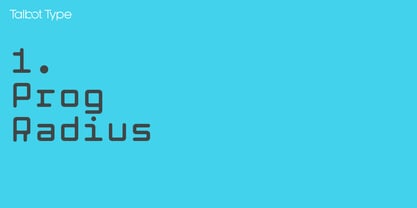
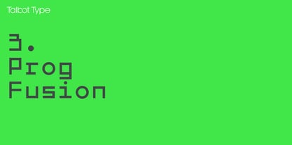
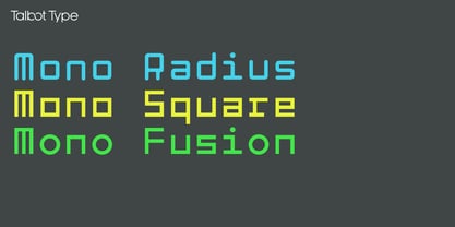
There are three versions of Prog available: Square (square-edged), Radius (round-edged) and Fusion which is essentially square but with round O's, round punctuation and diagonal 45° X's. The addition of a few disruptive characters makes quite a difference to the look of the font, it has a bit of a dangerous quality.
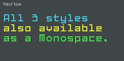
A few characters, namely the M and W in both upper and lower case are granted a width of seven units to give them a more conventional look, however for the purists, a monospace version of the font also exists in all three styles, which demands that the M's and W's are restricted to a width of five units.
All versions have full upper and lower case character sets and includes all accented characters for Western and Central European languages.
Designers: Adrian Talbot
Publisher: Talbot Type
Foundry: Talbot Type
Design Owner: Talbot Type
MyFonts debut: Oct 14, 2024
About Talbot Type
Most of my fonts are influenced by the classic movements of the twentieth century — Modernism, the Bauhaus, Constructivism and Art Deco — I aspire to create timeless designs, valid now and in the future. These are not showy faces, but practical, hard-working text and display fonts. Occasionally I branch out into more experimental, display fonts, possibly as a result of my years as a graphic designer with a focus on identities and communications and the need to stand out from the crowd — in a good way.
Read more
Read less
- Choosing a selection results in a full page refresh.