Select this license type when you are developing an app for iOS, Android, or Windows Phone, and you will be embedding the font file in your mobile application's code.
Refuel
by Typodermic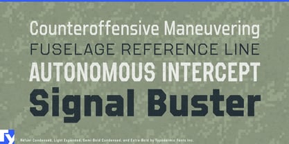
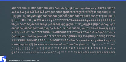


- Aa Glyphs
-
Best ValueFamily Packages
- Individual Styles
- Tech Specs
- Licensing
Basic typesetting
Letter case
Numerals and scientific typesetting
Typographic variants
Reset
About Refuel Font Family
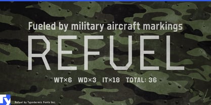
Prepare for takeoff with Refuel, the typeface that brings military-grade precision to your designs. This is a typographic wingman, ready to elevate your message to cruising altitude and beyond.
Inspired by the no-nonsense world of military aviation markings, Refuel’s octagonal letterforms stand at attention, ready to deploy your words with the authority of a five-star general. Each character is a marvel of typographic engineering, as aerodynamic as a stealth fighter and as robust as a battle-tested bomber. Refuel’s unique features are more than just eye candy—they’re mission-critical. The automatic serif production when a capital “I” meets a lowercase “L” isn’t just clever; it’s a tactical advantage in the war against illegibility. It’s the typographic equivalent of radar, ensuring your message cuts through the noise with pinpoint accuracy.
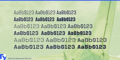
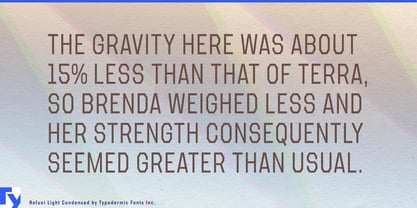
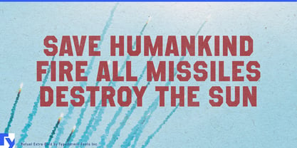
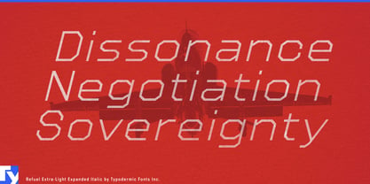
With six weights, six widths, and a full squadron of italics, Refuel gives you more firepower than an aircraft carrier. From the sleek, streamlined lighter weights that slip through defenses like a reconnaissance drone, to the heavy-hitting bold styles that drop your message like a payload, Refuel has you covered for any typographic sortie. This typeface doesn’t just cross borders—it flies over them. Supporting a vast array of Latin-based European, Vietnamese, Greek, and Cyrillic-based writing systems, Refuel ensures your message has clearance to land in territories from Afrikaans to Zulu. It’s your linguistic passport, ready to communicate with the precision of an air traffic controller in multiple languages.
Why settle for typography that merely gets the job done when you can deploy Refuel and watch your designs take flight? Get it now and transform your projects from ground-bound to stratospheric. Whether you’re crafting a logo that needs to break the sound barrier of brand recognition or designing a website that requires the navigational clarity of a heads-up display, Refuel is standing by, ready for action.
Designers: Ray Larabie
Publisher: Typodermic
Foundry: Typodermic
Original Foundry: Typodermic
Design Owner: Typodermic
MyFonts debut: Dec 14, 2016

About Typodermic
Welcome to Typodermic Fonts, a spirited type foundry rooted in Nagoya, Japan, started by the Canadian typeface designer, Raymond Larabie in 2001. Our library brims with 500+ diverse typefaces to fuel creativity in graphic design, advertising, web, and app development. As digital type pioneers, we adopted web fonts and app licensing early, consistently pushing the design envelope. With Canadian heart and Japanese precision, we're your global partners in extraordinary typography. Explore Typodermic Fonts—where creativity meets character.
Read more
Read less


