


Select this license type when you are developing an app for iOS, Android, or Windows Phone, and you will be embedding the font file in your mobile application's code.

Roc Grotesk Font Family was
designed by
Nikola Kostić and
published by
Kostic. Roc Grotesk contains
45
styles and family package options.
More about this family
- Aa Glyphs
-
Best ValueFamily Packages
- Individual Styles
- Tech Specs
- Licensing
Basic typesetting
Letter case
Numerals and scientific typesetting
Typographic variants
Reset
Select style to display all glyphs:
Roc Grotesk Compressed Thin
▲
Roc Grotesk Compressed Thin
Roc Grotesk Compressed Extra Light
Roc Grotesk Compressed Light
Roc Grotesk Compressed
Roc Grotesk Compressed Medium
Roc Grotesk Compressed Bold
Roc Grotesk Compressed Extra Bold
Roc Grotesk Compressed Black
Roc Grotesk Compressed Heavy
Roc Grotesk Condensed Thin
Roc Grotesk Condensed Extra Light
Roc Grotesk Condensed Light
Roc Grotesk Condensed
Roc Grotesk Condensed Medium
Roc Grotesk Condensed Bold
Roc Grotesk Condensed Extra Bold
Roc Grotesk Condensed Black
Roc Grotesk Condensed Heavy
Roc Grotesk Thin
Roc Grotesk Extra Light
Roc Grotesk Light
Roc Grotesk Regular
Roc Grotesk Medium
Roc Grotesk Bold
Roc Grotesk Extra Bold
Roc Grotesk Black
Roc Grotesk Heavy
Roc Grotesk Wide Thin
Roc Grotesk Wide Extra Light
Roc Grotesk Wide Light
Roc Grotesk Wide
Roc Grotesk Wide Medium
Roc Grotesk Wide Bold
Roc Grotesk Wide Extra Bold
Roc Grotesk Wide Black
Roc Grotesk Wide Heavy
Roc Grotesk Extra Wide Thin
Roc Grotesk Extra Wide Extra Light
Roc Grotesk Extra Wide Light
Roc Grotesk Extra Wide
Roc Grotesk Extra Wide Medium
Roc Grotesk Extra Wide Bold
Roc Grotesk Extra Wide Extra Bold
Roc Grotesk Extra Wide Black
Roc Grotesk Extra Wide Heavy
Roc Grotesk Compressed Thin - Glyph count:
This is a listing of all glyphs contained in the font, including OpenType variants that may only be accessible via OpenType-aware applications.
Each basic character (“A”) is followed by Unicode variants of the same character (Á, Ä…), then OpenType variants (small caps, alternates, ligatures…). This way you can see all the variations on a single character in one place.
About this glyph
Unicode: ( )
Access this glyph
Copy-Paste:
Windows:
Mac:
HTML Entity:
Roc Grotesk Wide Family
9 fontsPer Style:
$21.00 USD
Pack of 9 styles:
$189.00 USD
Roc Grotesk Normal Family
9 fontsPer Style:
$21.00 USD
Pack of 9 styles:
$189.00 USD
Roc Grotesk Extra Wide Family
9 fontsPer Style:
$21.00 USD
Pack of 9 styles:
$189.00 USD
Roc Grotesk Condensed Family
9 fontsPer Style:
$21.00 USD
Pack of 9 styles:
$189.00 USD
Roc Grotesk Compressed Family
9 fontsPer Style:
$21.00 USD
Pack of 9 styles:
$189.00 USD
-
from $40.00 USD
-
from $40.00 USD
-
from $40.00 USD
-
from $40.00 USD
-
from $40.00 USD
-
from $40.00 USD
-
from $40.00 USD
-
from $40.00 USD
-
from $40.00 USD
-
from $40.00 USD
-
from $40.00 USD
-
from $40.00 USD
-
from $40.00 USD
-
from $40.00 USD
-
from $40.00 USD
-
from $40.00 USD
-
from $40.00 USD
-
from $40.00 USD
-
from $40.00 USD
-
from $40.00 USD
-
from $40.00 USD
-
from $40.00 USD
-
from $40.00 USD
-
from $40.00 USD
-
from $40.00 USD
-
from $40.00 USD
-
from $40.00 USD
-
from $40.00 USD
-
from $40.00 USD
-
from $40.00 USD
-
from $40.00 USD
-
from $40.00 USD
-
from $40.00 USD
-
from $40.00 USD
-
from $40.00 USD
-
from $40.00 USD
-
from $40.00 USD
-
from $40.00 USD
-
from $40.00 USD
-
from $40.00 USD
-
from $40.00 USD
-
from $40.00 USD
-
from $40.00 USD
-
from $40.00 USD
-
from $40.00 USD
See 35 more...
See less...
Select style to display tech specs:
-
-
167525297
-
-
167525292
-
-
167525294
-
-
167525296
-
-
167525295
-
-
167525290
-
-
167525291
-
-
167525289
-
-
167525293
-
-
167525306
-
-
167525301
-
-
167525303
-
-
167525305
-
-
167525304
-
-
167525299
-
-
167525300
-
-
167525298
-
-
167525302
-
-
167525322
-
-
167525308
-
-
167525319
-
-
167525321
-
-
167525320
-
-
167525288
-
-
167525307
-
-
167525287
-
-
167525318
-
-
167525331
-
-
167525326
-
-
167525328
-
-
167525330
-
-
167525329
-
-
167525324
-
-
167525325
-
-
167525323
-
-
167525327
-
-
167525317
-
-
167525312
-
-
167525314
-
-
167525316
-
-
167525315
-
-
167525310
-
-
167525311
-
-
167525309
-
-
167525313
Licensing Options
You can use this font in any of the following places. Read the full EULA text for details about each license. If you have a usage in mind that's not covered by these licenses, contact us and we'll see what we can do.
Electronic Doc: for embedding in e-text products
You can use an Electronic Doc license to embed the font in an electronic publication such as an eBook, eMagazine, eNewspaper, or interactive PDF.
An Electronic Doc license is based on the number of publications in which the font is used. Each issue counts as a separate publication. Regional or format variations don't count as separate publications.
Updated versions of publications that are free to previous customers do not need a new license; otherwise, each new version that is released counts as a separate publication.
For font usage in graphic images shown as the ePub cover, consider a Desktop license instead as most allow for it.
Digital Ad/Email: for use in HTML5 ads
You can use this type of license to embed fonts into digital ads, such as ads built using HTML5.
We'll supply a kit containing webfonts that can be used within digital ads, such as banner ads. This kit may be shared with third parties who are working on your behalf to produce the ad creatives, however you are wholly responsible for it.
HTML5 ads use webfonts, so why purchase a Digital Ads license rather than a Webfont license?
There are a few reasons, such as the Digital Ads EULA having terms that enable usage in digital ads and on advertising networks.
Digital advertisements also have different usage patterns compared to websites. Most websites generally have consistent pageviews month-to-month whereas advertising impressions can vary wildly month-to-month. Prices reflect this, making it much less expensive to use a Digital Ad license.
If you know the number of impressions the campaign requires, that amount can be ordered before the campaign begins. For campaigns where number impressions is unknown until the end of the campaign, you can true up at the end of each calendar month.
Webfonts: for your website
Webfonts allow you to embed the font into a webpage using the @font-face rule, so paragraphs and headings of text can be styled as the webfont. You will be serving the webfont kit for your own site and linking it in the CSS.
Webfonts can be used on a single domain. Agencies responsible for multiple websites, for example web design agencies or hosting providers, may not share a single webfont license across multiple websites.
If the font file itself won't be embedded in the website (for example, when the font is used in a static graphic image such as a logo) you should purchase a Desktop license instead.
Most foundries on MyFonts offer their webfonts with the Annual license model. Click here to Learn more.
Desktop: for use on a desktop workstation
For the most common uses, both personal and professional, for use in desktop applications with a font menu.
For example:
- Install the font on your Mac OS X or Windows system
- Use the font within desktop applications such as Microsoft Word, Mac Pages, Adobe InDesign, Adobe Photoshop, etc.
- Create and print documents, as well as static images (.jpeg, .tiff, .png)
Desktop licenses are based on the number of users of the fonts. You can change the number of users by clicking the quantity dropdown option on Buying Choices or Cart pages.
Please be sure to review the listing foundry's Desktop license agreement as some restrictions may apply—such as use in logos/trademarks, geographic restrictions (number of locations), and products that will be sold.
Licensing Options
About Roc Grotesk Font Family
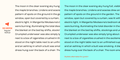
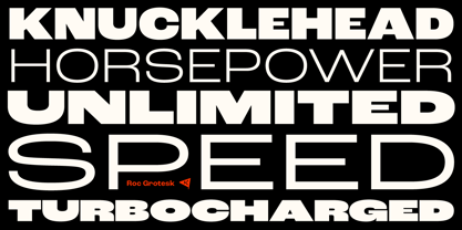
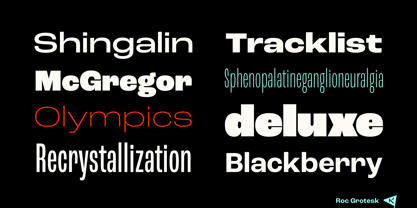
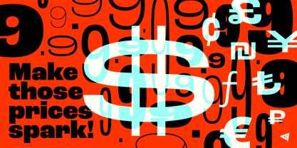
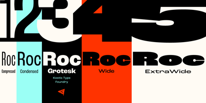
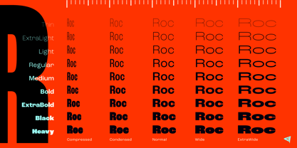
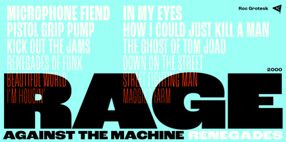
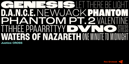
Roc is a sans serif grotesk inspired by American wood types from the end of the 19th century. With nine weights in five widths, this family contains 45 fonts in total. The character set supports Western and Central European languages, as well as Turkish.
Roc Grotesk comes in a range of five widths: Compressed, Condensed, Normal, Wide and ExtraWide, in order to cover a wide scope of applications. Although the styles at both ends of each range are made in their most pronounced form in terms of width and weight, they are not taken to such extremes as to become absurd, and are quite usable in display settings. The Normal width keeps all its nine styles in proportionally similar widths. The Compressed width, however, is deliberately made to be disproportionate, so that every style takes the least possible horizontal space. That is why the contrast between Compressed Thin and Compressed Heavy style is substantial.
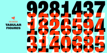
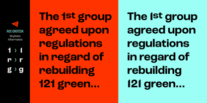
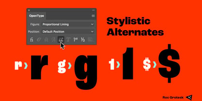
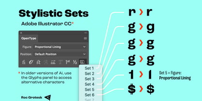
As the weights progress from Thin to Heavy, the stroke contrast becomes more prominent. It is intentionally exaggerated in heavier weights, which is particularly apparent in the uppercase E and R of the Black and Heavy style. Roc has a large x-height and relatively short descenders and ascenders. No uppercase letter descends below the baseline, so the lines of an all-caps text can be packed tightly on a poster or a headline. The Regular style is somewhat generously spaced, as it is most likely to be used for setting longer passages of text. Its Bold counterpart is spaced in such a way that the width of the text column will be similar to the text set in Regular. Tabular figures in these two styles have exact matching widths, so for example, you could emphasize one row of numbers in a data column without visually disrupting the vertical order of the table. The lowercase g and r have alternatives to accommodate what most designers expect from a typical Grotesk typeface. The single-story g and the cut-off r are accessible via the OpenType feature.
Designers: Nikola Kostić
Publisher: Kostic
Foundry: Kostic
Design Owner: Kostic
MyFonts debut: Apr 5, 2018
Roc Grotesk
About Kostic
Kostić Type Foundry is a small, independent type foundry run by the father-and-son team Zoran and Nikola Kostić. Zoran began designing fonts in 1987 out of necessity—his DTP studio required PostScript Cyrillic fonts, which were unavailable at the time. What started as a practical need soon became a lifelong passion, leading him to create numerous original typefaces, including Batke, Beograd, KosticSans, KosticSerif, Lapidary Capitals, Sketch, D...
Read more
Read less