Select this license type when you are developing an app for iOS, Android, or Windows Phone, and you will be embedding the font file in your mobile application's code.
Spitzkant Variable
by Fincker Font Cuisine
Individual Styles from $185.00 USD
40% Off

Spitzkant Variable Font Family was
designed by
Julien Fincker and
published by
Fincker Font Cuisine. Spitzkant Variable contains
1
styles.
More about this family
About Spitzkant Variable Font Family
About the design
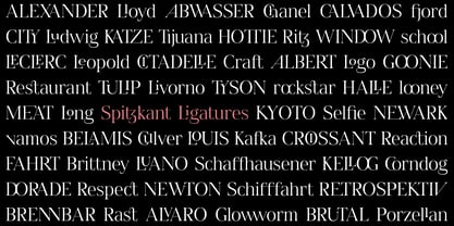
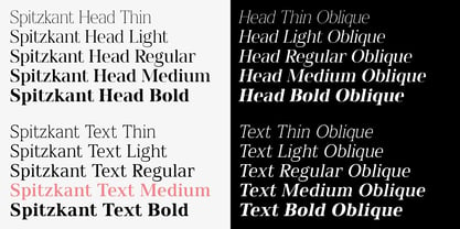
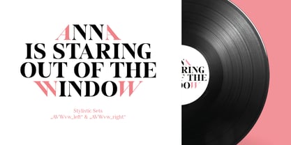
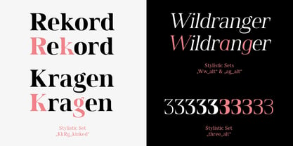
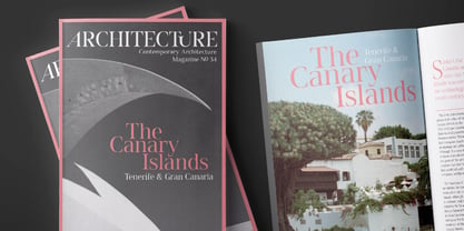
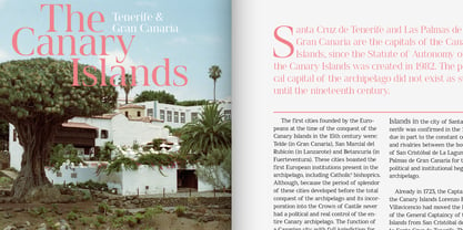
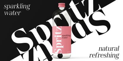
Spitzkant is a serif typeface family that is characterized by strong contrasts. Pointed, sharp serifs and edges contrast with round and fine forms, making it very individual and expressive. This makes it particularly suitable for branding, editorial, packaging and advertising. The high-contrast display version has been complemented by a lower-contrast text version, making Spitzkant in combination suitable for both strong headlines and extensive body text. An allrounder that can be used for many purposes.
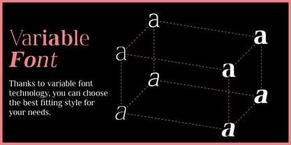
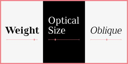
Variable Font
The Variable Font contains 3 axes: weight, oblique and optical size – all in just one file.
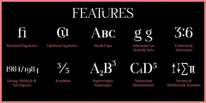
Features
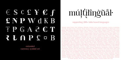
With over 850 characters, it covers over 200 Latin-based languages. It also has an extended set of currency symbols and a whole range of open type features. For example, there are alternative characters as Stylistic Sets, Small Caps, automatic fractions and many other features.
Ligatures
Especially the extensive selection of ligatures (standard and optional) is a special feature which was an important part during the design process. With over 95 different ligatures there are many possibilities to give headlines and logos an individual touch.
Get the usual version of the Spitzkant family here:
Designers: Julien Fincker
Publisher: Fincker Font Cuisine
Foundry: Fincker Font Cuisine
Design Owner: Fincker Font Cuisine
MyFonts debut: Jan 7, 2022
Spitzkant Variable

About Fincker Font Cuisine
We are passionate about letters, type and everything that comes along with. That’s why we enjoy to offer retail typefaces and custom solutions. Due to our French roots we also like to dine well and see many parallels between cooking and designing fonts. It is always the details in the preparation process that make the difference – therefore Font Cuisine.https://www.fontcuisine.com/
Read more
Read less
- Choosing a selection results in a full page refresh.