Select this license type when you are developing an app for iOS, Android, or Windows Phone, and you will be embedding the font file in your mobile application's code.
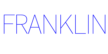
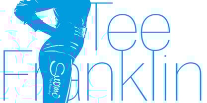
Tee Franklin™
by Suomi


- Aa Glyphs
-
Best ValueFamily Packages
- Individual Styles
- Tech Specs
- Licensing
About Tee Franklin Font Family
Designers: Morris Fuller Benton, Tomi Haaparanta
Publisher: Suomi
Foundry: Suomi
Original Foundry: ATF
Design Owner: Suomi
MyFonts debut: Nov 6, 2009
About Suomi
Suomi Type Foundry is a company dedicated to creating high quality typefaces. The company was founded by Tomi Haaparanta, who has been designing typefaces since 1990. Tomi Haaparanta's fonts are already distributed by Linotype, Monotype, ITC, T-26 and Psy/Ops, and in January 2004 he decided to set up his own font foundry. The philosophy of Suomi Type Foundry is to make extensive type families, so the user has more to choose from; too often you find a great typeface, but the weight is not just right. Our fonts often come with an average of seven weights, so it is likely that you will find the right weight. Also we do not want to exclude any users, so we try to keep the range of our type library as versatile as possible, from comfortable types for text setting, to signage type families, to more evocative fonts for brand design. And sometimes stuff just for fun.
Read more
Read less
- Choosing a selection results in a full page refresh.