Skip to content
Home / Fonts / Quadrat / Toronto Subway
Toronto Subway

Toronto Subway™

by Quadrat
Individual Styles from $35.00 USD
Complete family of 4 fonts: $105.00 USD
Toronto Subway Font Family was designed by David Vereschagin and published by Quadrat. Toronto Subway contains 4 styles and family package options.

More about this family
FREE 30-DAY TRIAL of Monotype Fonts to get over 150,000 fonts from more than 1,400 type foundries. Start free trial
Start free trial

About Toronto Subway Font Family


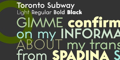
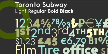
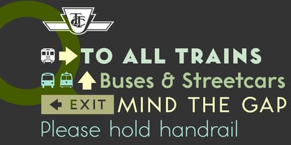
Toronto Subway is based on the lettering originally used for station identification and signs by the Toronto Transit Commission (TTC) in the Toronto, Canada, subway system. The first subway line opened in 1954. However, the original lettering remains unique. The lettering on the original signage consists only of uppercase characters and a few bits of punctuation in two weights: Regular and Bold, introduced in 2004. The Toronto Subway fonts were developed from rubbings of the lettering etched into station walls and photographs of painted signs. The overall style of the lettering is very mechanical, almost naive, yet still having a certain amount of elegance. This style was followed as much as possible in creating the extra lowercase, punctuation and other special characters. The Toronto Subway family was expanded in 2014 with the addition of the Light and Black weights.

Designers: David Vereschagin

Publisher: Quadrat

Foundry: Quadrat

Design Owner: Quadrat

MyFonts debut: Apr 19, 2004

Toronto Subway™ is a trademark of Quadrat Communications.

About Quadrat

Quadrat is a one-person graphic design firm based in Toronto, Ontario, Canada, run by David Vereschagin, and specializing in publication, web and typeface design.

Read more

Read less