Select this license type when you are developing an app for iOS, Android, or Windows Phone, and you will be embedding the font file in your mobile application's code.
Vitruv Text
by René Bieder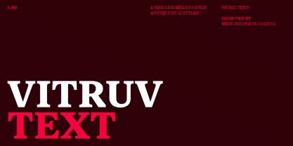
- Aa Glyphs
-
Best ValueFamily Packages
- Individual Styles
- Tech Specs
- Licensing
About Vitruv Text Font Family
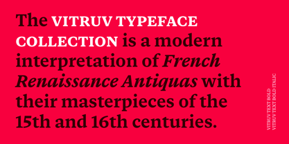
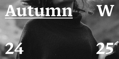
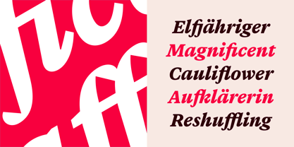
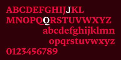
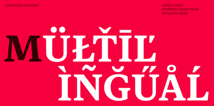
The Vitruv typeface collection is a modern interpretation of French Renaissance Antiquas with their masterpieces of the 15th and 16th centuries. The family combines the elegance of timeless work of Garamond and Plantijn with the robustness and versatility requirements of contemporary graphic design. Guided by the principles of ideal proportions and the principles of the ancient architect Vitruvius, Firmitas (Firmness), Utilitas (Utility), and Venustas (Beauty), the typeface collection extends into three subfamilies.
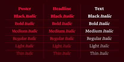
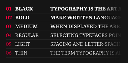
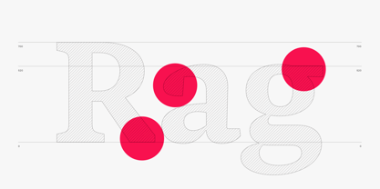
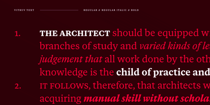
Vitruv Poster is designed for large headlines with an elegant appearance. With its tight spacing, it creates a timeless, elegant look in large font sizes. Vitruv Headline is aimed at users looking for a universal stroke weight, between the robust forms of the Text family and the fine details of the Poster family. The Text family is optimized for body text, as its name suggests. With its rugged construction and open shapes, it offers optimal readability in small font sizes.
With its wide range of styles and subfamilies, Vitruv can be used in a variety of design applications. Ranging from editorial design to brand identities, it is equipped for all areas of typesetting and modern graphic design requiring a timeless, trustworthy and elegant voice.
Designers: René Bieder
Publisher: René Bieder
Foundry: René Bieder
Design Owner: René Bieder
MyFonts debut: Oct 15, 2024

About René Bieder
René Bieder (*1982) is a trained Graphic designer and Art Director and self taught type designer. Before setting up his own studio as a type designer in 2013, he was employed in various small and large advertising agencies as an Art Director and Graphic Designer working for national and international clients. During his agency time he developed a deep interest in type design and started designing typefaces as a side project. His second commercial release has won the title "Myfonts Most popular typeface of the year 2012". Since then his typefaces were a constant on the Myfonts best seller lists. Today, you can find his work all around the world. From the Nemo Science Museum in Amsterdam to the University of Florida.The Premium foundry page can be viewed Here.
Read more
Read less
- Choosing a selection results in a full page refresh.