Select this license type when you are developing an app for iOS, Android, or Windows Phone, and you will be embedding the font file in your mobile application's code.
VLNL Beatbox
by VetteLetters
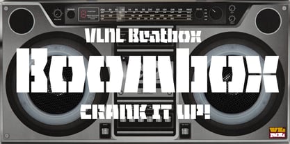
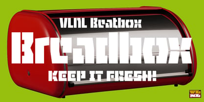
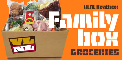
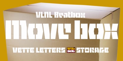

- Aa Glyphs
-
Best ValueFamily Packages
- Individual Styles
- Tech Specs
- Licensing
Per Style:
$20.00 USD
Pack of 2 styles:
$40.00 USD
About VLNL Beatbox Font Family
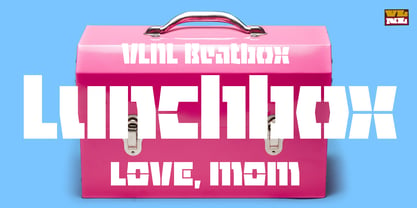
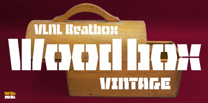
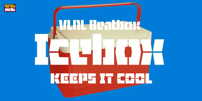
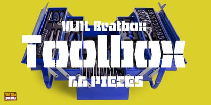
VLNL Beatbox is a solid tech heavy straight stencil-face with a lot of character.
It was originally designed as a logo for dj Markus Schultz back in 2004, who rejected it. His management couldn't read it, or thought people wouldn’t be able to read it. But Chef Donald DBXL found the concept interesting enough to finish it and has used it in many projects since. It was the identity font for the Battle of Amsterdam, a talent showcase in beat boxing and other skills. Beatboxing is a style of hiphop music (beats) made with the mouth and a microphone. A box is a handy container to store stuff. Like food, or fonts. We use a lot of boxes at the VetteLetters office.
VLNL Beatbox is best deployed big, like in logos or headlines. Or flyers, album covers, posters and signage. As a display and headline typeface it’s got a lot of character. We could definitely see it painted on the side of a tank, or an airplane. It’s heavy, but not at all dangerous. Use it without risk.
VLNL Beatbox comes in two variations; Regular and Small (smallcaps)
Designers: Donald Beekman
Publisher: VetteLetters
Foundry: VetteLetters
Design Owner: VetteLetters
MyFonts debut: Sep 1, 2022
About VetteLetters
VetteLetters.nl is fascinated by kebab shops, local chinese restaurants and fish-and-chips joints – not just the food but especially the shopfront typography. If all the other type foundries are like haute cuisine restaurants, then VetteLetters is the font-imbiss in the world of exclusive and expensive font foundries. VetteLetters, based in Amsterdam, loves food and loves fonts. So let’s introduce our chefs: After a wonderful career as a dishwasher, assistant cook, some kind of designer, and last but not least type designer, Donald® Roos is now one of VetteLetters CEOs. Donald DBXL Beekman is “the other Donald” and also the other CEO. DBXL produces as many typefases as Prince makes records. Jacques “Sardines” Le Bailly also known as the Baron von Fonthausen is Chief Type Tech. Dev. Dept. and we have Martin “TwoPoints” Lorenz, baking his fonts in the lovely climate of Barcelona. The latest addition to the VetteLetters stable is designer Henning Brehm aka “Design Tourist” hailing from Berlin.
Read more
Read less
- Choosing a selection results in a full page refresh.