


Select this license type when you are developing an app for iOS, Android, or Windows Phone, and you will be embedding the font file in your mobile application's code.
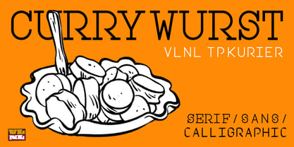
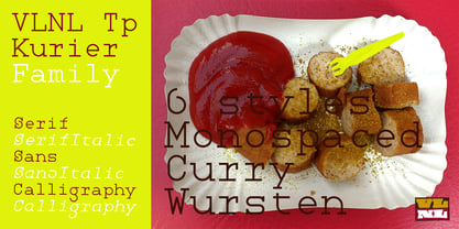
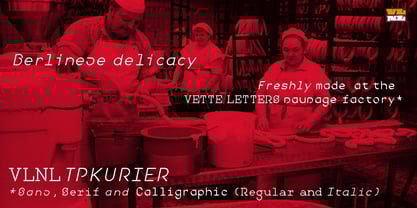
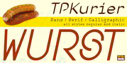
VLNL Tp Kurier™
by VetteLetters
Individual Styles from $35.00 USD
Complete family of 6 fonts: $103.00 USD


VLNL Tp Kurier Font Family was
designed by
Martin Lorenz and
published by
VetteLetters. VLNL Tp Kurier contains
6
styles and family package options.
More about this family
- Aa Glyphs
-
Best ValueFamily Packages
- Individual Styles
- Tech Specs
- Licensing
Basic typesetting
Letter case
Numerals and scientific typesetting
Typographic variants
Reset
Per Style:
$17.16 USD
Pack of 6 styles:
$103.00 USD
VLNL Tp Kurier Serif Pack
2 fontsPer Style:
$23.50 USD
Pack of 2 styles:
$47.00 USD
VLNL Tp Kurier Sans Pack
2 fontsPer Style:
$23.50 USD
Pack of 2 styles:
$47.00 USD
VLNL Tp Kurier Calligraphic Pack
2 fontsPer Style:
$23.50 USD
Pack of 2 styles:
$47.00 USD
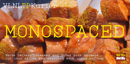
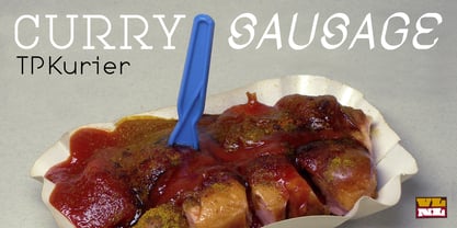
About VLNL Tp Kurier Font Family
VetteLetters is proud to bring you the TpKurier-family. It is cooked up by our German chef Martin Lorenz currently living in lovely Barcelona! Chef Lorenz about the TpKurier recipe: “TpKurier is the second redesign we did of Courier. The first redesign in 2000, although based on a five-unit grid, was drawn completely by hand. Six years later we designed another grid version of Courier, and the TpKurier family was born. This version is completely constructed up till its last detail. We didn't want to correct ‘mistakes’ deriving from the use of the grid, but instead make them visible (see “S”). TpKurier is based on a very simple grid, composed a proportion of four units high by two units wide. A series of other links between them make it possible to form a font from this grid. We felt it was important to consistently work within these limitations so that any unexpected asperities would help provide the font with its character. Even though it is a rough constructed typeface it was important to us to design real italic lower case letters and not just a sloped roman (see “a”, “g” or “s”). The first family published contained a serif and sans-serif version of the TpKurier, with italic and bold.”
Designers: Martin Lorenz
Publisher: VetteLetters
Foundry: VetteLetters
Design Owner: VetteLetters
MyFonts debut: Jul 30, 2013
VLNL Tp Kurier™
is a trademark of VetteLetters.
About VetteLetters
VetteLetters.nl is fascinated by kebab shops, local chinese restaurants and fish-and-chips joints – not just the food but especially the shopfront typography. If all the other type foundries are like haute cuisine restaurants, then VetteLetters is the font-imbiss in the world of exclusive and expensive font foundries. VetteLetters, based in Amsterdam, loves food and loves fonts. So let’s introduce our chefs: After a wonderful career as a dishwasher, assistant cook, some kind of designer, and l...
Read more