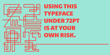
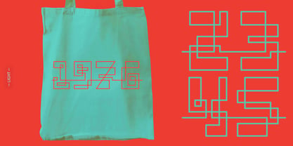
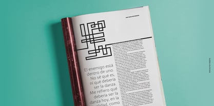
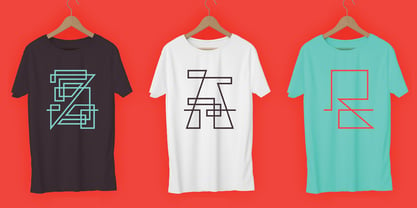
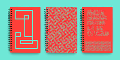
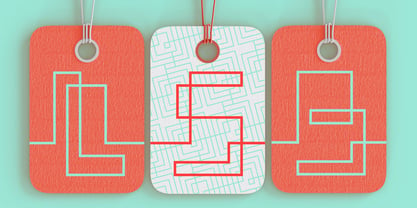
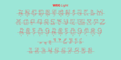
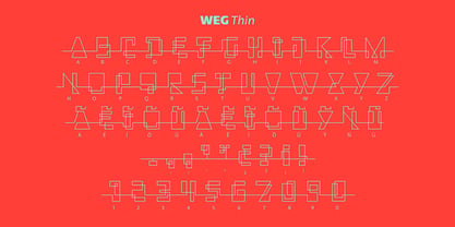
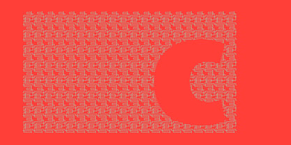
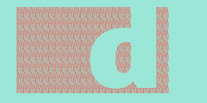
WEG* font is an experimental type system where legibility isn’t the focus.
This project studies how glyphs are constructed and how their ductus can be modified.
I explored how far I can move the limits if I don’t worry about the legibility.
In Weg, letters are built by a single line that connects them, along with words and paragraphs. When weight decreases, the legibility of the signs increases.
This is the first stage. It’s a project in expansion.
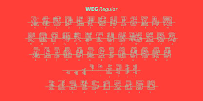
The set contains uppercase, lining figures and basic punctuation in three weights: Regular, Light and Thin. The current supported languages are Spanish, Guaraní and English. If you need any other language, please let me know. I would like to expand the character set.
Second stage project
WEG is an experimental in-expansion font family.
Here I present to you the second stage.
I’m planning the first upgrade for middle 2021.
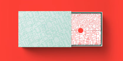
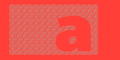
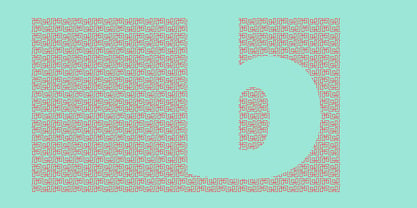
I’m preparing a pattern set for July 2021. Here you can see the first four patterns.
If you buy the font before July 2021, you’ll get this upgrade!
• Second stage April - July 2021: pattern set (first four ready).
• This upgrade will be available on August 2021.
About Huerta Tipográfica
We are Juan Pablo del Peral, Carolina Giovagnoli, Sol Matas and Andrés Torresi, all graphic and type designers from Argentina. In 2009 we founded a collaborative type foundry with a deep respect for design and typography.
We were originated as a place to meet, cooperate and share experiences while collaborating on academic and commercial projects.
We identify specific typographical needs and this motivate us to create innovative and functional ideas. We do it with a strong commitment to the quality of our work and through the exchange of ideas, experiences and knowledge.
With all of these in mind we develop custom or retail fonts with libre, proprietary or exclusive licenses.
The quality of our work has been recognized in several international events such as Letter.2 (ATypI), Tipos Latinos and the “Bienal Iberoamericana de diseño de Madrid”.
Read more
Read less

