Select this license type when you are developing an app for iOS, Android, or Windows Phone, and you will be embedding the font file in your mobile application's code.
Wheaton
by Typodermic
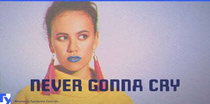
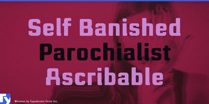
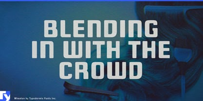
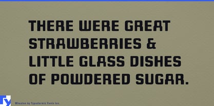
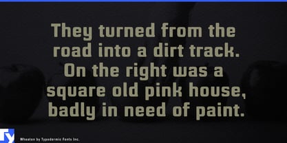
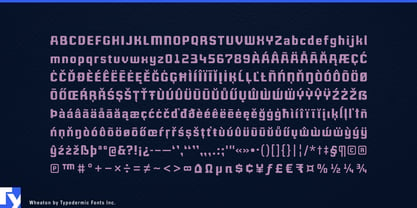
About Wheaton Font Family
Step into the typographic time machine with Wheaton—a headline font that bridges the gap between retro charm and futuristic flair. This robust typeface teleports your message across decades, fusing the electronic aesthetics of the 1980s with the sleek sensibilities of tomorrow’s design.
Wheaton’s DNA is a perfect splice of nostalgia and innovation. Its clean lines and futuristic curves echo the optimistic tech dreams of the past, while softened edges and fluid forms speak the language of contemporary design. It’s as if the glowing text from a vintage arcade cabinet evolved to fit seamlessly into a holographic display. But Wheaton isn’t just about visual time travel. Its scientific elegance and industrial wonder make it the ideal choice for brands and projects that push boundaries. From cutting-edge tech startups to retro-inspired fashion lines, Wheaton lends an air of technological assurance that’s impossible to ignore.
This typographic chameleon adapts effortlessly across mediums. On screens, it radiates with the warm glow of CRT monitors past. In print, its subtle details and confident strokes command attention, turning every headline into a statement piece. Wheaton doesn’t just caption your design—it becomes an integral part of your visual story. Wheaton speaks fluently in the mother tongue of most Latin-based European writing systems. From the fjords of Norway to the plains of Hungary, from the Celtic shores of Ireland to the sun-drenched coasts of Portugal, Wheaton translates your message with retro-futuristic flair. It’s equally at home spelling out “Welcome to the future” in English or crafting nostalgic movie titles in Polish.
Why settle for typography that’s stuck in a single era when you can have Wheaton—a font that dances through time? It’s a portal to design dimensions where past and future collide in perfect harmony.
Designers: Ray Larabie
Publisher: Typodermic
Foundry: Typodermic
Original Foundry: Typodermic
Design Owner: Typodermic
MyFonts debut: Aug 12, 2011

About Typodermic
Welcome to Typodermic Fonts, a spirited type foundry rooted in Nagoya, Japan, started by the Canadian typeface designer, Raymond Larabie in 2001. Our library brims with 500+ diverse typefaces to fuel creativity in graphic design, advertising, web, and app development. As digital type pioneers, we adopted web fonts and app licensing early, consistently pushing the design envelope. With Canadian heart and Japanese precision, we're your global partners in extraordinary typography. Explore Typodermic Fonts—where creativity meets character.
Read more
Read less
- Choosing a selection results in a full page refresh.