Select this license type when you are developing an app for iOS, Android, or Windows Phone, and you will be embedding the font file in your mobile application's code.
Zingende
by Typodermic
- Aa Glyphs
-
Best ValueFamily Packages
- Individual Styles
- Tech Specs
- Licensing
About Zingende Font Family
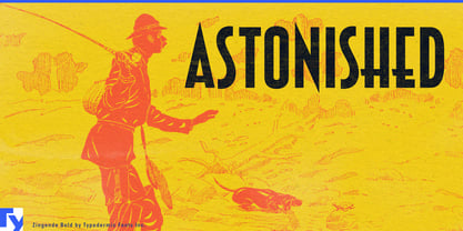
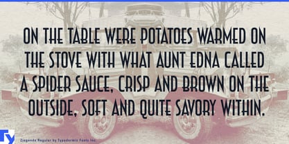
Ladies and gents, put on your dancing shoes and prepare to cut a rug with Zingende, the typeface that’s hotter than a brass section in full blast! This is a typographic tribute to the era when the joint was always jumping and the music never stopped.
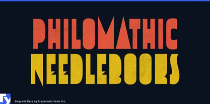
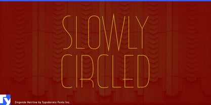
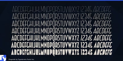
Zingende struts onto the page with all the confidence of a lead trumpeter taking center stage. Its razor-sharp points and elegant waistline aren’t just design choices—they’re a visual rhythm, baby, syncopating your message with the precision of a seasoned jazz drummer. Each letter is a solo act, but together, they create a harmony that’s sweeter than a Benny Goodman clarinet lick. But don’t think Zingende is a one-trick pony. Oh no, this cat’s got range! With six different weights, you can fine-tune your typographic arrangement like a bandleader adjusting the mix. Need to shout it from the rooftops? Crank it up to bold. Want to whisper sweet nothings? Take it down to light. And for those times when you need to really blow the doors off the joint, Zingende’s solid, counterless design is like a typographic big band in full swing—impossible to ignore and guaranteed to get toes tapping.
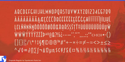
Zingende isn’t just fluent in the language of jazz—it’s a regular polyglot, speaking to audiences from the smoky clubs of Paris to the dancehalls of Havana. With support for a swinging selection of Latin-based European writing systems, your message will be the talk of the town from Stockholm to Seville.
So whether you’re designing a poster for the hottest swing revival this side of the Cotton Club, branding a speakeasy that’s so exclusive even the feds don’t know about it, or just want to add some Art Deco pizzazz to your next presentation, Zingende is your ticket to typographic stardom.
Designers: Ray Larabie
Publisher: Typodermic
Foundry: Typodermic
Original Foundry: Typodermic
Design Owner: Typodermic
MyFonts debut: Nov 20, 2009

About Typodermic
Welcome to Typodermic Fonts, a spirited type foundry rooted in Nagoya, Japan, started by the Canadian typeface designer, Raymond Larabie in 2001. Our library brims with 500+ diverse typefaces to fuel creativity in graphic design, advertising, web, and app development. As digital type pioneers, we adopted web fonts and app licensing early, consistently pushing the design envelope. With Canadian heart and Japanese precision, we're your global partners in extraordinary typography. Explore Typodermic Fonts—where creativity meets character.
Read more
Read less
- Choosing a selection results in a full page refresh.