Bembo Book Font Field Guide

Foundry: Monotype Designers: Francesco Griffo & Robin Nicholas Classification: Serif, Old Style Serif
Best Practises
The Bembo® typestyle has been the go-to typeface for fine text typography since it was first released in 1929. The Bembo® Book family carries on the tradition of the design maintaining the grace, elegance and legibility of the of the early 20th century typeface.
Family
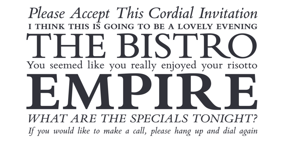
Two weights of roman with complementary italic designs. Both Bembo® Book Regular and Bold have small caps.
Font Facts
- Three years after Aldus’ typefaces was first used, the basic font was enhanced by with a suite of capital letters. Previously, capitals were pulled from other fonts prior to the release of these new designs.
- The original Aldus Bembo also had no italic designs, In its 1929 revival, the Monotype design staff created a new italic based on the works of Giovanni Tagliente, a 16th century writing master.
Roots
The fonts made by Francesco Griffo and used by Aldus Manutius in 1495, provided the inspiration for the Bembo® typeface. Monotype’s designers used antique books and specimen material set with Aldus’ original fonts as the basis for their design. The first phototypesetting and digital versions were based on the original Monotype drawings. Unfortunately, the new fonts did not take into account the “ink spread” of using inked fonts on paper. The result was a design that had the elegance of the original – but lacked its robustness.
Bembo® Book was designed to better suit setting copy in text sizes. Outlines were also taken directly from the first Monotype drawings and digitized – but were then meticulously edited to preserve the design features and overall color of the original Bembo typeface in use.

Legibility
Ascenders are noticeably taller than the caps aiding their legibility at text sizes. Changes in stroke weight are obvious but not dramatic. Serifs are hardy with ample bracketing.
How to spot Bembo Book


