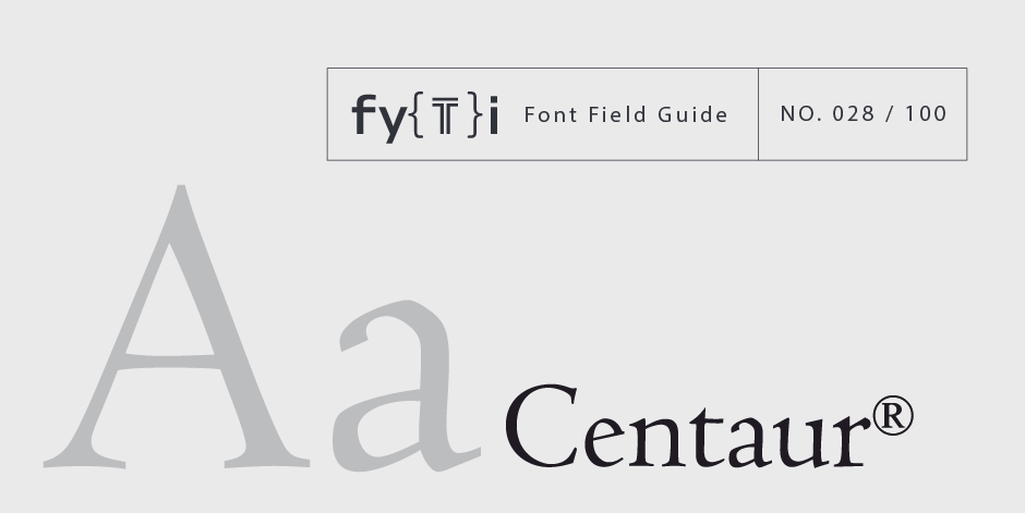
Centaur® Font Field Guide

FOUNDRY: Monotype, DESIGNER: Bruce Rogers & CLASSIFICATION: Serif Old Style
Best Practices
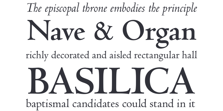
A distinctive design that performs best at larger sizes in headlines and short blocks of text copy. Centaur should not be combined with equally distinctive designs.

Family
Two weights with corresponding italics. A suite of swash characters are included with the italic designs.
Font Facts
- Bruce Rodgers originally wanted the typeface to be called “Kent” after the name of the director of the private press for which it was initially designed.
- The italic, first called “Arrighi,” was designed in the late 1920s by Frederic Warde.
Roots
The design is based on the 1470 font of the Venetian printer, Nicolas Jenson. Drawn by Bruce Rogers, and first released in 1914 for a private press, Centaur was made available as a commercial typeface in 1929.

Legibility
While originally designed for text copy set in metal type, Centaur’s small x-height, delicate serifs and idiosyncratic characters detract from legibility. This is especially true in small sizes.
Spotting Centaur

Alternate Choices
Perfect Pairings
Download a pdf version of Centaur Font Field Guide and view the Centaur font family.
More Font Field Guides

TT Travels Next Font Field Guide
TT Travels Next is a trendy wide sans serif designed to attract attention. Just after its release, it has found its place in the world of show bills and posters, as well as on packaging. Learn more

Cotford Font Field Guide
Cotford is a versatile serif family of elegant display and robust text styles. This range makes Cotford suitable for a variety of print and digital applications. Learn more


