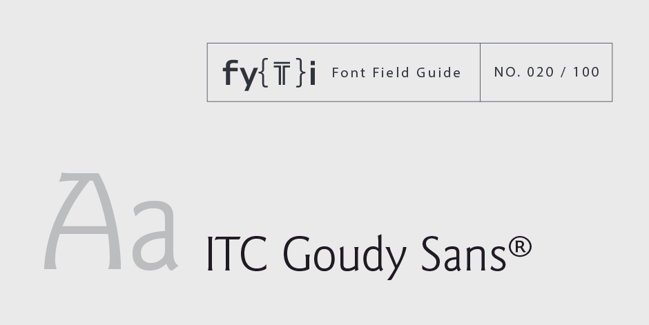
ITC Goudy Sans® Font Field Guide

Foundry: ITC Designers: Frederic Goudy, ITC Design Staff Classification: Humanist Sans
Best Practices
While typefaces with strong personalities have limitations, few applications are outside the range of ITC Goudy Sans. It’s a good choice for advertising copy, promotional material, catalogs, brochures and even long form print and on-screen text copy.

Family
Four weights of regular designs – each with a complementary italic
Font Facts
- Goudy’s only commercial sans serif design.
- Goudy said of the typeface, “I attempted to give to my type a definite expression of freedom and a personal quality not always found in this kind of letter.”
Roots
Frederic Goudy created the three designs of heavy, light and light italic for metal typesetting in the 1920s. Then, many years later, Compugraphic Corp. revived Goudy’s original work for photocomposition. In the process, three more faces were added to the family. International Typeface Corporation (ITC) re-released the design under a license from Compugraphic in 1986. ITC took the opportunity to enlarge the family again to four weights with corresponding italics.

Legibility
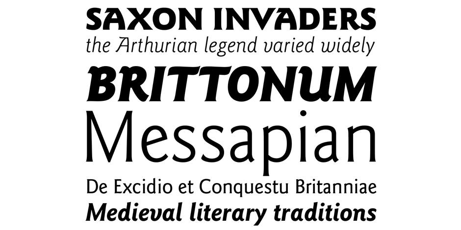
Distinctive characters, such as the bowl and loop g and diagonal crossbar e aid legibility. Open counters help define characters, and have a strong influence on ease of recognition. Open apertures also aid in small text and on-screen legibility.
How to spot ITC Goudy Sans®

Alternate Choices
Perfect Pairing
Download a pdf version of the ITC Goudy Sans® font field guide and view the ITC Goudy Sans® font family.
More Font Field Guides

Optima nova should be set more open than tight. The unhurried elegance and light gray color created by the face is disrupted when letters are set too tight. Learn more

The original Baskerville typeface was created for setting books, and its modern revivals are ideally suited to the setting of continuous text. Learn More


