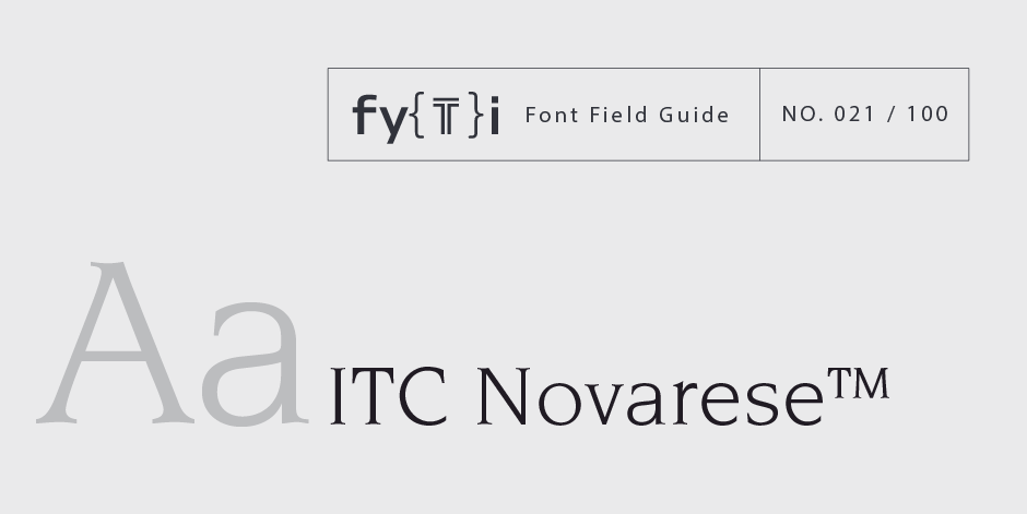
ITC Novarese™ Font Field Guide

Foundry: ITC Designers: Aldo Novarese Classification: Glyphic Serif
Best Practices
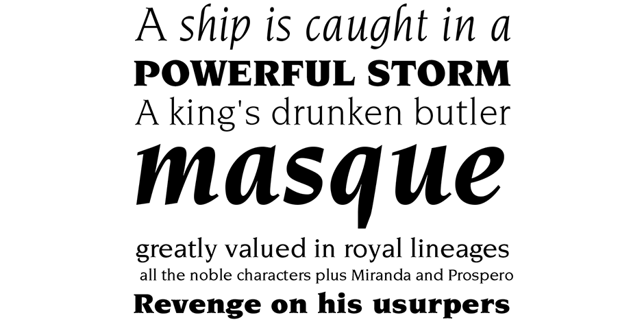
The contrast between thick and thin strokes is noticeable but not extreme, giving text set in ITC Novarese sparkle and color without sacrificing readability. This is a typeface that performs equally well at both display and text sizes in print and digital environments.

Family
Four weights of roman, three with italics
Font Facts
- The first italics were designed as single-weight families and only contained lowercase characters
- The idea was to use capitals and other characters as they became necessary, from whatever font the printer had available. The italics in the ITC Novarese family are a traditional interpretation of the italic genre.
Roots
Aldo Novarese originally designed this typeface for Switzerland’s Haas type foundry. International Typeface Corporation (ITC) licensed it shortly after its first release and issued the design as ITC Novarese in December of 1979.

Legibility
Highly legible letterforms with abbreviated descenders that provide economy of space. Short serifs allow latitude in letter spacing with no loss of readability.
How to spot ITC Novarese™

Alternate Choices
Perfect Pairing
Download a pdf version of the ITC Novarese™ font field guide and view the ITC Novarese™ font family.
More Font Field Guides

Optima nova should be set more open than tight. The unhurried elegance and light gray color created by the face is disrupted when letters are set too tight. Learn more

The original Baskerville typeface was created for setting books, and its modern revivals are ideally suited to the setting of continuous text. Learn More


