Palatino® Sans Font Field Guide

FOUNDRY: Linotype
DESIGNER: Hermann Zapf & Akira Kobayashi
CLASSIFICATION: Humanistic Sans Serif
Best Practices
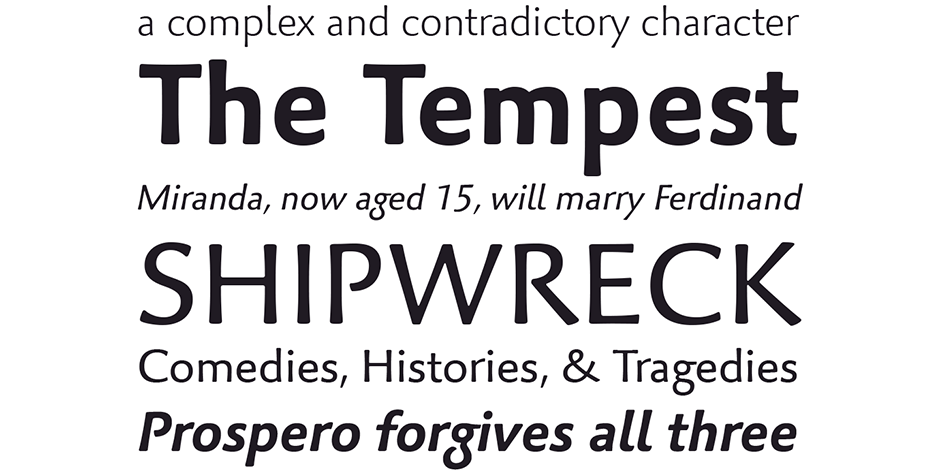
The characters in Palatino Sans based on written letter forms and the pressure of the hand. The lighter weighs can be excellent alternatives to many traditional serif and sans serif designs. The bolder weights translate well to large size display and on-screen settings.

FAMILY
Five roman weights, each with corresponding italics. Fonts include several OpenType features, such as an extended characters sets, old style figures, small caps, fractions, ordinals, ligatures, alternates, and ornaments.
Font Facts
- Not only is Palatino Sans a completely new typeface, it is a refreshing interpretation of the sans serif genre. Its letterforms are curved, rounded, and soft.
- Special care was taken in the design of the figures avoid mistakes and confusion – especially on screen and in very small sizes.
Roots
Palatino Sans was designed as part of a group of three font families: Palatino Nova, Palatino Sans, and Palatino Sans Informal. Together these three families are the 21st century fulfilment of Herman Zapf’s original Palatino concept.

Legibility
Sturdy proportions, a large x-height, open counters and distinctive character designs, make Palatino Sans legible. Because the design is so distinctive, however, it can hinder message delivery in lengthy text copy blocks.
How To Spot Palatino Sans

Alternate Choices
Perfect Pairing
Download a pdf version of the Palatino Sans Font Field Guide and view Palatino Sans.
More Font Field Guides

Truesdell Font Field Guide
A distinctive design that performs best at larger sizes in headlines and short blocks of text copy. Learn more

Truesdell Font Field Guide
A distinctive design that performs best at larger sizes in headlines and short blocks of text copy. Learn more


