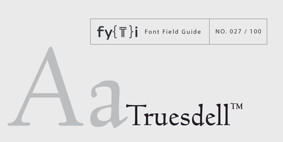
Truesdell Font Field Guide

Best Practices
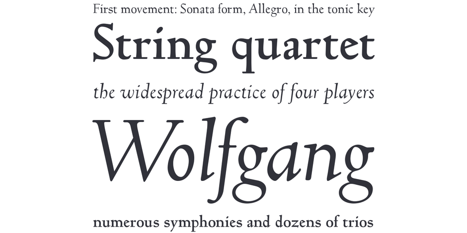
A distinctive design that performs best at larger sizes in headlines and short blocks of text copy. It should not be combined with equally distinctive designs

Family
Two weights with corresponding italics. Included are a suite of small caps, ligatures and swash characters.
Font Facts
- Goudy was asked to write an article that he could set in any typeface. He designed Truesdell for the article.
- Truesdell™ is named after Goudy’s mother’s maiden name.
- Matteson saw rare proofs of the original design when he was a student at Rochester Institute of Technology
Roots
First drawn and used by Frederic Goudy in 1931. Revived by Steve Matteson for Monotype in 1994.

Legibility
While originally designed to set text copy, the design’s small x-height, delicate serifs and idiosyncratic characters detract from legibility. This is especially true in small sizes.
Spotting Truesdell™


